设置应用内主题换肤
概述
对于采用ArkTS开发的应用,提供了应用内组件的主题换肤功能,支持局部的深浅色切换及动态换肤。目前,该功能只支持设置应用内主题换肤,暂不支持在UIAbility或窗口层面进行主题设置,同时也不支持C-API和Node-API。
自定义主题色
当应用需要使用换肤功能时,应自定义主题颜色。CustomTheme用于自定义主题色的内容,其属性可选,仅需要复写需修改的部分,未修改内容将继承系统默认设置,可参考系统默认的token颜色值。请参照以下示例自定义主题色:
  import { CustomColors, CustomTheme } from '@kit.ArkUI';

  export class AppColors implements CustomColors {
    //自定义主题色
    brand: ResourceColor = '#FF75D9';
  }

  export class AppTheme implements CustomTheme {
    public colors: AppColors = new AppColors();
  }

  export let gAppTheme: CustomTheme = new AppTheme();
设置应用内组件自定义主题色
-
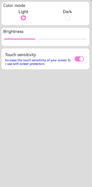
可以在页面入口处统一设置应用内组件自定义主题色,但需确保在页面build前执行ThemeControl。 其中,onWillApplyTheme回调函数用于使自定义组件获取当前生效的Theme对象。
import { Theme, ThemeControl } from '@kit.ArkUI'; import { gAppTheme } from './AppTheme'; //在页面build前执行ThemeControl ThemeControl.setDefaultTheme(gAppTheme); @Entry @Component struct DisplayPage { @State menuItemColor: ResourceColor = $r('sys.color.background_primary'); onWillApplyTheme(theme: Theme) { this.menuItemColor = theme.colors.backgroundPrimary; } build() { Column() { List({ space: 10 }) { ListItem() { Column({ space: '5vp' }) { Text('Color mode') .margin({ top: '5vp', left: '14fp' }) .width('100%') Row() { Column() { Text('Light') .fontSize('16fp') .textAlign(TextAlign.Start) .alignSelf(ItemAlign.Center) Radio({ group: 'light or dark', value: 'light' }) .checked(true) } .width('50%') Column() { Text('Dark') .fontSize('16fp') .textAlign(TextAlign.Start) .alignSelf(ItemAlign.Center) Radio({ group: 'light or dark', value: 'dark' }) } .width('50%') } } .width('100%') .height('90vp') .borderRadius('10vp') .backgroundColor(this.menuItemColor) } ListItem() { Column() { Text('Brightness') .width('100%') .margin({ top: '5vp', left: '14fp' }) Slider({ value: 40, max: 100 }) } .width('100%') .height('70vp') .borderRadius('10vp') .backgroundColor(this.menuItemColor) } ListItem() { Column() { Row() { Column({ space: '5vp' }) { Text('Touch sensitivity') .fontSize('16fp') .textAlign(TextAlign.Start) .width('100%') Text('Increase the touch sensitivity of your screen' + ' for use with screen protectors') .fontSize('12fp') .fontColor(Color.Blue) .textAlign(TextAlign.Start) .width('100%') } .alignSelf(ItemAlign.Center) .margin({ left: '14fp' }) .width('75%') Toggle({ type: ToggleType.Switch, isOn: true }) .margin({ right: '14fp' }) .alignSelf(ItemAlign.Center) } .width('100%') .height('80vp') } .width('100%') .borderRadius('10vp') .backgroundColor(this.menuItemColor) } } } .padding('10vp') .backgroundColor('#dcdcdc') .width('100%') .height('100%') } } -
在UIAbility中设置ThemeControl,需要在onWindowStageCreate()方法中setDefaultTheme,设置应用内组件的自定义主题色。
  import {AbilityConstant, UIAbility, Want } from '@kit.AbilityKit';
  import { hilog } from '@kit.PerformanceAnalysisKit';
  import { window, CustomColors, ThemeControl } from '@kit.ArkUI';

  class AppColors implements CustomColors {
    fontPrimary = 0xFFD53032;
    iconOnPrimary = 0xFFD53032;
    iconFourth = 0xFFD53032;
  }

  const abilityThemeColors = new AppColors();

  export default class EntryAbility extends UIAbility {
    onCreate(want: Want, launchParam: AbilityConstant.LaunchParam) {
      hilog.info(0x0000, 'testTag', '%{public}s', 'Ability onCreate');
    }

    onDestroy() {
      hilog.info(0x0000, 'testTag', '%{public}s', 'Ability onDestroy');
    }

    onWindowStageCreate(windowStage: window.WindowStage) {
      // Main window is created, set main page for this ability
      hilog.info(0x0000, 'testTag', '%{public}s', 'Ability onWindowStageCreate');

      windowStage.loadContent('pages/Index', (err, data) => {
        if (err.code) {
          hilog.error(0x0000, 'testTag', 'Failed to load the content. Cause: %{public}s', JSON.stringify(err) ?? '');
          return;
        }
        hilog.info(0x0000, 'testTag', 'Succeeded in loading the content. Data: %{public}s', JSON.stringify(data) ?? '');
        // 在onWindowStageCreate()方法中setDefaultTheme
        ThemeControl.setDefaultTheme({ colors: abilityThemeColors });
        hilog.info(0x0000, 'testTag', '%{public}s', 'ThemeControl.setDefaultTheme done');
      });
    }

  }
说明:
如果setDefaultTheme的参数为undefined时,默认token值对应的色值参考系统缺省token色值。
设置应用局部页面自定义主题风格
通过设置WithTheme,将自定义主题Theme的配色应用于内部组件的默认样式。在WithTheme的作用范围内,组件的配色会根据Theme的配色进行调整。
如示例所示,使用WithTheme({ theme: this.myTheme })可将作用域内组件的配色设置为自定义主题风格。后续可以通过更新this.myTheme来更换主题风格。onWillApplyTheme回调函数用于使自定义组件能够获取当前生效的Theme对象。
  import { CustomColors, CustomTheme, Theme } from '@kit.ArkUI';

  class AppColors implements CustomColors {
    fontPrimary: ResourceColor = $r('app.color.brand_purple');
    backgroundEmphasize: ResourceColor = $r('app.color.brand_purple');
  }

  class AppColorsSec implements CustomColors {
    fontPrimary: ResourceColor = $r('app.color.brand');
    backgroundEmphasize: ResourceColor = $r('app.color.brand');
  }

  class AppTheme implements CustomTheme {
    public colors: AppColors = new AppColors();
  }

  class AppThemeSec implements CustomTheme {
    public colors: AppColors = new AppColorsSec();
  }

  @Entry
  @Component
  struct DisplayPage {
    @State customTheme: CustomTheme = new AppTheme();
    @State message: string = '设置应用局部页面自定义主题风格';
    count = 0;

    build() {
      WithTheme({ theme: this.customTheme }) {
        Row(){
          Column() {
            Text('WithTheme')
              .fontSize(30)
              .margin({bottom: 10})
            Text(this.message)
              .margin({bottom: 10})
            Button('change theme').onClick(() => {
              this.count++;
              if (this.count > 1) {
                this.count = 0;
              }
              switch (this.count) {
                case 0:
                  this.customTheme = new AppTheme();
                  break;
                case 1:
                  this.customTheme = new AppThemeSec();
                  break;
              }
            })
          }
          .width('100%')
        }
        .height('100%')
        .width('100%')
      }
    }
  }

设置应用页面局部深浅色
通过WithTheme可以设置三种颜色模式,跟随系统模式,浅色模式和深色模式。
在WithTheme的作用范围内,组件的样式资源值会根据指定的模式,读取对应的深浅色模式系统和应用资源值。这意味着,在WithTheme作用范围内,组件的配色会根据所指定的深浅模式进行调整。
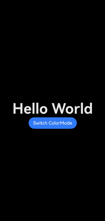
如下面的示例所示,通过WithTheme({ colorMode: ThemeColorMode.DARK }),可以将作用范围内的组件设置为深色模式。
设置局部深浅色时,需要添加dark.json资源文件,深浅色模式才会生效。

dark.json数据示例:
  {
    "color": [
      {
        "name": "start_window_background",
        "value": "#FFFFFF"
      }
    ]
  }
  @Entry
  @Component
  struct DisplayPage {
    @State message: string = 'Hello World';
    @State colorMode: ThemeColorMode = ThemeColorMode.DARK;

    build() {
      WithTheme({ colorMode: this.colorMode }) {
        Row() {
          Column() {
            Text(this.message)
              .fontSize(50)
              .fontWeight(FontWeight.Bold)
            Button('Switch ColorMode').onClick(() => {
              if (this.colorMode === ThemeColorMode.LIGHT) {
                this.colorMode = ThemeColorMode.DARK;
              } else if (this.colorMode === ThemeColorMode.DARK) {
                this.colorMode = ThemeColorMode.LIGHT;
              }
            })
          }
          .width('100%')
        }
        .backgroundColor($r('sys.color.background_primary'))
        .height('100%')
        .expandSafeArea([SafeAreaType.SYSTEM], [SafeAreaEdge.TOP, SafeAreaEdge.END, SafeAreaEdge.BOTTOM, SafeAreaEdge.START])
      }
    }
  }
系统缺省token色值
| Token | 场景类别 | Light | Dark | ||
|---|---|---|---|---|---|
| theme.colors.brand | 品牌色 | #ff0a59f7 |  | #ff317af7 |  |
| theme.colors.warning | 一级警示色 | #ffe84026 |  | #ffd94838 |  |
| theme.colors.alert | 二级警示色 | #ffed6f21 |  | #ffdb6b42 |  |
| theme.colors.confirm | 确认色 | #ff64bb5c |  | #ff5ba854 |  |
| theme.colors.fontPrimary | 一级文本 | #e5000000 |  | #e5ffffff |  |
| theme.colors.fontSecondary | 二级文本 | #99000000 |  | #99ffffff |  |
| theme.colors.fontTertiary | 三级文本 | #66000000 |  | #66ffffff |  |
| theme.colors.fontFourth | 四级文本 | #33000000 |  | #33ffffff |  |
| theme.colors.fontEmphasize | 高亮文本 | #ff0a59f7 | | #ff317af7 | |
| theme.colors.fontOnPrimary | 一级文本反色 | #ffffffff |  | #ff000000 |  |
| theme.colors.fontOnSecondary | 二级文本反色 | #99ffffff | | #99000000 | |
| theme.colors.fontOnTertiary | 三级文本反色 | #66ffffff | | #66000000 | |
| theme.colors.fontOnFourth | 四级文本反色 | #33ffffff | | #33000000 | |
| theme.colors.iconPrimary | 一级图标 | #e5000000 | | #e5ffffff | |
| theme.colors.iconSecondary | 二级图标 | #99000000 | | #99ffffff | |
| theme.colors.iconTertiary | 三级图标 | #66000000 | | #66ffffff | |
| theme.colors.iconFourth | 四级图标 | #33000000 | | #33ffffff | |
| theme.colors.iconEmphasize | 高亮图标 | #ff0a59f7 | | #ff317af7 | |
| theme.colors.iconSubEmphasize | 高亮辅助图标 | #660a59f7 |  | #66317af7 |  |
| theme.colors.iconOnPrimary | 一级图标反色 | #ffffffff | | #ff000000 | |
| theme.colors.iconOnSecondary | 二级图标反色 | #99ffffff | | #99000000 | |
| theme.colors.iconOnTertiary | 三级图标反色 | #66ffffff | | #66000000 | |
| theme.colors.iconOnFourth | 四级图标反色 | #33ffffff | | #33000000 | |
| theme.colors.backgroundPrimary | 一级背景(实色/不透明色) | #ffffffff | | #ffe5e5e5 |  |
| theme.colors.backgroundSecondary | 二级背景(实色/不透明色) | #fff1f3f5 |  | #ff191a1c |  |
| theme.colors.backgroundTertiary | 三级背景(实色/不透明色) | #ffe5e5ea |  | #ff202224 |  |
| theme.colors.backgroundFourth | 四级背景(实色/不透明色) | #ffd1d1d6 |  | #ff2e3033 |  |
| theme.colors.backgroundEmphasize | 高亮背景(实色/不透明色) | #ff0a59f7 | | #ff317af7 | |
| theme.colors.compForegroundPrimary | 前背景 | #ff000000 | | #ffe5e5e5 | |
| theme.colors.compBackgroundPrimary | 白色背景 | #ffffffff | | #ffffffff | |
| theme.colors.compBackgroundPrimaryTran | 白色透明背景 | #ffffffff | | #33ffffff | |
| theme.colors.compBackgroundPrimaryContrary | 常亮背景 | #ffffffff | | #ffe5e5e5 | |
| theme.colors.compBackgroundGray | 灰色背景 | #fff1f3f5 | | #ffe5e5ea | |
| theme.colors.compBackgroundSecondary | 二级背景 | #19000000 |  | #19ffffff |  |
| theme.colors.compBackgroundTertiary | 三级背景 | #0c000000 |  | #0cffffff |  |
| theme.colors.compBackgroundEmphasize | 高亮背景 | #ff0a59f7 | | #ff317af7 | |
| theme.colors.compBackgroundNeutral | 黑色中性高亮背景 | #ff000000 | | #ffffffff | |
| theme.colors.compEmphasizeSecondary | 20%高亮背景 | #330a59f7 |  | #33317af7 |  |
| theme.colors.compEmphasizeTertiary | 10%高亮背景 | #190a59f7 |  | #19317af7 |  |
| theme.colors.compDivider | 分割线颜色 | #33000000 | | #33ffffff | |
| theme.colors.compCommonContrary | 通用反色 | #ffffffff | | #ff000000 | |
| theme.colors.compBackgroundFocus | 获焦态背景色 | #fff1f3f5 | | #ff000000 | |
| theme.colors.compFocusedPrimary | 获焦态一级反色 | #e5000000 | | #e5ffffff | |
| theme.colors.compFocusedSecondary | 获焦态二级反色 | #99000000 | | #99ffffff | |
| theme.colors.compFocusedTertiary | 获焦态三级反色 | #66000000 | | #66ffffff | |
| theme.colors.interactiveHover | 通用悬停交互式颜色 | #0c000000 | | #0cffffff | |
| theme.colors.interactivePressed | 通用按压交互式颜色 | #19000000 | | #19ffffff | |
| theme.colors.interactiveFocus | 通用获焦交互式颜色 | #ff0a59f7 | | #ff317af7 | |
| theme.colors.interactiveActive | 通用激活交互式颜色 | #ff0a59f7 | | #ff317af7 | |
| theme.colors.interactiveSelect | 通用选择交互式颜色 | #33000000 | | #33ffffff | |
| theme.colors.interactiveClick | 通用点击交互式颜色 | #19000000 | | #19ffffff | |