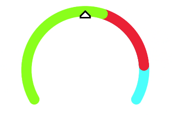
chart
The <chart> component displays line charts, gauge charts, and bar charts.
NOTE
The APIs of this module are supported since API version 8. Updates will be marked with a superscript to indicate their earliest API version.
Child Components
Not supported
Attributes
In addition to the universal attributes, the following attributes are supported.
| Name | Type | Default Value | Mandatory | Description |
|---|---|---|---|---|
| type | string | line | No | Chart type. Dynamic modification is not supported. Available values include: - bar: bar chart. - line: line chart. - gauge: gauge chart. - progress: circle chart of progresses - loading: circle chart of loading processes - rainbow: circle chart of proportions. |
| options | ChartOptions | - | No | Chart parameters. Parameter settings for gauge charts do not take effect. You can set the minimum value, maximum value, scale, and line width of the x-axis or y-axis, whether to display the x-axis and y-axis, and whether the line is smooth. Dynamic modification is not supported. |
| datasets | Array<ChartDataset> | - | No | Data sets. Data sets for a gauge chart do not take effect. You can set multiple datasets and their background colors. |
| segments | DataSegment |Array<DataSegment> | No | Data structures used by progress, loading, and rainbow charts. The DataSegment type is applicable to progress and loading charts. The Array<DataSegment> type is applicable to rainbow charts. A maximum of nine DataSegments are supported. | |
| effects | boolean | true | No | Whether to enable the effects for progress and rainbow charts. |
| animationduration | number | 3000 | No | Animation duration for expanding a rainbow chart, in milliseconds. |
Table 1 ChartOptions
| Name | Type | Default Value | Mandatory | Description |
|---|---|---|---|---|
| xAxis | ChartAxis | - | Yes | X-axis parameters. You can set the minimum value, maximum value, and scale of the x-axis, and whether to display the x-axis. |
| yAxis | ChartAxis | - | Yes | Y-axis parameters. You can set the minimum value, maximum value, and scale of the y-axis, and whether to display the y-axis. |
| series | ChartAxis | - | No | Data series. Only line charts support this attribute. Available values include: - Line styles, such as the line width and whether the line is smooth. - Style and size of the white point at the start of the line. |
Table 2 ChartDataset
| Name | Type | Default Value | Mandatory | Description |
|---|---|---|---|---|
| strokeColor | <color> | #ff6384 | No | Line color. Only line charts support this attribute. |
| fillColor | <color> | #ff6384 | No | Fill color. For line charts, this attribute indicates a gradient fill color. |
| data | Array<number> |Array<Point> | - | Yes | Data of the drawn line or bar. |
| gradient | boolean | false | No | Whether to display the gradient fill color. Only line charts support this attribute. |
Table 3 ChartAxis
| Name | Type | Default Value | Mandatory | Description |
|---|---|---|---|---|
| min | number | 0 | No | Minimum value of the axis. Negative numbers are not supported. Only line charts support this attribute. |
| max | number | 100 | No | Maximum value of the axis. Negative numbers are not supported. Only line charts support this attribute. |
| axisTick | number | 10 | No | Number of scales displayed on the axis. The value ranges from 1 to 20. The display effect depends on the calculation result of Number of pixels occupied by the image width/(max-min). In the bar chart, the number of bars in each group of data is the same as the number of scales, and the bars are displayed at the scales. |
| display | boolean | false | No | Whether to display the axis. |
| color | <color> | #c0c0c0 | No | Axis color. |
Table 4 ChartSeries
| Name | Type | Default Value | Mandatory | Description |
|---|---|---|---|---|
| lineStyle | ChartLineStyle | - | No | Line style, such as the line width and whether the line is smooth. |
| headPoint | PointStyle | - | No | Style and size of the white point at the start of the line. |
| topPoint | PointStyle | - | No | Style and size of the top point. |
| bottomPoint | PointStyle | - | No | Style and size of the bottom point. |
| loop | ChartLoop | - | No | Whether to start drawing again when the screen is looped. |
Table 5 ChartLineStyle
| Name | Type | Default Value | Mandatory | Description |
|---|---|---|---|---|
| width | <length> | 1px | No | Line width. |
| smooth | boolean | false | No | Whether the line is smooth. |
Table 6 PointStyle
| Name | Type | Default Value | Mandatory | Description |
|---|---|---|---|---|
| shape | string | circle | No | Shape of the highlight point. Available values are as follows: - circle - square - triangle |
| size | <length> | 5px | No | Size of the highlight point. |
| strokeWidth | <length> | 1px | No | Stroke width. |
| strokeColor | <color> | #ff0000 | No | Stroke color. |
| fillColor | <color> | #ff0000 | No | Fill color. |
Table 7 ChartLoop
| Name | Type | Default Value | Mandatory | Description |
|---|---|---|---|---|
| margin | <length> | 1 | No | Number of erased points (horizontal distance between the latest drawn point and the earliest point). You are not advised to use margin together with topPoint, bottomPoint, or headPoint. If you do so, there is a possibility that the point is in the erase area and is invisible. |
| gradient | boolean | false | No | Whether to perform gradient erase. |
Table 8 Point
| Name | Type | Default Value | Mandatory | Description |
|---|---|---|---|---|
| value | number | 0 | Yes | Y coordinate of the point to draw. |
| pointStyle | PointStyle | - | No | Style of the point. |
| description | string | - | No | Description of the point. |
| textLocation | string | - | No | Location of the description. Available values are as follows: - "top": The description is above the point. - "bottom": The description is below the point. - "none": The description is not displayed. |
| textColor | <color> | #000000 | No | Color of the description text. |
| lineDash | string | solid | No | Dashed line pattern. You can set the dash length and space length between the dashes. - "dashed, 5, 5": dashed line with each dash in 5 px and a 5 px space between dashes. - "solid": solid line. |
| lineColor | <color> | #000000 | No | Line color. If this attribute is not set, the value of strokeColor is used. |
Table 9 DataSegment
| Name | Type | Default Value | Mandatory | Description |
|---|---|---|---|---|
| startColor | Color | - | No | Color of the start position. If this attribute is set, endColor must be set. If this attribute is not set, the default color array preset in the system is used. For details about the color values, see the following table. |
| endColor | Color | - | No | Color of the end position. If this attribute is set, startColor must be set. If this attribute is not set, the default color array preset in the system is used. |
| value | number | 0 | Yes | Percentage for the current data segment. The maximum value is 100. |
| name | string | - | No | Name of the data segment. |
| Data Segment | Light Theme | Dark Theme |
|---|---|---|
| 0 | Start color: #f7ce00; end color: #f99b11 | Start color: #d1a738; end color: #eb933d |
| 1 | Start color: #f76223; end color: #f2400a | Start color: #e67d50; end color: #d9542b |
| 2 | Start color: #f772ac; end color: #e65392 | Start color: #d5749e; end color: #d6568d |
| 3 | Start color: #a575eb; end color: #a12df7 | Start color: #9973d1; end color: #5552d9 |
| 4 | Start color: #7b79f7; end color: #4b48f7 | Start color: #7977d9; end color: #f99b11 |
| 5 | Start color: #4b8af3; end color: #007dff | Start color: #4c81d9; end color: #217bd9 |
| 6 | Start color: #73c1e6; end color: #4fb4e3 | Start color: #5ea6d1; end color: #4895c2 |
| 7 | Start color: #a5d61d; end color: #69d14f | Start color: #91c23a; end color: #70ba5d |
| 8 | Start color: #a2a2b0; end color: #8e8e93 | Start color: #8c8c99; end color: #6b6b76 |
For the gauge charts, the following attributes are also supported.
| Name | Type | Default Value | Mandatory | Description |
|---|---|---|---|---|
| percent | number | 0 | No | Percentage of the current value to the total value. The value ranges from 0 to 100. |
Styles
In addition to the universal styles, the following styles are supported.
| Name | Type | Default Value | Mandatory | Description |
|---|---|---|---|---|
| stroke-width | <length> | 32px (gauge charts) 24px (rainbow charts) | No | Width of the scale bar for gauge and rainbow charts. |
| start-angle | <deg> | 240 (gauge charts) 0 (rainbow charts) | No | Start angle of the scale bar for gauge and rainbow charts, which starts from zero o'clock. The value ranges from 0 to 360. |
| total-angle | <deg> | 240 (gauge charts) 360 (rainbow charts) | No | Total length of the scale bar for gauge and rainbow charts. The value ranges from –360 to 360. A negative number indicates the anticlockwise direction. |
| center-x | <length> | - | No | X-coordinate of the scale bar center position for gauge charts. This style takes precedence over the position universal style and must be used together with center-y and radius. |
| center-y | <length> | - | No | Y-coordinate of the scale bar center position for gauge charts. This style takes precedence over the position universal style and must be used together with center-x and radius. |
| radius | <length> | - | No | Radius of the scale bar for gauge charts. This style takes precedence over the width and height universal style and must be used together with center-x and center-y. |
| colors | Array | - | No | Colors of ranges on the scale bar for gauge charts. For example, colors: #ff0000, #00ff00. |
| weights | Array | - | No | Weights of ranges on the scale bar for gauge charts. For example, weights: 2, 2. |
| font-family | Array | - | No | Font style of the description text. You can use a custom font. |
| font-size | <length> | - | No | Font size of the description text. |
Events
The universal events are supported.
Example
-
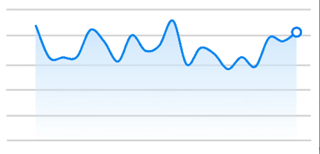
Line chart
<!-- xxx.hml -->
<div class="container">
  <stack class="chart-region">
    <image class="chart-background" src="common/background.png"></image>
    <chart class="chart-data" type="line" ref="linechart" options="{{lineOps}}" datasets="{{lineData}}"></chart>
  </stack>
</div>
/* xxx.css */ .container { flex-direction: column; justify-content: center; align-items: center; } .chart-region { height: 400px; width: 700px; } .chart-background { object-fit: fill; } .chart-data { width: 700px; height: 600px; }// xxx.json { "data": { "lineData": [ { "strokeColor": "#0081ff", "fillColor": "#cce5ff", "data": [ 763, 550, 551, 554, 731, 654, 525, 696, 595, 628, 791, 505, 613, 575, 475, 553, 491, 680, 657, 716 ], "gradient": true } ], "lineOps": { "xAxis": { "min": 0, "max": 20, "display": false }, "yAxis": { "min": 0, "max": 1000, "display": false }, "series": { "lineStyle": { "width": "5px", "smooth": true }, "headPoint": { "shape": "circle", "size": 20, "strokeWidth": 5, "fillColor": "#ffffff", "strokeColor": "#007aff", "display": true }, "loop": { "margin": 2, "gradient": true } } } } }4 x 4 widget
-
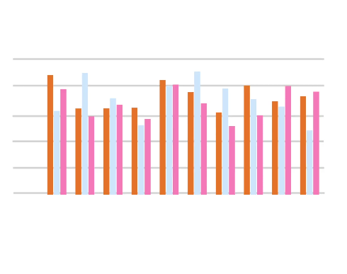
Bar chart
<!-- xxx.hml -->
<div class="container">
  <stack class="data-region">
    <image class="data-background" src="common/background.png"></image>
    <chart class="data-bar" type="bar" id="bar-chart" options="{{barOps}}" datasets="{{barData}}"></chart>
  </stack>
</div>
/* xxx.css */ .container { flex-direction: column; justify-content: center; align-items: center; } .data-region { height: 400px; width: 700px; } .data-background { object-fit: fill; } .data-bar { width: 700px; height: 400px; }{ "data": { "barData": [ { "fillColor": "#f07826", "data": [763, 550, 551, 554, 731, 654, 525, 696, 595, 628] }, { "fillColor": "#cce5ff", "data": [535, 776, 615, 444, 694, 785, 677, 609, 562, 410] }, { "fillColor": "#ff88bb", "data": [673, 500, 574, 483, 702, 583, 437, 506, 693, 657] } ], "barOps": { "xAxis": { "min": 0, "max": 20, "display": false, "axisTick": 10 }, "yAxis": { "min": 0, "max": 1000, "display": false } } } }4 x 4 widget
-
Gauge chart
<!-- xxx.hml -->
<div class="container">
  <div class="gauge-region">
    <chart class="data-gauge" type="gauge" percent = "50"></chart>
  </div>
</div>
/* xxx.css */ .container { flex-direction: column; justify-content: center; align-items: center; } .gauge-region { height: 400px; width: 400px; } .data-gauge { colors: #83f115, #fd3636, #3bf8ff; weights: 4, 2, 1; }4 x 4 widget