ArkUI Subsystem Changelog
cl.arkui.1 Safe Area Behavior Change for Dialog Box Avoidance
Access Level
Public API
Reason for Change
The mask area cannot cover the bottom navigation bar, and in immersive mode, the content is still displayed in the navigation bar and status bar.
Change Impact
This change is a non-compatible change.
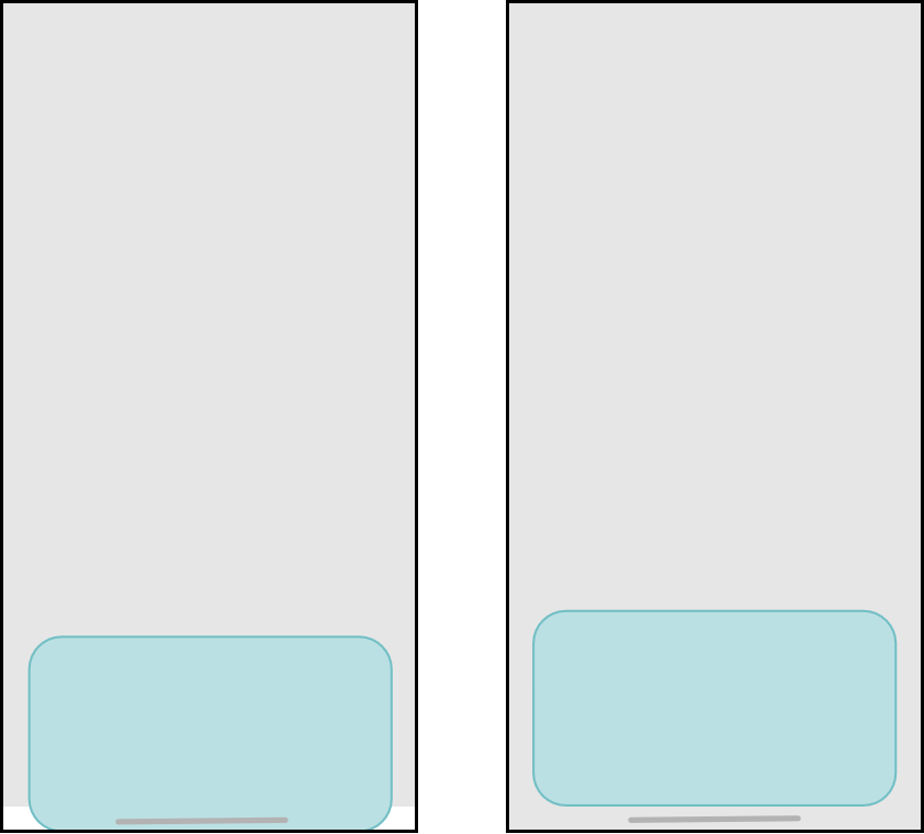
Before change: 1. The dialog box mask area does not extend to the bottom navigation bar. 2. When showInSubwindow is true or the application is configured for immersive mode, the content is still displayed in the top status bar and bottom navigation bar.
After change: 1. The dialog box mask area extends to the bottom navigation bar by default. 2. When showInSubwindow is true or the application is configured for immersive mode, the content is not displayed in the top status bar and bottom navigation bar.
The following figure shows the effect comparison before and after the change when Alignment is set to Bottom.
API Level
AlertDialog and CustomDialog: API version 7; ActionSheet, DatePickerDialog, TimePickerDialog, and TextPickerDialog: API version 8; promptAction.showDialog: API version 9; promptAction.openCustomDialog: API version 11
Change Since
OpenHarmony SDK 5.0.0.19
Key API/Component Changes
promptAction.showDialog, promptAction.openCustomDialog, AlertDialog, ActionSheet, DatePickerDialog, TimePickerDialog, TextPickerDialog, CustomDialog
Adaptation Guide
To enable the dialog box content to display in the navigation bar, set alignment to DialogAlignment.Bottom and offset.dy to the height of the navigation bar. Here is a specific example code snippet:
- In the EntryAbility page, set the window to full screen and obtain the height of the top status bar and the bottom navigation bar.
// src/main/ets/entryability/EntryAbility.ets
import { AbilityConstant, UIAbility, Want } from '@kit.AbilityKit';
import { window } from '@kit.ArkUI';

export default class EntryAbility extends UIAbility {
  onWindowStageCreate(windowStage: window.WindowStage): void {
    windowStage.loadContent('pages/Index', (err, data) => {
      if (err.code) {
        return;
      }
      // Obtain the main window.
      let windowClass: window.Window = windowStage.getMainWindowSync();
      // Set the window to full screen.
      windowClass.setWindowLayoutFullScreen(true)
      // Obtain the height of the status bar.
      let statusArea = windowClass.getWindowAvoidArea(window.AvoidAreaType.TYPE_SYSTEM);
      AppStorage.setOrCreate('SafeAreaTopHeight', statusArea.topRect.height);
      // Obtain the height of the navigation bar.
      let navigationArea = windowClass.getWindowAvoidArea(window.AvoidAreaType.TYPE_NAVIGATION_INDICATOR);
      AppStorage.setOrCreate('SafeAreaBottomHeight', navigationArea.bottomRect.height);
    });
  }
}
- When calling the dialog box page, set alignment and offset.
// src/main/ets/pages/Index.ets
let storage = LocalStorage.getShared();

@CustomDialog
struct CustomDialogExample {
  controller?: CustomDialogController

  build() {
    Column() {
      Text('This is a dialog box')
        .fontSize(30)
        .height(100)
      Button('Close Dialog Box')
        .onClick(() => {
          if (this.controller != undefined) {
            this.controller.close()
          }
        })
        .margin(20)
    }
  }
}

@Entry(storage)
@Component
struct CustomDialogUser {
  safeAreaTopHeight: string = AppStorage.get<number>('SafeAreaTopHeight') + 'px';
  safeAreaBottomHeight: string = AppStorage.get<number>('SafeAreaBottomHeight') + 'px';
  dialogController: CustomDialogController|null = new CustomDialogController({
    builder: CustomDialogExample(),
    alignment: DialogAlignment.Bottom,
    offset: { dx: 0, dy: this.safeAreaBottomHeight }
  })

  build() {
    Column() {
      Button('Open Dialog Box')
        .onClick(() => {
          if (this.dialogController != null) {
            this.dialogController.open()
          }
        })
    }
    .width('100%')
    .height('100%')
    .justifyContent(FlexAlign.Center)
  }
}
cl.arkui.2 Change in the colors Parameter Type for linearGradient, sweepGradient, radialGradient, and LinearGradient from Array<any> to Array<[ResourceColor, number]>
Access Level
Public API
Reason for Change
The use of the any type in APIs can be too broad, as it does not provide clear guidance on what specific types are expected or allowed.
Change Impact
This change is a non-compatible change.
Before change: The colors parameter for the linearGradient, sweepGradient, and radialGradient universal attributes and the LinearGradient API is allowed to be defined as an Array<any> type.
After change: If an incompatible colors parameter type with Array<[ResourceColor, number]> is used, such as Array<any>, a compilation error will occur.
API Level
linearGradient, sweepGradient, and radialGradient: API version 7; LinearGradient: API version 9
Change Since
OpenHarmony SDK 5.0.0.19
Adaptation Guide
To define variables used in the linearGradient, sweepGradient, and radialGradient APIs, the type of the colors parameter should be accurately defined to be compatible with Array<[ResourceColor, number]>.
Example:
@Entry
@Component
struct Test {
  colors: Array<any> = [[0xff0000, 0.0], [0x0000ff, 0.3], [0xffff00, 1.0]];
  build() {
    Row()
      .width('90%')
      .height(50)
      .linearGradient({
        angle: 90,
        // colors is defined as the Array<any> type. This will result in a compilation error.
        colors: this.colors
      })
  }
}
Adjust the colors parameter to be compatible with the API's expected type, for example, colors: Array<[ResourceColor, number]> = [[0xff0000, 0.0], [0x0000ff, 0.3], [0xffff00, 1.0]].
你可能感兴趣的鸿蒙文章
harmony 鸿蒙ArkCompiler Subsystem Changelog
harmony 鸿蒙ArkTS Subsystem Changelog