Class (UIContext)
Implements a UIContext instance.
NOTE
The initial APIs of this module are supported since API version 10. Newly added APIs will be marked with a superscript to indicate their earliest API version.
You can preview how this component looks on a real device, but not in DevEco Studio Previewer.
The following APIs must be called through a corresponding UIContext instance. There are three ways to obtain a UIContext instance: (1) using the getUIContext() method from ohos.window; (2) using the built-in method getUIContext() of a custom component; (3) using static methods of the UIContext class such as getCallingScopeUIContext. In this document, the UIContext instance is represented by uiContext.
Example
The following example illustrates the three ways to obtain a UIContext instance.
// The three approaches return identical UIContext instances.
// index.ets
import { UIContext } from '@kit.ArkUI';

@Entry
@Component
struct Index {
  build() {
    Column() {
      Button("Button")
          .onClick(()=>{
            // Obtain using the built-in component method
            this.getUIContext()
            // Obtain using a static method of the UIContext class
            let uiContext = UIContext.getCallingScopeUIContext();
            // Additional logic
          })
    }
  }
}

// EntryAbility.ets
import { AbilityConstant, ConfigurationConstant, UIAbility, Want } from '@kit.AbilityKit';
import { hilog } from '@kit.PerformanceAnalysisKit';
import { window } from '@kit.ArkUI';

const DOMAIN = 0x0000;

export default class EntryAbility extends UIAbility {
  onWindowStageCreate(windowStage: window.WindowStage): void {
    // Obtain using ohos.window
    windowStage.getMainWindowSync().getUIContext()
    // Additional logic
  }
}
constructor22+
constructor()
Construct a UIContext object.
NOTE
A UIContext object created using the constructor points to an ambiguous UI context, meaning it is not bound to any specific UI instance. The unique ID of such a UIContext instance is -1.
Atomic service API: This API can be used in atomic services since API version 22.
System capability: SystemCapability.ArkUI.ArkUI.Full
Example
import { UIContext } from '@kit.ArkUI';
import { hilog } from '@kit.PerformanceAnalysisKit';

function GetUIContextByAtomicInterface(): UIContext {
  let callingScopeUIContext = UIContext.getCallingScopeUIContext();
  if (callingScopeUIContext) {
    hilog.info(0x00, 'testTag', `Get UIContext of calling scope.`)
    return callingScopeUIContext;
  }
  let allContexts = UIContext.getAllUIContexts();
  let length = allContexts.length;
  if (length === 1) {
    hilog.info(0x00, 'testTag', `Get UIContext of unique UI instance.`)
    return allContexts[0];
  }
  let lastFocusedUIContext = UIContext.getLastFocusedUIContext();
  if (lastFocusedUIContext) {
    hilog.info(0x00, 'testTag', `Get UIContext of last focused instance.`)
    return lastFocusedUIContext;
  }
  let lastForegroundUIContext = UIContext.getLastForegroundUIContext();
  if (lastForegroundUIContext) {
    hilog.info(0x00, 'testTag', `Get UIContext of last foregrounded instance.`)
    return lastForegroundUIContext;
  }
  if (length !== 0) {
    hilog.info(0x00, 'testTag', `Get UIContext with maximum instanceId.`)
    return allContexts[length - 1];
  }
  hilog.info(0x00, 'testTag', `Get UIContext of undefined calling scope.`)
  return new UIContext();
}

@Entry
@Component
struct Index {
  @State message: string = 'Hello World';

  aboutToAppear() {
    let uiContext = this.getUIContext();
    hilog.info(0x00, 'testTag', `aboutToAppear UIContext: ${uiContext.getId()}`)
  }

  build() {
    RelativeContainer() {
      Text(this.message)
        .id('HelloWorld')
        .fontSize($r('app.float.page_text_font_size'))
        .fontWeight(FontWeight.Bold)
        .alignRules({
          center: { anchor: '__container__', align: VerticalAlign.Center },
          middle: { anchor: '__container__', align: HorizontalAlign.Center }
        })
        .onClick(() => {
          let resolvedUIContext = UIContext.resolveUIContext();
          let contextByAtomicInterface = GetUIContextByAtomicInterface();
          hilog.info(0x00, 'testTag',
            `UIContext id: ${resolvedUIContext.getId()}, strategy: ${resolvedUIContext.strategy}, contextByAtomicInterface: ${contextByAtomicInterface.getId()}`);
          this.message = 'Welcome';
        })
    }
    .height('100%')
    .width('100%')
  }
}
getCallingScopeUIContext22+
static getCallingScopeUIContext(): UIContext|undefined
Obtains the UIContext of this calling scope. This API returns undefined if the calling scope is ambiguous.
NOTE
The returned UIContext object may point to a destroyed UI instance, which usually occurs when an asynchronous task is dispatched from an instance that has already been destroyed. As such, you are advised to verify its validity via the isAvailable API.
Atomic service API: This API can be used in atomic services since API version 22.
System capability: SystemCapability.ArkUI.ArkUI.Full
Return value
| Type | Description |
|---|---|
| UIContext |undefined | UIContext of the current calling scope. Returns undefined if the calling scope is ambiguous. |
Example
import { UIContext } from '@kit.ArkUI';
import { hilog } from '@kit.PerformanceAnalysisKit';

@Entry
@Component
struct Index {
  @State message: string = 'Hello World';

  build() {
    RelativeContainer() {
      Text(this.message)
        .fontWeight(FontWeight.Bold)
        .alignRules({
          center: { anchor: '__container__', align: VerticalAlign.Center },
          middle: { anchor: '__container__', align: HorizontalAlign.Center }
        })
        .onClick(() => {
          this.message = 'Welcome';
          let uiContext = UIContext.getCallingScopeUIContext();
          hilog.info(0x00, 'testTag', 'Current calling UIContext is : ' + uiContext?.isAvailable());
        })
    }
    .height('100%')
    .width('100%')
  }
}
getLastFocusedUIContext22+
static getLastFocusedUIContext(): UIContext|undefined
Obtains the UIContext of the UI instance that most recently switched to the focused state.
Atomic service API: This API can be used in atomic services since API version 22.
System capability: SystemCapability.ArkUI.ArkUI.Full
Return value
| Type | Description |
|---|---|
| UIContext |undefined | UIContext of the UI instance that most recently switched to the focused state. Returns undefined if the most recently focused instance has been destroyed or if no instance has ever been focused. |
Example
import { UIContext } from '@kit.ArkUI';
import { hilog } from '@kit.PerformanceAnalysisKit';

@Entry
@Component
struct Index {
  @State message: string = 'Hello World';

  build() {
    RelativeContainer() {
      Text(this.message)
        .fontWeight(FontWeight.Bold)
        .alignRules({
          center: { anchor: '__container__', align: VerticalAlign.Center },
          middle: { anchor: '__container__', align: HorizontalAlign.Center }
        })
        .onClick(() => {
          this.message = 'Welcome';
          let uiContext = UIContext.getLastFocusedUIContext();
          hilog.info(0x00, 'testTag', 'Current calling UIContext is : ' + uiContext?.isAvailable());
        })
    }
    .height('100%')
    .width('100%')
  }
}
getLastForegroundUIContext22+
static getLastForegroundUIContext(): UIContext|undefined
Obtains the UIContext of the UI instance that most recently switched to the foreground state.
Atomic service API: This API can be used in atomic services since API version 22.
System capability: SystemCapability.ArkUI.ArkUI.Full
Return value
| Type | Description |
|---|---|
| UIContext |undefined | UIContext of the UI instance that most recently switched to the foreground state. Returns undefined if the most recently foreground UI instance has been destroyed or if no UI instance has ever been in the foreground. |
Example
import { UIContext } from '@kit.ArkUI';
import { hilog } from '@kit.PerformanceAnalysisKit';

@Entry
@Component
struct Index {
  @State message: string = 'Hello World';

  build() {
    RelativeContainer() {
      Text(this.message)
        .fontWeight(FontWeight.Bold)
        .alignRules({
          center: { anchor: '__container__', align: VerticalAlign.Center },
          middle: { anchor: '__container__', align: HorizontalAlign.Center }
        })
        .onClick(() => {
          this.message = 'Welcome';
          let uiContext = UIContext.getLastForegroundUIContext();
          hilog.info(0x00, 'testTag', 'Current calling UIContext is : ' + uiContext?.isAvailable());
        })
    }
    .height('100%')
    .width('100%')
  }
}
getAllUIContexts22+
static getAllUIContexts(): UIContext[]
Obtains all currently valid UIContext instances.
Atomic service API: This API can be used in atomic services since API version 22.
System capability: SystemCapability.ArkUI.ArkUI.Full
Return value
| Type | Description |
|---|---|
| UIContext[] | Array of all currently valid UIContext instances. Returns an empty array if no valid UIContext instance exists. |
Example
import { UIContext } from '@kit.ArkUI';
import { hilog } from '@kit.PerformanceAnalysisKit';

@Entry
@Component
struct Index {
  @State message: string = 'Hello World';

  build() {
    RelativeContainer() {
      Text(this.message)
        .fontWeight(FontWeight.Bold)
        .alignRules({
          center: { anchor: '__container__', align: VerticalAlign.Center },
          middle: { anchor: '__container__', align: HorizontalAlign.Center }
        })
        .onClick(() => {
          this.message = 'Welcome';
          let uiContexts = UIContext.getAllUIContexts();
          hilog.info(0x00, 'testTag', `There are ${uiContexts.length} UIContext(s)`);
        })
    }
    .height('100%')
    .width('100%')
  }
}
resolveUIContext22+
static resolveUIContext(): ResolvedUIContext
Obtains a UIContext instance along with its resolution strategy using a predefined priority order.
NOTE
This API resolves and returns a UIContext instance together with the strategy used to determine it,
based on the following priority rules (in order):
- UIContext in the current calling scope.
- If only one UI instance exists, its UIContext is returned.
- If a UI instance has switched to the focused state, and the most recently focused UI instance has not been destroyed, the UIContext of that most recently focused instance is returned.
- If a UI instance has switched to the foreground state, and the most recently foreground UI instance has not been destroyed, the UIContext of that most recently foreground instance is returned.
- If multiple UI instances exist, the UIContext with the largest unique instance ID is returned.
- If none of the above conditions are met, an invalid UIContext instance is returned.
Atomic service API: This API can be used in atomic services since API version 22.
System capability: SystemCapability.ArkUI.ArkUI.Full
Return value
| Type | Description |
|---|---|
| ResolvedUIContext | UIContext instance along with its resolution strategy. |
Example
import { UIContext } from '@kit.ArkUI';
import { hilog } from '@kit.PerformanceAnalysisKit';

@Entry
@Component
struct Index {
  build() {
    Column() {
      Button('click').onClick(() => {
        let resolvedUIContext = UIContext.resolveUIContext();
        hilog.info(0x00, 'testTag', `UIContext id: ${resolvedUIContext.getId()}, strategy: ${resolvedUIContext.strategy}}`);
      })
    }
    .width(UIContext.resolveUIContext().px2vp(100))
    .height('100%')
  }
}
isAvailable20+
isAvailable(): boolean

Checks whether the UI instance corresponding to this UIContext object is valid. The UIContext object can be obtained using the getUIContext API. A UI instance is considered valid when the backend UI instance exists. UIContext objects created using new UIContext() have no corresponding UI instance. After multiple loadContent operations, old UI instances become invalid. In multi-window scenarios, when a window is closed, its UI instance becomes invalid. In summary, a UIContext object is invalid when it has no corresponding backend UI instance.
Atomic service API: This API can be used in atomic services since API version 20.
System capability: SystemCapability.ArkUI.ArkUI.Full
Return value
| Type | Description |
|---|---|
| boolean | Whether the UI instance corresponding to the current UIContext object is valid. The value true indicates yes, and the value false indicates no. |
Example
import { UIContext } from '@kit.ArkUI'

@Entry
@Component
struct UIContextCompare {
  @State result1: string = ""
  @State result2: string = ""

  build() {
    Column() {
      Text("getUIContext() result: " + this.result1)
        .fontSize(20)
        .margin(10)

      Text("new UIContext() result: " + this.result2)
        .fontSize(20)
        .margin(10)

      Divider().margin(20)

      Button("getUIContext()")
        .width("70%")
        .height(50)
        .margin(10)
        .onClick(() => {
          try {
            const ctx: UIContext = this.getUIContext();
            const available: boolean = ctx.isAvailable();
            this.result1 = `Status: ${available} (Valid UI instance)`;
            console.info("getUIContext test:", available);
          } catch (e) {
            this.result1 = "Error: " + (e instanceof Error ? e.message : String(e));
          }
        })

      Button("new UIContext()")
        .width("70%")
        .height(50)
        .margin(10)
        .onClick(() => {
          try {
            const ctx: UIContext = new UIContext();
            const available: boolean = ctx.isAvailable();
            this.result2 = `Status: ${available} (Invalid UI instance)`;
            console.info("new UIContext test:", available);
          } catch (e) {
            this.result2 = "Error: " + (e instanceof Error ? e.message : String(e));
          }
        })
    }
    .width("100%")
    .height("100%")
    .padding(20)
  }
}
getFont
getFont(): Font
Obtains a Font object.
Atomic service API: This API can be used in atomic services since API version 11.
System capability: SystemCapability.ArkUI.ArkUI.Full
Return value
| Type | Description |
|---|---|
| Font | Font object. |
Example
See the example for Font.
getComponentUtils
getComponentUtils(): ComponentUtils
Obtains the ComponentUtils object.
Atomic service API: This API can be used in atomic services since API version 11.
System capability: SystemCapability.ArkUI.ArkUI.Full
Return value
| Type | Description |
|---|---|
| ComponentUtils | ComponentUtils object. |
Example
For the complete example, see Example 1: Obtaining the ComponentUtils Object.
getUIInspector
getUIInspector(): UIInspector
Obtains the UIInspector object.
Atomic service API: This API can be used in atomic services since API version 11.
System capability: SystemCapability.ArkUI.ArkUI.Full
Return value
| Type | Description |
|---|---|
| UIInspector | UIInspector object. |
Example
See the example for UIInspector.
getUIObserver11+
getUIObserver(): UIObserver
Obtains the UIObserver object.
Atomic service API: This API can be used in atomic services since API version 12.
System capability: SystemCapability.ArkUI.ArkUI.Full
Return value
| Type | Description |
|---|---|
| UIObserver | UIObserver object. |
Example
@Component
struct PageOne {
  build() {
    NavDestination() {
      Text("pageOne")
    }.title("pageOne")
  }
}

@Entry
@Component
struct Index {
  private stack: NavPathStack = new NavPathStack();

  @Builder
  PageBuilder(name: string) {
    PageOne()
  }

  aboutToAppear() {
    this.getUIContext().getUIObserver().on('navDestinationUpdate', (info) => {
      console.info('NavDestination state update', JSON.stringify(info));
    });
  }

  aboutToDisappear() {
    this.getUIContext().getUIObserver().off('navDestinationUpdate');
  }

  build() {
    Column() {
      Navigation(this.stack) {
        Button("push").onClick(() => {
          this.stack.pushPath({ name: "pageOne" });
        })
      }
      .title("Navigation")
      .navDestination(this.PageBuilder)
    }
    .width('100%')
    .height('100%')
  }
}
getId22+
getId(): number
Obtains the unique ID of a UI instance object. In multi-instance scenarios, you can use this unique ID to distinguish between different UI instance objects for easier management.
Atomic service API: This API can be used in atomic services since API version 22.
System capability: SystemCapability.ArkUI.ArkUI.Full
Return value
| Type | Description |
|---|---|
| number | Unique ID of the backend instance. The value range is [-1, +∞). |
Example
@Entry
@Component
struct Index{
  build(){
    Column()
      .width("100%")
      .height("100%")
      .onClick(()=>{
      console.info(`id:${this.getUIContext()?.getId()}`);
    })
  }
}
getMediaQuery
getMediaQuery(): MediaQuery
Obtains a MediaQuery object.
Atomic service API: This API can be used in atomic services since API version 11.
System capability: SystemCapability.ArkUI.ArkUI.Full
Return value
| Type | Description |
|---|---|
| MediaQuery | MediaQuery object. |
Example
See the mediaquery Example.
getRouter
getRouter(): Router
Obtains a Router object.
Atomic service API: This API can be used in atomic services since API version 11.
System capability: SystemCapability.ArkUI.ArkUI.Full
Return value
| Type | Description |
|---|---|
| Router | Router object. |
Example
See the example for pushUrl.
getPromptAction
getPromptAction(): PromptAction
Obtains a PromptAction object.
Atomic service API: This API can be used in atomic services since API version 11.
System capability: SystemCapability.ArkUI.ArkUI.Full
Return value
| Type | Description |
|---|---|
| PromptAction | PromptAction object. |
Example
See the example for PromptAction.
getOverlayManager12+
getOverlayManager(): OverlayManager
Obtains the OverlayManager object.
Atomic service API: This API can be used in atomic services since API version 12.
System capability: SystemCapability.ArkUI.ArkUI.Full
Return value
| Type | Description |
|---|---|
| OverlayManager | OverlayManager instance obtained. |
Example
See the example for OverlayManager.
setOverlayManagerOptions15+
setOverlayManagerOptions(options: OverlayManagerOptions): boolean
Sets the parameters for OverlayManager. This API initializes the parameters of the OverlayManager before using its capabilities, including properties such as whether to render the overlay root node. It must be called before getOverlayManager and takes effect only once.
Atomic service API: This API can be used in atomic services since API version 15.
System capability: SystemCapability.ArkUI.ArkUI.Full
Parameters
| Name | Type | Mandatory | Description |
|---|---|---|---|
| options | OverlayManagerOptions | Yes | Parameters for OverlayManager. |
Return value
| Type | Description |
|---|---|
| boolean | Whether the setting is successful. Returns true if the setting is successful; returns false otherwise. |
Example
See the example for OverlayManager.
getOverlayManagerOptions15+
getOverlayManagerOptions(): OverlayManagerOptions
Obtains the current parameters of OverlayManagerOptions.
Atomic service API: This API can be used in atomic services since API version 15.
System capability: SystemCapability.ArkUI.ArkUI.Full
Return value
| Type | Description |
|---|---|
| OverlayManagerOptions | Current OverlayManagerOptions object. |
Example
See the example for OverlayManager.
animateToImmediately23+
animateToImmediately(param: AnimateParam, processor: Callback<void>): void
Specifies a clear animation host instance context via the UIContext object and triggers the explicit animation to be dispatched immediately. This avoids issues where animations are not executed or animation end callbacks are not triggered due to inability to locate the instance or using an incorrect instance. This API uses an asynchronous callback to return the result.
Atomic service API: This API can be used in atomic services since API version 23.
System capability: SystemCapability.ArkUI.ArkUI.Full
Parameters
| Name | Type | Mandatory | Description |
|---|---|---|---|
| param | AnimateParam | Yes | Animation settings. |
| processor | Callback<void> | Yes | Callback function. It specifies the closure function that displays the animation. The system automatically inserts the transition animation if the state changes in the closure function. |
Example
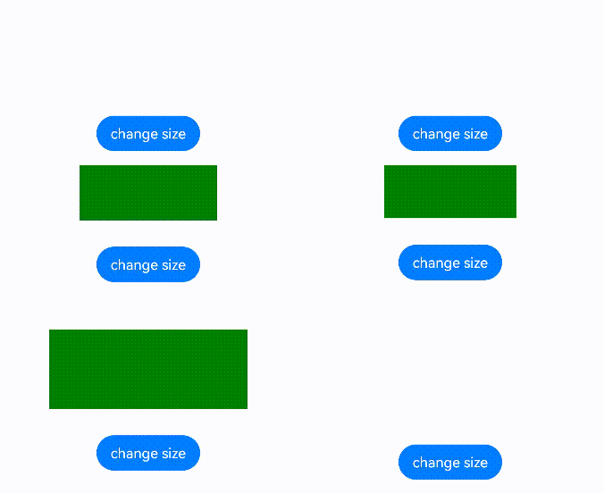
This example shows how to use animateToImmediately to implement immediate delivery of an explicit animation through a UIContext object.
// xxx.ets
@Entry
@Component
struct AnimateToImmediatelyExample {
  @State widthSize: number = 250
  @State heightSize: number = 100
  @State opacitySize: number = 0
  private flag: boolean = true
  uiContext: UIContext|null|undefined = this.getUIContext();

  build() {
    Column() {
      Column()
        .width(this.widthSize)
        .height(this.heightSize)
        .backgroundColor(Color.Green)
        .opacity(this.opacitySize)
      Button('change size')
        .margin(30)
        .onClick(() => {
          if (this.flag) {
            this.uiContext?.animateToImmediately({
              delay: 0,
              duration: 1000
            }, () => {
              this.opacitySize = 1
            })
            this.uiContext?.animateTo({
              delay: 1000,
              duration: 1000
            }, () => {
              this.widthSize = 150
              this.heightSize = 60
            })
          } else {
            this.uiContext?.animateToImmediately({
              delay: 0,
              duration: 1000
            }, () => {
              this.widthSize = 250
              this.heightSize = 100
            })
            this.uiContext?.animateTo({
              delay: 1000,
              duration: 1000
            }, () => {
              this.opacitySize = 0
            })
          }
          this.flag = !this.flag
        })
    }.width('100%').margin({ top: 5 })
  }
}
animateTo
animateTo(value: AnimateParam, event: () => void): void
Adds transition animations for state changes in closure code.
Atomic service API: This API can be used in atomic services since API version 11.
System capability: SystemCapability.ArkUI.ArkUI.Full
NOTE
- Avoid using animateTo in aboutToAppear or aboutToDisappear.
- When animateTo is called in aboutToAppear, the component's build method is not executed yet, and internal components are not created. This means the animation has no initial values to work with and will not function as expected.
- During execution of aboutToDisappear, the component is being destroyed, so animations should not be used.
- When a component appears or disappears, animation effects can be added through component transition.
- For properties that component transitions do not support, refer to Example 2: Enabling a Component to Disappear After the Animation, which uses animateTo to achieve the effect of the component disappearing after the animation finishes.
- In certain scenarios, using animateTo with state management V2 may produce unexpected results. For details, see Using animateTo Failed in State Management V2.
- When a UIAbility switches from the foreground to the background, any limited iteration animations that are currently running will end immediately, thereby triggering the onFinish animation completion callback.
- If transition animations are turned off in Developer options, animations end on the current frame, and the onFinish callback is executed immediately. Avoid placing timing-dependent functional logic inside this callback.
Parameters
| Name | Type | Mandatory | Description |
|---|---|---|---|
| value | AnimateParam | Yes | Animation settings. |
| event | () => void | Yes | Closure function that displays the animation. The system automatically inserts the transition animation if the state changes in the closure function. |
Example
// xxx.ets
@Entry
@Component
struct AnimateToExample {
  @State widthSize: number = 250;
  @State heightSize: number = 100;
  @State rotateAngle: number = 0;
  private flag: boolean = true;
  uiContext: UIContext|undefined = undefined;

  aboutToAppear() {
    this.uiContext = this.getUIContext();
    if (!this.uiContext) {
      console.warn("no uiContext");
      return;
    }
  }

  build() {
    Column() {
      Button('change size')
        .width(this.widthSize)
        .height(this.heightSize)
        .margin(30)
        .onClick(() => {
          if (this.flag) {
            this.uiContext?.animateTo({
              duration: 2000,
              curve: Curve.EaseOut,
              iterations: 3,
              playMode: PlayMode.Normal,
              onFinish: () => {
                console.info('play end');
              }
            }, () => {
              this.widthSize = 150;
              this.heightSize = 60;
            });
          } else {
            this.uiContext?.animateTo({}, () => {
              this.widthSize = 250;
              this.heightSize = 100;
            });
          }
          this.flag = !this.flag;
        })
      Button('stop rotating')
        .margin(50)
        .rotate({ x: 0, y: 0, z: 1, angle: this.rotateAngle })
        .onAppear(() => {
          // The animation starts when the component appears.
          this.uiContext?.animateTo({
            duration: 1200,
            curve: Curve.Friction,
            delay: 500,
            iterations: -1, // The value -1 indicates that the animation is played for an unlimited number of times.
            playMode: PlayMode.Alternate,
            expectedFrameRateRange: {
              min: 10,
              max: 120,
              expected: 60,
            }
          }, () => {
            this.rotateAngle = 90
          });
        })
        .onClick(() => {
          this.uiContext?.animateTo({ duration: 0 }, () => {
            // The value of this.rotateAngle is 90 before the animation. In an animation with a duration of 0, changing the property stops any previous animations for that property and applies the new value immediately.
            this.rotateAngle = 0;
          });
        })
    }.width('100%').margin({ top: 5 })
  }
}
getSharedLocalStorage12+
getSharedLocalStorage(): LocalStorage|undefined
Obtains the LocalStorage instance shared by this stage.
Atomic service API: This API can be used in atomic services since API version 12.
System capability: SystemCapability.ArkUI.ArkUI.Full
Model restriction: This API can be used only in the stage model.
Return value
| Type | Description |
|---|---|
| LocalStorage | undefined | LocalStorage instance if it exists; undefined if it does not exist. |
Example
// EntryAbility.ets
import { UIAbility } from '@kit.AbilityKit';
import { window } from '@kit.ArkUI';

export default class EntryAbility extends UIAbility {
  storage: LocalStorage = new LocalStorage();

  onWindowStageCreate(windowStage: window.WindowStage) {
    windowStage.loadContent('pages/Index', this.storage);
  }
}
// Index.ets

@Entry
@Component
struct SharedLocalStorage {
  localStorage = this.getUIContext().getSharedLocalStorage();

  build() {
    Row() {
      Column() {
        Button("Change Local Storage to 47")
          .onClick(() => {
            this.localStorage?.setOrCreate("propA", 47);
          })
        Button("Get Local Storage")
          .onClick(() => {
            console.info(`localStorage: ${this.localStorage?.get("propA")}`);
          })
      }
      .width('100%')
    }
    .height('100%')
  }
}
getHostContext12+
getHostContext(): Context|undefined
Obtains the context of this ability.
Atomic service API: This API can be used in atomic services since API version 12.
System capability: SystemCapability.ArkUI.ArkUI.Full
Model restriction: This API can be used only in the stage model.
Return value
| Type | Description |
|---|---|
| Context | undefined | Context of the ability. The context type depends on the ability type. For example, if this API is called in a page within a UIAbility window, the returned context type is UIAbilityContext. If this API is called in a page within an ExtensionAbility window, the returned context type is ExtensionContext. If the ability context does not exist, undefined is returned. |
Example
@Entry
@Component
struct Index {
  uiContext = this.getUIContext();

  build() {
    Row() {
      Column() {
        Text("cacheDir='" + this.uiContext?.getHostContext()?.cacheDir + "'")
          .fontSize(25)
          .border({ color: Color.Red, width: 2 })
          .padding(50)
        Text("bundleCodeDir='" + this.uiContext?.getHostContext()?.bundleCodeDir + "'")
          .fontSize(25)
          .border({ color: Color.Red, width: 2 })
          .padding(50)
      }
      .width('100%')
    }
    .height('100%')
  }
}
getFrameNodeById12+
getFrameNodeById(id: string): FrameNode|null
Obtains a FrameNode on the component tree based on the component ID.
Atomic service API: This API can be used in atomic services since API version 12.
System capability: SystemCapability.ArkUI.ArkUI.Full
Parameters
| Name | Type | Mandatory | Description |
|---|---|---|---|
| id | string | Yes | Component ID of the target node. |
Return value
| Type | Description |
|---|---|
| FrameNode |null | FrameNode of the component or null if no matching component is found. |
NOTE
The getFrameNodeById API searches for a node with a specific ID by traversing the tree, which can lead to poor performance. To deliver better performance, use the getAttachedFrameNodeById API.
Example
See Example of Obtaining the Root Node.
getAttachedFrameNodeById12+
getAttachedFrameNodeById(id: string): FrameNode|null
Obtains the FrameNode attached to the current window based on its component ID.
Atomic service API: This API can be used in atomic services since API version 12.
System capability: SystemCapability.ArkUI.ArkUI.Full
Parameters
| Name | Type | Mandatory | Description |
|---|---|---|---|
| id | string | Yes | Component ID of the target node. |
Return value
| Type | Description |
|---|---|
| FrameNode |null | FrameNode of the component or null if no matching component is found. |
NOTE
getAttachedFrameNodeById can only obtain nodes that are currently rendered on the screen.
Example
@Entry
@Component
struct MyComponent {
  @State message: string = 'Hello World';

  build() {
    RelativeContainer() {
      Text(this.message)
        .id('HelloWorld')
        .fontSize($r('app.float.page_text_font_size'))
        .fontWeight(FontWeight.Bold)
        .alignRules({
          center: { anchor: '__container__', align: VerticalAlign.Center },
          middle: { anchor: '__container__', align: HorizontalAlign.Center }
        })
        .onClick(() => {
          let node = this.getUIContext().getAttachedFrameNodeById("HelloWorld");
          console.info(`Find HelloWorld Tag:${node!.getNodeType()} id:${node!.getUniqueId()}`);
        })
    }
    .height('100%')
    .width('100%')
  }
}
getFrameNodeByUniqueId12+
getFrameNodeByUniqueId(id: number): FrameNode|null
Obtains the FrameNode of a component on the component tree using its uniqueId. The return value depends on the type of component associated with the uniqueId.
- If the uniqueId corresponds to a built-in component, the associated FrameNode is returned.
- If the uniqueId corresponds to a custom component: If the component has rendered content, its root node is returned, with the type Common; if the component has no rendered content, the FrameNode of its first child component is returned.
- If the uniqueId does not correspond to any component, null is returned.
Atomic service API: This API can be used in atomic services since API version 12.
System capability: SystemCapability.ArkUI.ArkUI.Full
Parameters
| Name | Type | Mandatory | Description |
|---|---|---|---|
| id | number | Yes | Unique ID of the target node. |
Return value
| Type | Description |
|---|---|
| FrameNode |null | FrameNode of the component or null if no matching component is found. |
Example
import { UIContext, FrameNode } from '@kit.ArkUI';

@Entry
@Component
struct MyComponent {
  aboutToAppear() {
    let uniqueId: number = this.getUniqueId();
    let uiContext: UIContext = this.getUIContext();
    if (uiContext) {
      let node: FrameNode|null = uiContext.getFrameNodeByUniqueId(uniqueId);
    }
  }

  build() {
    // ...
  }
}
getPageInfoByUniqueId12+
getPageInfoByUniqueId(id: number): PageInfo
Obtains the router or navigation destination page information corresponding to the node that matches the specified uniqueId.
- If the node that matches the specified uniqueId is in a page, the router information (routerPageInfo) is returned.
- If the node that matches the specified uniqueId is in a NavDestination component, the navigation destination page information (navDestinationInfo) is returned.
- If the node that matches the specified uniqueId does not have the corresponding router or navigation destination page information, undefined is returned.
- Modal dialog boxes are not contained within any pages. If the node that matches the specified uniqueId is in a modal dialog box, for example, on a modal page constructed by CustomDialog, bindSheet, or bindContentCover, undefined is returned for routerPageInfo.
Atomic service API: This API can be used in atomic services since API version 12.
System capability: SystemCapability.ArkUI.ArkUI.Full
Parameters
| Name | Type | Mandatory | Description |
|---|---|---|---|
| id | number | Yes | Unique ID of the target node. |
Return value
| Type | Description |
|---|---|
| PageInfo | Router or navigation destination page information corresponding to the specified node. |
Example
import { UIContext, PageInfo } from '@kit.ArkUI';

@Entry
@Component
struct PageInfoExample {
  @Provide('pageInfos') pageInfos: NavPathStack = new NavPathStack();

  build() {
    Column() {
      Navigation(this.pageInfos) {
        NavDestination() {
          MyComponent()
        }
      }.id('navigation')
    }
  }
}

@Component
struct MyComponent {
  @State content: string = '';

  build() {
    Column() {
      Text('PageInfoExample')
      Button('click').onClick(() => {
        const uiContext: UIContext = this.getUIContext();
        const uniqueId: number = this.getUniqueId();
        const pageInfo: PageInfo = uiContext.getPageInfoByUniqueId(uniqueId);
        console.info('pageInfo: ' + JSON.stringify(pageInfo));
        console.info('navigationInfo: ' + JSON.stringify(uiContext.getNavigationInfoByUniqueId(uniqueId)));
      })
      TextArea({
        text: this.content
      })
      .width('100%')
      .height(100)
    }
    .width('100%')
    .alignItems(HorizontalAlign.Center)
  }
}
getNavigationInfoByUniqueId12+
getNavigationInfoByUniqueId(id: number): observer.NavigationInfo|undefined
Obtains the navigation information corresponding to the node that matches the specified uniqueId.
- If the node that matches the specified uniqueId is in a Navigation component, the navigation information is returned.
- If the node that matches the specified uniqueId does not have the corresponding navigation information, undefined is returned.
Atomic service API: This API can be used in atomic services since API version 12.
System capability: SystemCapability.ArkUI.ArkUI.Full
Parameters
| Name | Type | Mandatory | Description |
|---|---|---|---|
| id | number | Yes | Unique ID of the target node. |
Return value
| Type | Description |
|---|---|
| observer.NavigationInfo |undefined | Navigation information corresponding to the specified node. |
Example
See the example of getPageInfoByUniqueId.
showAlertDialog
showAlertDialog(options: AlertDialogParamWithConfirm|AlertDialogParamWithButtons|AlertDialogParamWithOptions): void
Shows an alert dialog box.
NOTE
The showAlertDialog with showInSubWindow set to true cannot be used in the input method window. For details, see the createPanel description.
Atomic service API: This API can be used in atomic services since API version 11.
System capability: SystemCapability.ArkUI.ArkUI.Full
Parameters
| Name | Type | Mandatory | Description |
|---|---|---|---|
| options | AlertDialogParamWithConfirm | AlertDialogParamWithButtons | AlertDialogParamWithOptions | Yes | Shows an AlertDialog component in the given settings. |
Example
@Entry
@Component
struct Index {
  uiContext: UIContext = this.getUIContext()

  build() {
    Column() {
      Button('showAlertDialog')
        .onClick(() => {
          this.uiContext.showAlertDialog(
            {
              title: 'title',
              message: 'text',
              autoCancel: true,
              alignment: DialogAlignment.Bottom,
              offset: { dx: 0, dy: -20 },
              gridCount: 3,
              confirm: {
                value: 'button',
                action: () => {
                  console.info('Button-clicking callback');
                }
              },
              cancel: () => {
                console.info('Closed callbacks');
              }
            }
          );
        })
    }.height('100%').width('100%').justifyContent(FlexAlign.Center)
  }
}

showActionSheet
showActionSheet(value: ActionSheetOptions): void
Shows an action sheet in the given settings.
Atomic service API: This API can be used in atomic services since API version 11.
System capability: SystemCapability.ArkUI.ArkUI.Full
Parameters
| Name | Type | Mandatory | Description |
|---|---|---|---|
| value | ActionSheetOptions | Yes | Parameters of the action sheet. |
Example
@Entry
@Component
struct Index {
  uiContext: UIContext = this.getUIContext()

  build() {
    Column() {
      Button('showActionSheet')
        .onClick(() => {
          this.uiContext.showActionSheet({
            title: 'ActionSheet title',
            message: 'message',
            autoCancel: true,
            confirm: {
              value: 'Confirm button',
              action: () => {
                console.info('Get ActionSheet handled');
              }
            },
            cancel: () => {
              console.info('ActionSheet canceled');
            },
            alignment: DialogAlignment.Bottom,
            offset: { dx: 0, dy: -10 },
            sheets: [
              {
                title: 'apples',
                action: () => {
                  console.info('apples');
                }
              },
              {
                title: 'bananas',
                action: () => {
                  console.info('bananas');
                }
              },
              {
                title: 'pears',
                action: () => {
                  console.info('pears');
                }
              }
            ]
          });
        })
    }.height('100%').width('100%').justifyContent(FlexAlign.Center)
  }
}

showDatePickerDialog
showDatePickerDialog(options: DatePickerDialogOptions): void
Shows a date picker dialog box in the given settings.
NOTE
showDatePickerDialog does not support subwindows (showInSubwindow is set to true) in the input method type window. For details, see the restrictions of the input method framework createPanel.
Atomic service API: This API can be used in atomic services since API version 11.
System capability: SystemCapability.ArkUI.ArkUI.Full
Device behavior differences: On wearables, calling this API results in a runtime exception indicating that the API is undefined. On other devices, the API works correctly.
Parameters
| Name | Type | Mandatory | Description |
|---|---|---|---|
| options | DatePickerDialogOptions | Yes | Parameters of the date picker dialog box. |
Example
// xxx.ets
@Entry
@Component
struct DatePickerDialogExample {
  selectedDate: Date = new Date("2010-1-1");

  build() {
    Row(){
      Column() {
        Button("DatePickerDialog")
          .margin(20)
          .onClick(() => {
            this.getUIContext().showDatePickerDialog({
              start: new Date("2000-1-1"),
              end: new Date("2100-12-31"),
              selected: this.selectedDate,
              showTime: true,
              useMilitaryTime: false,
              dateTimeOptions: { hour: "numeric", minute: "2-digit" },
              onDateAccept: (value: Date) => {
                // Use the setFullYear method to set the date when the OK button is touched. In this way, when the date picker dialog box is displayed again, the selected date is the date last confirmed.
                this.selectedDate = value;
                console.info("DatePickerDialog:onDateAccept()" + value.toString());
              },
              onCancel: () => {
                console.info("DatePickerDialog:onCancel()");
              },
              onDateChange: (value: Date) => {
                console.info("DatePickerDialog:onDateChange()" + value.toString());
              },
              onDidAppear: () => {
                console.info("DatePickerDialog:onDidAppear()");
              },
              onDidDisappear: () => {
                console.info("DatePickerDialog:onDidDisappear()");
              },
              onWillAppear: () => {
                console.info("DatePickerDialog:onWillAppear()");
              },
              onWillDisappear: () => {
                console.info("DatePickerDialog:onWillDisappear()");
              }
            })
          })
      }.width('100%')
    }.height('100%')
  }
}

showTimePickerDialog
showTimePickerDialog(options: TimePickerDialogOptions): void
Shows a time picker dialog box in the given settings.
NOTE
showTimePickerDialog with showInSubwindow set to true cannot be used in the input method type window. For details, see the restrictions of the input method framework createPanel.
Atomic service API: This API can be used in atomic services since API version 11.
System capability: SystemCapability.ArkUI.ArkUI.Full
Device behavior differences: On wearables, calling this API results in a runtime exception indicating that the API is undefined. On other devices, the API works correctly.
Parameters
| Name | Type | Mandatory | Description |
|---|---|---|---|
| options | TimePickerDialogOptions | Yes | Parameters of the time picker dialog box. |
Example
// xxx.ets

class SelectTime{
  selectTime: Date = new Date('2020-12-25T08:30:00');
  hours(h:number,m:number){
    this.selectTime.setHours(h, m);
  }
}

@Entry
@Component
struct TimePickerDialogExample {
  @State selectTime: Date = new Date('2023-12-25T08:30:00');

  build() {
    Column() {
      Button('showTimePickerDialog')
        .margin(30)
        .onClick(() => {
          this.getUIContext().showTimePickerDialog({
            selected: this.selectTime,
            onAccept: (value: TimePickerResult) => {
              // Set selectTime to the time when the OK button is clicked. In this way, when the dialog box is displayed again, the selected time is the time when the operation was confirmed last time.
              let time = new SelectTime();
              if(value.hour && value.minute){
                time.hours(value.hour, value.minute);
              }
              console.info("TimePickerDialog:onAccept()" + JSON.stringify(value));
            },
            onCancel: () => {
              console.info("TimePickerDialog:onCancel()");
            },
            onChange: (value: TimePickerResult) => {
              console.info("TimePickerDialog:onChange()" + JSON.stringify(value));
            }
          });
        })
    }.width('100%').margin({ top: 5 })
  }
}
showTextPickerDialog
showTextPickerDialog(options: TextPickerDialogOptions): void
Shows a text picker dialog box in the given settings.
NOTE
showTextPickerDialog with showInSubwindow set to true cannot be used in the input method type window. For details, see the restrictions of the input method framework createPanel.
Atomic service API: This API can be used in atomic services since API version 11.
System capability: SystemCapability.ArkUI.ArkUI.Full
Device behavior differences: On wearables, calling this API results in a runtime exception indicating that the API is undefined. On other devices, the API works correctly.
Parameters
| Name | Type | Mandatory | Description |
|---|---|---|---|
| options | TextPickerDialogOptions | Yes | Parameters of the text picker dialog box. |
Example
// xxx.ets

class SelectedValue{
  select: number = 2;
  set(val: number){
    this.select = val;
  }
}
class SelectedArray{
  select: number[] = [];
  set(val: number[]){
    this.select = val;
  }
}
@Entry
@Component
struct TextPickerDialogExample {
  @State selectTime: Date = new Date('2023-12-25T08:30:00');
  private fruits: string[] = ['apple1', 'orange2', 'peach3', 'grape4', 'banana5'];
  private select: number  = 0;
  build() {
    Row(){
      Column() {
        Button('showTextPickerDialog')
          .margin(30)
          .onClick(() => {
            this.getUIContext().showTextPickerDialog({
              range: this.fruits,
              selected: this.select,
              onAccept: (value: TextPickerResult) => {
                // Set select to the index of the item selected when the OK button is touched. In this way, when the text picker dialog box is displayed again, the selected item is the one last confirmed.
                let selectedVal = new SelectedValue();
                let selectedArr = new SelectedArray();
                if (value.index){
                  value.index instanceof Array?selectedArr.set(value.index) : selectedVal.set(value.index);
                }
                console.info("TextPickerDialog:onAccept()" + JSON.stringify(value));
              },
              onCancel: () => {
                console.info("TextPickerDialog:onCancel()");
              },
              onChange: (value: TextPickerResult) => {
                console.info("TextPickerDialog:onChange()" + JSON.stringify(value));
              }
            });
          })
      }.width('100%').margin({ top: 5 })
    }.height('100%')
  }
}

showTextPickerDialog20+
showTextPickerDialog(style: TextPickerDialogOptions|TextPickerDialogOptionsExt): void
Shows a text picker dialog box in the given settings. Compared to API version 11, the TextPickerDialogOptionsExt parameter is now supported.
NOTE
showTextPickerDialog with showInSubwindow set to true cannot be used in the input method type window. For details, see the restrictions of the input method framework createPanel.
Atomic service API: This API can be used in atomic services since API version 20.
System capability: SystemCapability.ArkUI.ArkUI.Full
Device behavior differences: On wearables, calling this API results in a runtime exception indicating that the API is undefined. On other devices, the API works correctly.
Parameters
| Name | Type | Mandatory | Description |
|---|---|---|---|
| style | TextPickerDialogOptions|TextPickerDialogOptionsExt | Yes | Parameters of the text picker dialog box. |
createAnimator
createAnimator(options: AnimatorOptions): AnimatorResult
Creates an Animator object.
Atomic service API: This API can be used in atomic services since API version 11.
System capability: SystemCapability.ArkUI.ArkUI.Full
Parameters
| Name | Type | Mandatory | Description |
|---|---|---|---|
| options | AnimatorOptions | Yes | Animator options. |
Return value
| Type | Description |
|---|---|
| AnimatorResult | Animator result. |
Error codes
For details about the error codes, see Universal Error Codes.
| ID | Error Message |
|---|---|
| 401 | Parameter error. Possible causes: 1. Mandatory parameters are left unspecified; 2.Incorrect parameters types; 3. Parameter verification failed. |
Example
// EntryAbility.ets
import { UIAbility } from '@kit.AbilityKit';
import { AnimatorOptions, window } from '@kit.ArkUI';
import { hilog } from '@kit.PerformanceAnalysisKit';

export default class EntryAbility extends UIAbility {
  onWindowStageCreate(windowStage: window.WindowStage) {
    // Create the main window and set the home page for this ability.
    hilog.info(0x0000, 'testTag', '%{public}s', 'Ability onWindowStageCreate');
    windowStage.loadContent('pages/Index', (err, data) => {
      if (err.code) {
        hilog.error(0x0000, 'testTag', 'Failed to load the content. Cause: %{public}s', err.message);
        return;
      }
      hilog.info(0x0000, 'testTag', 'Succeeded in loading the content. Data: %{public}s', JSON.stringify(data) ?? '');
      let uiContext = windowStage.getMainWindowSync().getUIContext();
      let options:AnimatorOptions = {
        duration: 1500,
        easing: "friction",
        delay: 0,
        fill: "forwards",
        direction: "normal",
        iterations: 3,
        begin: 200.0,
        end: 400.0
      };
      uiContext.createAnimator(options);
    });
  }
}
createAnimator18+
createAnimator(options: AnimatorOptions|SimpleAnimatorOptions): AnimatorResult
Creates an AnimatorResult object for animations. Compared to the previous createAnimator API, this API adds support for the SimpleAnimatorOptions type.
Atomic service API: This API can be used in atomic services since API version 18.
System capability: SystemCapability.ArkUI.ArkUI.Full
Parameters
| Name | Type | Mandatory | Description |
|---|---|---|---|
| options | AnimatorOptions |SimpleAnimatorOptions | Yes | Animator options. |
Return value
| Type | Description |
|---|---|
| AnimatorResult | Animator result. |
Error codes
For details about the error codes, see Universal Error Codes.
| ID | Error Message |
|---|---|
| 401 | Parameter error. Possible causes: 1. Mandatory parameters are left unspecified; 2.Incorrect parameters types; 3. Parameter verification failed. |
Example
// EntryAbility.ets
import { UIAbility } from '@kit.AbilityKit';
import { SimpleAnimatorOptions, window } from '@kit.ArkUI';
import { hilog } from '@kit.PerformanceAnalysisKit';

export default class EntryAbility extends UIAbility {
  onWindowStageCreate(windowStage: window.WindowStage) {
    // Create the main window and set the home page for this ability.
    hilog.info(0x0000, 'testTag', '%{public}s', 'Ability onWindowStageCreate');
    windowStage.loadContent('pages/Index', (err, data) => {
      if (err.code) {
        hilog.error(0x0000, 'testTag', 'Failed to load the content. Cause: %{public}s', err.message);
        return;
      }
      hilog.info(0x0000, 'testTag', 'Succeeded in loading the content. Data: %{public}s', JSON.stringify(data) ?? '');
      let uiContext = windowStage.getMainWindowSync().getUIContext();
      let options: SimpleAnimatorOptions = new SimpleAnimatorOptions(100, 200).duration(2000);
      uiContext.createAnimator(options);
    });
  }
}
runScopedTask
runScopedTask(callback: () => void): void
Executes the specified callback in this UI context.
Atomic service API: This API can be used in atomic services since API version 11.
System capability: SystemCapability.ArkUI.ArkUI.Full
Parameters
| Name | Type | Mandatory | Description |
|---|---|---|---|
| callback | () => void | Yes | Callback used to return the result. |
Example
@Entry
@Component
struct Index {
  uiContext = this.getUIContext();

  build() {
    Row() {
      Column() {
        Button("run task").onClick(() => {
          this.uiContext.runScopedTask(() => {
            // do something
          })
        })
      }
      .width('100%')
    }
    .height('100%')
  }
}
setKeyboardAvoidMode11+
setKeyboardAvoidMode(value: KeyboardAvoidMode): void
Sets the avoidance mode for the virtual keyboard.
Atomic service API: This API can be used in atomic services since API version 11.
System capability: SystemCapability.ArkUI.ArkUI.Full
Parameters
| Name | Type | Mandatory | Description |
|---|---|---|---|
| value | KeyboardAvoidMode | Yes | Keyboard avoidance mode. Default value: KeyboardAvoidMode.OFFSET |
NOTE
With KeyboardAvoidMode.RESIZE, the page is resized to prevent the virtual keyboard from obstructing the view. Regarding components on the page, those whose width and height are set in percentage are resized with the page, and those whose width and height are set to specific values are laid out according to their settings. With KeyboardAvoidMode.RESIZE, expandSafeArea([SafeAreaType.KEYBOARD],[SafeAreaEdge.BOTTOM]) does not take effect.
With KeyboardAvoidMode.NONE, keyboard avoidance is disabled, and the page will be covered by the displayed keyboard.
setKeyboardAvoidMode only affects page layouts. It does not apply to popup components, including the following: Dialog, Popup, Menu, BindSheet, BindContentCover, Toast, OverlayManager. For details about the avoidance mode of popup components, see CustomDialogControllerOptions.
Example
See Example 4: Setting the Keyboard Avoidance Mode to Resize, Example 5: Setting Keyboard Avoidance Mode to Offset, and Example 6: Switching Avoidance Modes.
// EntryAbility.ets
import { KeyboardAvoidMode, UIContext } from '@kit.ArkUI';

export default class EntryAbility extends UIAbility{
  onWindowStageCreate(windowStage: window.WindowStage) {

      windowStage.loadContent('pages/Index', (err, data) => {
        let uiContext: UIContext = windowStage.getMainWindowSync().getUIContext();
        uiContext.setKeyboardAvoidMode(KeyboardAvoidMode.RESIZE);
      });
    }
}
getKeyboardAvoidMode11+
getKeyboardAvoidMode(): KeyboardAvoidMode
Obtains the avoidance mode for the virtual keyboard.
Atomic service API: This API can be used in atomic services since API version 11.
System capability: SystemCapability.ArkUI.ArkUI.Full
Return value
| Type | Description |
|---|---|
| KeyboardAvoidMode | Avoidance mode for the virtual keyboard. |
Example
See Example 4: Setting the Keyboard Avoidance Mode to Resize, Example 5: Setting Keyboard Avoidance Mode to Offset, and Example 6: Switching Avoidance Modes.
// EntryAbility.ets
import { KeyboardAvoidMode, UIContext } from '@kit.ArkUI';

export default class EntryAbility extends UIAbility{
  onWindowStageCreate(windowStage: window.WindowStage) {

      windowStage.loadContent('pages/Index', (err, data) => {
        let uiContext: UIContext = windowStage.getMainWindowSync().getUIContext();
        let KeyboardAvoidMode = uiContext.getKeyboardAvoidMode();
        console.info("KeyboardAvoidMode:", JSON.stringify(KeyboardAvoidMode));
      });
    }
}
getAtomicServiceBar11+
getAtomicServiceBar(): Nullable<AtomicServiceBar>
Obtains an AtomicServiceBar object, which can be used to set the properties of the atomic service menu bar.
Atomic service API: This API can be used in atomic services since API version 11.
System capability: SystemCapability.ArkUI.ArkUI.Full
Return value
| Type | Description |
|---|---|
| Nullable<AtomicServiceBar> | Returns the AtomicServerBar type if the service is an atomic service; returns undefined type otherwise. |
Example
// EntryAbility.ets
import { UIAbility } from '@kit.AbilityKit';
import { UIContext, AtomicServiceBar, window } from '@kit.ArkUI';

export default class EntryAbility extends UIAbility {
  onWindowStageCreate(windowStage: window.WindowStage) {
    // Main window is created, set main page for this ability
    console.info('Ability onWindowStageCreate');
    windowStage.loadContent('pages/Index', (err, data) => {
      let uiContext: UIContext = windowStage.getMainWindowSync().getUIContext();
      let atomicServiceBar: Nullable<AtomicServiceBar> = uiContext.getAtomicServiceBar();
      if (atomicServiceBar != undefined) {
        console.info('Get AtomServiceBar Successfully.');
      } else {
        console.error('Get AtomicServiceBar failed.');
      }
    });
  }
}
getDragController11+
getDragController(): DragController
Obtains the DragController object, which can be used to create and initiate dragging.
Atomic service API: This API can be used in atomic services since API version 12.
System capability: SystemCapability.ArkUI.ArkUI.Full
Return value
| Type | Description |
|---|---|
| DragController | DragController object. |
Example
See the example for DragController.
keyframeAnimateTo11+
keyframeAnimateTo(param: KeyframeAnimateParam, keyframes: Array<KeyframeState>): void
Generates a key frame animation. For details about how to use this API, see keyframeAnimateTo.
Atomic service API: This API can be used in atomic services since API version 12.
System capability: SystemCapability.ArkUI.ArkUI.Full
Parameters
| Name | Type | Mandatory | Description |
|---|---|---|---|
| param | KeyframeAnimateParam | Yes | Overall animation parameter of the keyframe animation. |
| keyframes | Array<KeyframeState> | Yes | List of all keyframe states. |
Example
// xxx.ets
import { UIContext } from '@kit.ArkUI';

@Entry
@Component
struct KeyframeDemo {
  @State myScale: number = 1.0;
  uiContext: UIContext|undefined = undefined;

  aboutToAppear() {
    this.uiContext = this.getUIContext();
  }

  build() {
    Column() {
      Circle()
        .width(100)
        .height(100)
        .fill("#46B1E3")
        .margin(100)
        .scale({ x: this.myScale, y: this.myScale })
        .onClick(() => {
          if (!this.uiContext) {
            console.error("no uiContext, keyframe failed");
            return;
          }
          this.myScale = 1;
          // Configure the keyframe animation to play three times.
          this.uiContext.keyframeAnimateTo({
              iterations: 3,
              expectedFrameRateRange: {
                min: 10,
                max: 120,
                expected: 60,
              }
            }, [
            {
              // The first keyframe animation lasts for 800 ms, during which the scale attribute changes from 1 to 1.5.
              duration: 800,
              event: () => {
                this.myScale = 1.5;
              }
            },
            {
              // The second keyframe animation lasts for 500 ms, during which the scale attribute changes from 1.5 to 1.
              duration: 500,
              event: () => {
                this.myScale = 1;
              }
            }
          ]);
        })
    }.width('100%').margin({ top: 5 })
  }
}
getFocusController12+
getFocusController(): FocusController
Obtains a FocusController object, which can be used to control the focus.
Atomic service API: This API can be used in atomic services since API version 12.
System capability: SystemCapability.ArkUI.ArkUI.Full
Return value
| Type | Description |
|---|---|
| FocusController | FocusController object. |
Example
See the example for FocusController.
getFilteredInspectorTree12+
getFilteredInspectorTree(filters?: Array<string>): string
Obtains the component tree and component attributes. This API has a long processing time and is intended for testing scenarios only.
Atomic service API: This API can be used in atomic services since API version 12.
System capability: SystemCapability.ArkUI.ArkUI.Full
Parameters
| Name | Type | Mandatory | Description |
|---|---|---|---|
| filters | Array<string> | No | List of component attributes used for filtering. Currently, only the following filter fields are supported: "id": unique ID of the component. "src": source of the resource. "content": information or data contained in the element, component, or object. "editable": whether the component is editable. "scrollable": whether the component is scrollable. "selectable": whether the component is selectable. "focusable": whether the component is focusable. "focused": whether the component is currently focused. If filters includes one or more fields, unspecified fields will be filtered out from the results. If filters is not provided or is an empty array, none of the aforementioned fields will be filtered out. The following filter field is supported since API version 20: "isLayoutInspector": whether the component tree contains custom components. If filters is omitted or does not contain "isLayoutInspector", the returned component tree will not include custom component details. Other filter fields are used only in testing scenarios. |
Return value
| Type | Description |
|---|---|
| string | JSON string of the component tree and component attributes. For details about each field in the component, see the return value description of getInspectorInfo. |
Error codes
For details about the error codes, see Universal Error Codes.
| ID | Error Message |
|---|---|
| 401 | Parameter error. Possible causes: 1. Mandatory parameters are left unspecified. 2. Incorrect parameters types. 3. Parameter verification failed. |
Example
uiContext.getFilteredInspectorTree(['id', 'src', 'content']);
// xxx.ets
import { UIContext } from '@kit.ArkUI';
@Entry
@Component
struct ComponentPage {
  loopConsole(inspectorStr: string, i: string) {
    console.info(`InsTree ${i}|type: ${JSON.parse(inspectorStr).$type}, ID: ${JSON.parse(inspectorStr).$ID}`);
    if (JSON.parse(inspectorStr).$children) {
      i += '-';
      for (let index = 0; index < JSON.parse(inspectorStr).$children.length; index++) {
        this.loopConsole(JSON.stringify(JSON.parse(inspectorStr).$children[index]), i);
      }
    }
  }

  build() {
    Column() {
      Button('content').onClick(() => {
        const uiContext: UIContext = this.getUIContext();
        let inspectorStr = uiContext.getFilteredInspectorTree(['content']);
        console.info(`InsTree : ${inspectorStr}`);
        inspectorStr = JSON.stringify(JSON.parse(inspectorStr));
        this.loopConsole(inspectorStr, '-');
      })
      Button('isLayoutInspector').onClick(() => {
        const uiContext: UIContext = this.getUIContext();
        let inspectorStr = uiContext.getFilteredInspectorTree(['isLayoutInspector']);
        console.info(`InsTree : ${inspectorStr}`);
        inspectorStr = JSON.stringify(JSON.parse(inspectorStr).content);
        this.loopConsole(inspectorStr, '-');
      })
    }
    .width('100%')
    .height('100%')
  }
}
When the "content" filter field is passed, the returned JSON string has the following structure:
InsTree : {"$type":"root","width":"720.000000","height":"1280.000000","$resolution":"1.500000","$children":[{"$type":"Column","$ID":15,"type":"build-in","$rect":"[0.00, 72.00],[720.00,1208.00]","$debugLine":"","$attrs":{},"$children":[{"$type":"Button","$ID":16,"type":"build-in","$rect":"[293.00, 72.00],[427.00,132.00]","$debugLine":"","$attrs":{}},{"$type":"Button","$ID":18,"type":"build-in","$rect":"[237.00, 132.00],[484.00,192.00]","$debugLine":"","$attrs":{}}]}]}\
InsTree -|type: root, ID: undefined
InsTree --|type: Column, ID: 15
InsTree ---|type: Button, ID: 16
InsTree ---|type: Button, ID: 18
Since API version 20, when the "isLayoutInspector" filter field is passed, the returned JSON string structure includes an outer layer with "type" and "content" fields, where "content" contains the original JSON structure (as returned without this field), and the return value structure includes custom components. This JSON string structure is as follows:
InsTree : {"type":"root","content":{"$type":"root","width":"720.000000","height":"1280.000000","$resolution":"1.500000","$children":[{"$type":"JsView","$ID":13,"type":"custom","state":{"observedPropertiesInfo":[],"viewInfo":{"componentName":"ComponentPage","id":14,"isV2":false,"isViewActive_":true}},"$rect":"[0.00, 72.00],[720.00,1208.00]","$debugLine":"{\"$line\":\"(0:0)\"}","viewTag":"ComponentPage","$attrs":{"viewKey":"13"},"$children":[{"$type":"Column","$ID":15, "type":"build-in","$rect":"[0.00, 72.00],[720.00,1208.00]","$debugLine":"","$attrs":{ ...
InsTree -|type: root, ID: undefined
InsTree --|type: JsView, ID: 13
InsTree ---|type: Column, ID: 15
InsTree ----|type: Button, ID: 16
InsTree ----|type: Button, ID: 18
getFilteredInspectorTreeById12+
getFilteredInspectorTreeById(id: string, depth: number, filters?: Array<string>): string
Obtains the attributes of the specified component and its child components. This API has a long processing time and is intended for testing scenarios only.
Atomic service API: This API can be used in atomic services since API version 12.
System capability: SystemCapability.ArkUI.ArkUI.Full
Parameters
| Name | Type | Mandatory | Description |
|---|---|---|---|
| id | string | Yes | ID of the target component. |
| depth | number | Yes | Number of layers of child components. If the value is 0, the attributes of the specified component and all its child components are obtained. If the value is 1, only the attributes of the specified component are obtained. If the value is 2, the attributes of the specified component and its level-1 child components are obtained. The rest can be deduced by analogy. |
| filters | Array<string> | No | List of component attributes used for filtering. Currently, only the following filter fields are supported: "id": unique ID of the component. "src": source of the resource. "content": information or data contained in the element, component, or object. "editable": whether the component is editable. "scrollable": whether the component is scrollable. "selectable": whether the component is selectable. "focusable": whether the component is focusable. "focused": whether the component is currently focused. If filters includes one or more fields, unspecified fields will be filtered out from the results. If filters is not provided or is an empty array, none of the aforementioned fields will be filtered out. Other filter fields are used only in testing scenarios. |
Return value
| Type | Description |
|---|---|
| string | JSON string of the attributes of the specified component and its child components. For details about each field in the component, see the return value description of getInspectorInfo. |
Error codes
For details about the error codes, see Universal Error Codes.
| ID | Error Message |
|---|---|
| 401 | Parameter error. Possible causes: 1. Mandatory parameters are left unspecified. 2. Incorrect parameters types. 3. Parameter verification failed. |
Example
uiContext.getFilteredInspectorTreeById('testId', 0, ['id', 'src', 'content']);
import { UIContext } from '@kit.ArkUI';
@Entry
@Component
struct ComponentPage {
  build() {
    Column() {
      Text("Hello World")
        .fontSize(20)
        .id("TEXT")
      Button('getFilteredInspectorTreeById').onClick(() => {
        const uiContext: UIContext = this.getUIContext();
        try {
          let inspectorStr = uiContext.getFilteredInspectorTreeById('TEXT', 1, ["id", "src"]);
          console.info(`result1: ${inspectorStr}`);
          inspectorStr = JSON.stringify(JSON.parse(inspectorStr)['$children'][0]);
          console.info(`result2: ${inspectorStr}`);
          inspectorStr = uiContext.getFilteredInspectorTreeById('TEXT', 1, ["src"]);
          inspectorStr = JSON.stringify(JSON.parse(inspectorStr)['$children'][0]);
          console.info(`result3: ${inspectorStr}`);
        } catch(e) {
          console.error(`getFilteredInspectorTreeById error: ${e}`);
        }
      })
    }
    .width('100%')
    .height('100%')
  }
}
This JSON string structure is as follows:
result1: {"$type":"root","width":"1260.000000","height":"2720.000000","$resolution":"3.250000","$children":[{"$type":"Text","$ID":6,"type":"build-in","$rect":"[457.00, 123.00],[804.00,199.00]","$debugLine":"","$attrs":{"id":"TEXT","isLayoutDirtyMarked":false,"isRenderDirtyMarked":false,"isMeasureBoundary":false,"hasPendingRequest":false,"isFirstBuilding":false}}]}
result2: {"$type":"Text","$ID":6,"type":"build-in","$rect":"[457.00, 123.00],[804.00,199.00]","$debugLine":"","$attrs":{"id":"TEXT","isLayoutDirtyMarked":false,"isRenderDirtyMarked":false,"isMeasureBoundary":false,"hasPendingRequest":false,"isFirstBuilding":false}}
result3: {"$type":"Text","$ID":6,"type":"build-in","$rect":"[457.00, 123.00],[804.00,199.00]","$debugLine":"","$attrs":{"isLayoutDirtyMarked":false,"isRenderDirtyMarked":false,"isMeasureBoundary":false,"hasPendingRequest":false,"isFirstBuilding":false}}
To obtain the component specified by the id parameter in the getFilteredInspectorTreeById API, you must first convert the API's result into a JSON object (as demonstrated in the sample code), and then extract the first item from the $children array. A comparison between result2 and result3 reveals that, if the filters parameter is changed from ["id", "src"] to ["src"], the $attrs property obtained does not contain the id key.
getCursorController12+
getCursorController(): CursorController
Obtains a CursorController object, which can be used to control the cursor.
Atomic service API: This API can be used in atomic services since API version 12.
System capability: SystemCapability.ArkUI.ArkUI.Full
Return value
| Type | Description |
|---|---|
| CursorController | CursorController object. |
Example
See the example for CursorController.
getContextMenuController12+
getContextMenuController(): ContextMenuController
Obtains a ContextMenuController object, which can be used to control menus.
Atomic service API: This API can be used in atomic services since API version 12.
System capability: SystemCapability.ArkUI.ArkUI.Full
Return value
| Type | Description |
|---|---|
| ContextMenuController | ContextMenuController object. |
getMeasureUtils12+
getMeasureUtils(): MeasureUtils
Obtains a MeasureUtils object for text calculation.
Atomic service API: This API can be used in atomic services since API version 12.
System capability: SystemCapability.ArkUI.ArkUI.Full
Return value
| Type | Description |
|---|---|
| MeasureUtils | Text metrics, such as text height and width. |
Example
See the example for MeasureUtils.
getComponentSnapshot12+
getComponentSnapshot(): ComponentSnapshot
Obtains a ComponentSnapshot object, which can be used to obtain a component snapshot.
For typical use cases (for example, long screenshots) and best practices of component snapshots, see Using Component Snapshot (ComponentSnapshot).
Atomic service API: This API can be used in atomic services since API version 12.
System capability: SystemCapability.ArkUI.ArkUI.Full
Return value
| Type | Description |
|---|---|
| ComponentSnapshot | ComponentSnapshot object. |
Example
See the example for ComponentSnapshot.
vp2px12+
vp2px(value : number) : number
Converts a value in units of vp to a value in units of px.
Conversion formula: px value = vp value × pixel density
Pixel density: effective pixel density of the current window, which is the virtual screen density VirtualScreenConfig.density.
NOTE
getUIContext must be called after windowStage.loadContent to ensure the UIContext is initialized before this API is called. Otherwise, accurate results cannot be guaranteed.
When a UI instance has not been created yet, the vp2px API in Pixel Units uses the default screen's virtual pixel ratio for conversion. In such scenarios, if you need to replace this API with a UIContext-based one, refer to Replacing Pixel Unit Conversion APIs with UIContext APIs.
Atomic service API: This API can be used in atomic services since API version 12.
System capability: SystemCapability.ArkUI.ArkUI.Full
Parameters
| Name | Type | Mandatory | Description |
|---|---|---|---|
| value | number | Yes | Value to convert. Value range: (-∞, +∞) |
Return value
| Type | Description |
|---|---|
| number | Value after conversion. Value range: (-∞, +∞) |
Example
@Entry
@Component
struct MatrixExample {
  build() {
    Column({ space: 100 }) {
      Text('Hello1')
        .textAlign(TextAlign.Center)
        .width(100)
        .height(60)
        .backgroundColor(0xAFEEEE)
        .borderWidth(1)
        .rotate({
          z: 1,
          angle: 90,
          centerX: this.getUIContext().vp2px(50),
          centerY: this.getUIContext().vp2px(30)
        })
    }.width('100%')
    .height('100%')
  }
}
px2vp12+
px2vp(value : number) : number
Converts a value in units of px to a value in units of vp.
Conversion formula: vp value = px value/pixel density
Pixel density: effective pixel density of the current window, which is the virtual screen density VirtualScreenConfig.density.
NOTE
getUIContext must be called after windowStage.loadContent to ensure the UIContext is initialized before this API is called. Otherwise, accurate results cannot be guaranteed.
When a UI instance has not been created yet, the px2vp API in Pixel Units uses the default screen's virtual pixel ratio for conversion. In such scenarios, if you need to replace this API with a UIContext-based one, refer to Replacing Pixel Unit Conversion APIs with UIContext APIs.
Atomic service API: This API can be used in atomic services since API version 12.
System capability: SystemCapability.ArkUI.ArkUI.Full
Parameters
| Name | Type | Mandatory | Description |
|---|---|---|---|
| value | number | Yes | Value to convert. Value range: (-∞, +∞) |
Return value
| Type | Description |
|---|---|
| number | Value after conversion. Value range: (-∞, +∞) |
Example
@Entry
@Component
struct MatrixExample {
  build() {
    Column({ space: 100 }) {
      Text('Hello1')
        .textAlign(TextAlign.Center)
        .width(100)
        .height(60)
        .backgroundColor(0xAFEEEE)
        .borderWidth(1)
        .rotate({
          z: 1,
          angle: 90,
          centerX: this.getUIContext().px2vp(50),
          centerY: this.getUIContext().px2vp(30)
        })
    }.width('100%')
    .height('100%')
  }
}
fp2px12+
fp2px(value : number) : number
Converts a value in units of fp to a value in units of px.
Conversion formula: px value = fp value × pixel density × font scale factor
Pixel density: effective pixel density of the current window, which is the virtual screen density VirtualScreenConfig.density.
Font scale factor: system font scaling coefficient (Configuration.fontScale).
NOTE
getUIContext must be called after windowStage.loadContent to ensure the UIContext is initialized before this API is called. Otherwise, accurate results cannot be guaranteed.
Atomic service API: This API can be used in atomic services since API version 12.
System capability: SystemCapability.ArkUI.ArkUI.Full
Parameters
| Name | Type | Mandatory | Description |
|---|---|---|---|
| value | number | Yes | Value to convert. Value range: (-∞, +∞) |
Return value
| Type | Description |
|---|---|
| number | Value after conversion. Value range: (-∞, +∞) |
Example
@Entry
@Component
struct MatrixExample {
  build() {
    Column({ space: 100 }) {
      Text('Hello1')
        .textAlign(TextAlign.Center)
        .width(100)
        .height(60)
        .backgroundColor(0xAFEEEE)
        .borderWidth(1)
        .rotate({
          z: 1,
          angle: 90,
          centerX: this.getUIContext().fp2px(50),
          centerY: this.getUIContext().fp2px(30)
        })
    }.width('100%')
    .height('100%')
  }
}
px2fp12+
px2fp(value : number) : number
Converts a value in units of px to a value in units of fp.
Conversion formula: fp value = px value/pixel density/font scale factor
Pixel density: effective pixel density of the current window, which is the virtual screen density VirtualScreenConfig.density.
Font scale factor: system font scaling coefficient (Configuration.fontScale).
NOTE
getUIContext must be called after windowStage.loadContent to ensure the UIContext is initialized before this API is called. Otherwise, accurate results cannot be guaranteed.
Atomic service API: This API can be used in atomic services since API version 12.
System capability: SystemCapability.ArkUI.ArkUI.Full
Parameters
| Name | Type | Mandatory | Description |
|---|---|---|---|
| value | number | Yes | Value to convert. Value range: (-∞, +∞) |
Return value
| Type | Description |
|---|---|
| number | Value after conversion. Value range: (-∞, +∞) |
Example
@Entry
@Component
struct MatrixExample {
  build() {
    Column({ space: 100 }) {
      Text('Hello1')
        .textAlign(TextAlign.Center)
        .width(100)
        .height(60)
        .backgroundColor(0xAFEEEE)
        .borderWidth(1)
        .rotate({
          z: 1,
          angle: 90,
          centerX: this.getUIContext().px2fp(50),
          centerY: this.getUIContext().px2fp(30)
        })
    }.width('100%')
    .height('100%')
  }
}
lpx2px12+
lpx2px(value : number) : number
Converts a value in units of lpx to a value in units of px.
Conversion formula: px value = lpx value × (actual screen width/logical width), where the logical width is configured using designWidth
NOTE
getUIContext must be called after windowStage.loadContent to ensure the UIContext is initialized before this API is called. Otherwise, accurate results cannot be guaranteed.
Atomic service API: This API can be used in atomic services since API version 12.
System capability: SystemCapability.ArkUI.ArkUI.Full
Parameters
| Name | Type | Mandatory | Description |
|---|---|---|---|
| value | number | Yes | Value to convert. Value range: (-∞, +∞) |
Return value
| Type | Description |
|---|---|
| number | Value after conversion. Value range: (-∞, +∞) |
Example
@Entry
@Component
struct MatrixExample {
  build() {
    Column({ space: 100 }) {
      Text('Hello1')
        .textAlign(TextAlign.Center)
        .width(100)
        .height(60)
        .backgroundColor(0xAFEEEE)
        .borderWidth(1)
        .rotate({
          z: 1,
          angle: 90,
          centerX: this.getUIContext().lpx2px(50),
          centerY: this.getUIContext().lpx2px(30)
        })
    }.width('100%')
    .height('100%')
  }
}
px2lpx12+
px2lpx(value : number) : number
Converts a value in units of px to a value in units of lpx.
Conversion formula: lpx value = px value/(actual screen width/logical width), where the logical width is configured using designWidth
NOTE
getUIContext must be called after windowStage.loadContent to ensure the UIContext is initialized before this API is called. Otherwise, accurate results cannot be guaranteed.
Atomic service API: This API can be used in atomic services since API version 12.
System capability: SystemCapability.ArkUI.ArkUI.Full
Parameters
| Name | Type | Mandatory | Description |
|---|---|---|---|
| value | number | Yes | Value to convert. Value range: (-∞, +∞) |
Return value
| Type | Description |
|---|---|
| number | Value after conversion. Value range: (-∞, +∞) |
Example
@Entry
@Component
struct MatrixExample {
  build() {
    Column({ space: 100 }) {
      Text('Hello1')
        .textAlign(TextAlign.Center)
        .width(100)
        .height(60)
        .backgroundColor(0xAFEEEE)
        .borderWidth(1)
        .rotate({
          z: 1,
          angle: 90,
          centerX: this.getUIContext().px2lpx(50),
          centerY: this.getUIContext().px2lpx(30)
        })
    }.width('100%')
    .height('100%')
  }
}
getWindowName12+
getWindowName(): string|undefined
Obtains the name of the window where this instance is located.
Atomic service API: This API can be used in atomic services since API version 12.
System capability: SystemCapability.ArkUI.ArkUI.Full
Return value
| Type | Description |
|---|---|
| string |undefined | Name of the window where the current instance is located. If the window does not exist, undefined is returned. |
Example
import { window } from '@kit.ArkUI';

@Entry
@Component
struct Index {
  @State message: string = 'Hello World';

  aboutToAppear() {
    const windowName = this.getUIContext().getWindowName();
    console.info('WindowName ' + windowName);
    const currWindow = window.findWindow(windowName);
    const windowProperties = currWindow.getWindowProperties();
    console.info(`Window width ${windowProperties.windowRect.width}, height ${windowProperties.windowRect.height}`);
  }

  build() {
    Row() {
      Column() {
        Text(this.message)
          .fontSize(50)
          .fontWeight(FontWeight.Bold)
      }
      .width('100%')
    }
    .height('100%')
  }
}
getWindowId23+
getWindowId(): number|undefined
Obtains the ID of the window to which the current application instance belongs.
NOTE
If the UIContext resides inside a UIExtensionAbility that runs in the main application process, the top-level window ID of the main application is returned.
Atomic service API: This API can be used in atomic services since API version 23.
System capability: SystemCapability.ArkUI.ArkUI.Full
Return value
| Type | Description |
|---|---|
| number |undefined | ID of the window to which the current application instance belongs. If the window does not exist, undefined is returned. |
Example
import { hilog } from '@kit.PerformanceAnalysisKit';

@Entry
@Component
struct Index {
  @State message: string = 'Hello World';

  aboutToAppear() {
    const windowId = this.getUIContext().getWindowId();
    hilog.info(0x0000, 'testTag', 'current window id: %{public}d', windowId);
  }

  build() {
    Row() {
      Column() {
        Text(this.message)
          .fontSize(50)
          .fontWeight(FontWeight.Bold)
      }
      .width('100%')
    }
    .height('100%')
  }
}
getWindowWidthBreakpoint13+
getWindowWidthBreakpoint(): WidthBreakpoint
Obtains the width breakpoint value of the window where this instance is located. The specific value is determined by the vp value of the window width. For details, see WidthBreakpoint.
Atomic service API: This API can be used in atomic services since API version 13.
System capability: SystemCapability.ArkUI.ArkUI.Full
Return value
| Type | Description |
|---|---|
| WidthBreakpoint | Width breakpoint value of the window where the current instance is located. If the window width is 0 vp, WIDTH_XS is returned. |
Example
import { UIContext } from '@kit.ArkUI';

@Entry
@Component
struct Index {
  @State message: string = 'Hello World';

  build() {
    Row() {
      Column() {
        Text(this.message)
          .fontSize(30)
          .fontWeight(FontWeight.Bold)
        Button() {
          Text('test')
            .fontSize(30)
        }
        .onClick(() => {
          let uiContext: UIContext = this.getUIContext();
          let widthBp: WidthBreakpoint = uiContext.getWindowWidthBreakpoint();
          console.info(`Window widthBp: ${widthBp}`);
        })
      }
      .width('100%')
    }
    .height('100%')
  }
}
getWindowHeightBreakpoint13+
getWindowHeightBreakpoint(): HeightBreakpoint
Obtains the height breakpoint value of the window where this instance is located. The specific value is determined based on the window aspect ratio. For details, see HeightBreakpoint.
Atomic service API: This API can be used in atomic services since API version 13.
System capability: SystemCapability.ArkUI.ArkUI.Full
Return value
| Type | Description |
|---|---|
| HeightBreakpoint | Height breakpoint value of the window where the current instance is located. If the window aspect ratio is 0, HEIGHT_SM is returned. |
Example
import { UIContext } from '@kit.ArkUI';

@Entry
@Component
struct Index {
  @State message: string = 'Hello World';

  build() {
    Row() {
      Column() {
        Text(this.message)
          .fontSize(30)
          .fontWeight(FontWeight.Bold)
        Button() {
          Text('test')
            .fontSize(30)
        }
        .onClick(() => {
          let uiContext: UIContext = this.getUIContext();
          let heightBp: HeightBreakpoint = uiContext.getWindowHeightBreakpoint();
          let widthBp: WidthBreakpoint = uiContext.getWindowWidthBreakpoint();
          console.info(`Window heightBP: ${heightBp}, widthBp: ${widthBp}`);
        })
      }
      .width('100%')
    }
    .height('100%')
  }
}
postFrameCallback12+
postFrameCallback(frameCallback: FrameCallback): void
Registers a callback that is executed when the next frame is rendered.
Atomic service API: This API can be used in atomic services since API version 12.
System capability: SystemCapability.ArkUI.ArkUI.Full
Parameters
| Name | Type | Mandatory | Description |
|---|---|---|---|
| frameCallback | FrameCallback | Yes | Callback to be executed for the next frame. |
Example
import { FrameCallback } from '@kit.ArkUI';

class MyFrameCallback extends FrameCallback {
  private tag: string;

  constructor(tag: string) {
    super();
    this.tag = tag;
  }

  onFrame(frameTimeNanos: number) {
    console.info('MyFrameCallback ' + this.tag + ' ' + frameTimeNanos.toString());
  }
}

@Entry
@Component
struct Index {
  build() {
    Row() {
      Button('Invoke postFrameCallback')
        .onClick(() => {
          this.getUIContext().postFrameCallback(new MyFrameCallback("normTask"));
        })
    }
  }
}
postDelayedFrameCallback12+
postDelayedFrameCallback(frameCallback: FrameCallback, delayTime: number): void
Registers a callback to be executed on the next frame after a delay.
Atomic service API: This API can be used in atomic services since API version 12.
System capability: SystemCapability.ArkUI.ArkUI.Full
Parameters
| Name | Type | Mandatory | Description |
|---|---|---|---|
| frameCallback | FrameCallback | Yes | Callback to be executed for the next frame. |
| delayTime | number | Yes | Delay time, in milliseconds. If a null, undefined, or value less than 0 is passed in, it will be treated as 0. |
Example
import { FrameCallback } from '@kit.ArkUI';

class MyFrameCallback extends FrameCallback {
  private tag: string;

  constructor(tag: string) {
    super();
    this.tag = tag;
  }

  onFrame(frameTimeNanos: number) {
    console.info('MyFrameCallback ' + this.tag + ' ' + frameTimeNanos.toString());
  }
}

@Entry
@Component
struct Index {
  build() {
    Row() {
      Button('Invoke postDelayedFrameCallback')
        .onClick(() => {
          this.getUIContext().postDelayedFrameCallback(new MyFrameCallback("delayTask"), 5);
        })
    }
  }
}
requireDynamicSyncScene12+
requireDynamicSyncScene(id: string): Array<DynamicSyncScene>
Requests the dynamic sync scene of a component for customizing related frame rate configuration.
Atomic service API: This API can be used in atomic services since API version 12.
System capability: SystemCapability.ArkUI.ArkUI.Full
Parameters
| Name | Type | Mandatory | Description |
|---|---|---|---|
| id | string | Yes | Component ID of the target node. |
Return value
| Type | Description |
|---|---|
| Array<DynamicSyncScene> | DynamicSyncScene object array. |
Example
import { SwiperDynamicSyncSceneType, SwiperDynamicSyncScene } from '@kit.ArkUI';

@Entry
@Component
struct Frame {
  @State ANIMATION: ExpectedFrameRateRange = { min: 0, max: 120, expected: 90 };
  @State GESTURE: ExpectedFrameRateRange = { min: 0, max: 120, expected: 30 };
  private scenes: SwiperDynamicSyncScene[] = [];

  build() {
    Column() {
      Text("Animation "+ JSON.stringify(this.ANIMATION))
      Text("Gesture "+ JSON.stringify(this.GESTURE))
      Row() {
        Swiper() {
          Text("one")
          Text("two")
          Text("three")
        }
        .width('100%')
        .height('300vp')
        .id("dynamicSwiper")
        .backgroundColor(Color.Blue)
        .autoPlay(true)
        .onAppear(() => {
          this.scenes = this.getUIContext().requireDynamicSyncScene("dynamicSwiper") as SwiperDynamicSyncScene[];
        })
      }

      Button("set frame")
        .onClick(() => {
          this.scenes.forEach((scenes: SwiperDynamicSyncScene) => {

            if (scenes.type == SwiperDynamicSyncSceneType.ANIMATION) {
              scenes.setFrameRateRange(this.ANIMATION);
            }

            if (scenes.type == SwiperDynamicSyncSceneType.GESTURE) {
              scenes.setFrameRateRange(this.GESTURE);
            }
          });
        })
    }
  }
}
openBindSheet12+
openBindSheet<T extends Object>(bindSheetContent: ComponentContent<T>, sheetOptions?: SheetOptions, targetId?: number): Promise<void>
Creates a sheet whose content is as defined in bindSheetContent and displays the sheet. This API uses a promise to return the result.
NOTE
When calling this API, if no valid value is provided for targetId, you won't be able to set SheetOptions.preferType to POPUP or SheetOptions.mode to EMBEDDED.
Since updateBindSheet and closeBindSheet depend on bindSheetContent, you need to maintain the passed bindSheetContent yourself.
Setting SheetOptions.UIContext is not supported.
Atomic service API: This API can be used in atomic services since API version 12.
System capability: SystemCapability.ArkUI.ArkUI.Full
Parameters
| Name | Type | Mandatory | Description |
|---|---|---|---|
| bindSheetContent | ComponentContent<T> | Yes | Content to display on the sheet. |
| sheetOptions | SheetOptions | No | Style of the sheet. NOTE 1. SheetOptions.uiContext cannot be set. Its value is fixed to the UIContext object of the current instance. 2. If targetId is not passed in, SheetOptions.preferType cannot be set to POPUP; if POPUP is set, it will be replaced with CENTER. 3. If targetId is not passed in, SheetOptions.mode cannot be set to EMBEDDED; the default mode is OVERLAY. 4. For the default values of other attributes, see SheetOptions. |
| targetId | number | No | ID of the component to be bound. If this parameter is not set, no component is bound. If the ID does not exist, the error code 120004 is returned. Returns error code 401 if undefined is passed in. |
Return value
| Type | Description |
|---|---|
| Promise<void> | Promise that returns no value. |
Error codes
For details about the error codes, see Universal Error Codes and Sheet Error Codes.
| ID | Error Message |
|---|---|
| 401 | Parameter error. Possible causes: 1. Mandatory parameters are left unspecified; 2.Incorrect parameters types; 3. Parameter verification failed. |
| 120001 | The bindSheetContent is incorrect. |
| 120002 | The bindSheetContent already exists. |
| 120004 | The targetId does not exist. |
| 120005 | The node of targetId is not in the component tree. |
| 120006 | The node of targetId is not a child of the page node or NavDestination node. |
Example
import { FrameNode, ComponentContent } from "@kit.ArkUI";
import { BusinessError } from '@kit.BasicServicesKit';

class Params {
  text: string = "";

  constructor(text: string) {
    this.text = text;
  }
}

let contentNode: ComponentContent<Params>;
let gUIContext: UIContext;

@Builder
function buildText(params: Params) {
  Column() {
    Text(params.text)
    Button('Update BindSheet')
      .fontSize(20)
      .onClick(() => {
        gUIContext.updateBindSheet(contentNode, {
          backgroundColor: Color.Pink,
        }, true)
          .then(() => {
            console.info('updateBindSheet success');
          })
          .catch((err: BusinessError) => {
            console.error('updateBindSheet error: ' + err.code + ' ' + err.message);
          })
      })

    Button('Close BindSheet')
      .fontSize(20)
      .onClick(() => {
        gUIContext.closeBindSheet(contentNode)
          .then(() => {
            console.info('closeBindSheet success');
          })
          .catch((err: BusinessError) => {
            console.error('closeBindSheet error: ' + err.code + ' ' + err.message);
          })
      })
  }
}

@Entry
@Component
struct UIContextBindSheet {
  @State message: string = 'BindSheet';

  aboutToAppear() {
    gUIContext = this.getUIContext();
    contentNode = new ComponentContent(this.getUIContext(), wrapBuilder(buildText), new Params(this.message));
  }

  build() {
    RelativeContainer() {
      Column() {
        Button('Open BindSheet')
          .fontSize(20)
          .onClick(() => {
            let uiContext = this.getUIContext();
            let uniqueId = this.getUniqueId();
            let frameNode: FrameNode|null = uiContext.getFrameNodeByUniqueId(uniqueId);
            let targetId = frameNode?.getFirstChild()?.getUniqueId();
            uiContext.openBindSheet(contentNode, {
              height: SheetSize.MEDIUM,
              backgroundColor: Color.Green,
              title: { title: "Title", subtitle: "subtitle" }
            }, targetId)
              .then(() => {
                console.info('openBindSheet success');
              })
              .catch((err: BusinessError) => {
                console.error('openBindSheet error: ' + err.code + ' ' + err.message);
              })
          })
      }
    }
    .height('100%')
    .width('100%')
  }
}
updateBindSheet12+
updateBindSheet<T extends Object>(bindSheetContent: ComponentContent<T>, sheetOptions: SheetOptions, partialUpdate?: boolean ): Promise<void>
Updates the style of the sheet corresponding to the provided bindSheetContent. This API uses a promise to return the result.
NOTE
SheetOptions.UIContext, SheetOptions.mode, and callback functions cannot be updated.
Atomic service API: This API can be used in atomic services since API version 12.
System capability: SystemCapability.ArkUI.ArkUI.Full
Parameters
| Name | Type | Mandatory | Description |
|---|---|---|---|
| bindSheetContent | ComponentContent<T> | Yes | Content to display on the sheet. |
| sheetOptions | SheetOptions | Yes | Style of the sheet. NOTE SheetOptions.UIContext and SheetOptions.mode cannot be updated. |
| partialUpdate | boolean | No | Whether to update the sheet in incremental mode. Default value: false NOTE 1. true: incremental update, where the specified properties in SheetOptions are updated, and other properties stay at their current value. 2. false: full update, where all properties except those specified in SheetOptions are restored to default values. |
Return value
| Type | Description |
|---|---|
| Promise<void> | Promise that returns no value. |
Error codes
For details about the error codes, see Universal Error Codes and Sheet Error Codes.
| ID | Error Message |
|---|---|
| 401 | Parameter error. Possible causes: 1. Mandatory parameters are left unspecified; 2.Incorrect parameters types; 3. Parameter verification failed. |
| 120001 | The bindSheetContent is incorrect. |
| 120003 | The bindSheetContent cannot be found. |
Example
import { FrameNode, ComponentContent } from "@kit.ArkUI";
import { BusinessError } from '@kit.BasicServicesKit';

class Params {
  text: string = "";

  constructor(text: string) {
    this.text = text;
  }
}

let contentNode: ComponentContent<Params>;
let gUIContext: UIContext;

@Builder
function buildText(params: Params) {
  Column() {
    Text(params.text)
    Button('Update BindSheet')
      .fontSize(20)
      .onClick(() => {
        gUIContext.updateBindSheet(contentNode, {
          backgroundColor: Color.Pink,
        }, true)
          .then(() => {
            console.info('updateBindSheet success');
          })
          .catch((err: BusinessError) => {
            console.error('updateBindSheet error: ' + err.code + ' ' + err.message);
          })
      })

    Button('Close BindSheet')
      .fontSize(20)
      .onClick(() => {
        gUIContext.closeBindSheet(contentNode)
          .then(() => {
            console.info('closeBindSheet success');
          })
          .catch((err: BusinessError) => {
            console.error('closeBindSheet error: ' + err.code + ' ' + err.message);
          })
      })
  }
}

@Entry
@Component
struct UIContextBindSheet {
  @State message: string = 'BindSheet';

  aboutToAppear() {
    gUIContext = this.getUIContext();
    contentNode = new ComponentContent(this.getUIContext(), wrapBuilder(buildText), new Params(this.message));
  }

  build() {
    RelativeContainer() {
      Column() {
        Button('Open BindSheet')
          .fontSize(20)
          .onClick(() => {
            let uiContext = this.getUIContext();
            let uniqueId = this.getUniqueId();
            let frameNode: FrameNode|null = uiContext.getFrameNodeByUniqueId(uniqueId);
            let targetId = frameNode?.getFirstChild()?.getUniqueId();
            uiContext.openBindSheet(contentNode, {
              height: SheetSize.MEDIUM,
              backgroundColor: Color.Green,
              title: { title: "Title", subtitle: "subtitle" }
            }, targetId)
              .then(() => {
                console.info('openBindSheet success');
              })
              .catch((err: BusinessError) => {
                console.error('openBindSheet error: ' + err.code + ' ' + err.message);
              })
          })
      }
    }
    .height('100%')
    .width('100%')
  }
}
closeBindSheet12+
closeBindSheet<T extends Object>(bindSheetContent: ComponentContent<T>): Promise<void>
Closes the sheet corresponding to bindSheetContent. This API uses a promise to return the result.
NOTE
Closing a sheet using this API will not invoke the shouldDismiss callback.
Atomic service API: This API can be used in atomic services since API version 12.
System capability: SystemCapability.ArkUI.ArkUI.Full
Parameters
| Name | Type | Mandatory | Description |
|---|---|---|---|
| bindSheetContent | ComponentContent<T> | Yes | Content to display on the sheet. |
Return value
| Type | Description |
|---|---|
| Promise<void> | Promise that returns no value. |
Error codes
For details about the error codes, see Universal Error Codes and Sheet Error Codes.
| ID | Error Message |
|---|---|
| 401 | Parameter error. Possible causes: 1. Mandatory parameters are left unspecified; 2.Incorrect parameters types; 3. Parameter verification failed. |
| 120001 | The bindSheetContent is incorrect. |
| 120003 | The bindSheetContent cannot be found. |
Example
import { FrameNode, ComponentContent } from "@kit.ArkUI";
import { BusinessError } from '@kit.BasicServicesKit';

class Params {
  text: string = "";

  constructor(text: string) {
    this.text = text;
  }
}

let contentNode: ComponentContent<Params>;
let gUIContext: UIContext;

@Builder
function buildText(params: Params) {
  Column() {
    Text(params.text)
    Button('Update BindSheet')
      .fontSize(20)
      .onClick(() => {
        gUIContext.updateBindSheet(contentNode, {
          backgroundColor: Color.Pink,
        }, true)
          .then(() => {
            console.info('updateBindSheet success');
          })
          .catch((err: BusinessError) => {
            console.error('updateBindSheet error: ' + err.code + ' ' + err.message);
          })
      })

    Button('Close BindSheet')
      .fontSize(20)
      .onClick(() => {
        gUIContext.closeBindSheet(contentNode)
          .then(() => {
            console.info('closeBindSheet success');
          })
          .catch((err: BusinessError) => {
            console.error('closeBindSheet error: ' + err.code + ' ' + err.message);
          })
      })
  }
}

@Entry
@Component
struct UIContextBindSheet {
  @State message: string = 'BindSheet';

  aboutToAppear() {
    gUIContext = this.getUIContext();
    contentNode = new ComponentContent(this.getUIContext(), wrapBuilder(buildText), new Params(this.message));
  }

  build() {
    RelativeContainer() {
      Column() {
        Button('Open BindSheet')
          .fontSize(20)
          .onClick(() => {
            let uiContext = this.getUIContext();
            let uniqueId = this.getUniqueId();
            let frameNode: FrameNode|null = uiContext.getFrameNodeByUniqueId(uniqueId);
            let targetId = frameNode?.getFirstChild()?.getUniqueId();
            uiContext.openBindSheet(contentNode, {
              height: SheetSize.MEDIUM,
              backgroundColor: Color.Green,
              title: { title: "Title", subtitle: "subtitle" }
            }, targetId)
              .then(() => {
                console.info('openBindSheet success');
              })
              .catch((err: BusinessError) => {
                console.error('openBindSheet error: ' + err.code + ' ' + err.message);
              })
          })
      }
    }
    .height('100%')
    .width('100%')
  }
}
isFollowingSystemFontScale13+
isFollowingSystemFontScale(): boolean
Checks whether this UI context follows the system font scale settings.
Atomic service API: This API can be used in atomic services since API version 13.
System capability: SystemCapability.ArkUI.ArkUI.Full
Return value
| Type | Description |
|---|---|
| boolean | Whether the current UI context follows the system font scale settings. true: The current UI context follows the system font scale settings. false: The current UI context does not follow the system font scale settings. |
Example
Refer to the configuration tag and set the value of fontSizeScale to "followSystem".
@Entry
@Component
struct Index {
  build() {
    Column() {
      Button('isFollowingSystemFontScale').onClick(() => {
        console.info('isFollowingSystemFontScale', this.getUIContext().isFollowingSystemFontScale());
      });
    }
  }
}
getMaxFontScale13+
getMaxFontScale(): number
Obtains the maximum font scale of this UI context.
Atomic service API: This API can be used in atomic services since API version 13.
System capability: SystemCapability.ArkUI.ArkUI.Full
Return value
| Type | Description |
|---|---|
| number | Maximum font scale of the current UI context. |
Example
Refer to the configuration tag and set the value of fontSizeMaxScale to "1.75".
@Entry
@Component
struct Index {
  build() {
    Column() {
      Button('getMaxFontScale').onClick(() => {
        console.info('getMaxFontScale', this.getUIContext().getMaxFontScale().toFixed(2));
      });
    }
  }
}
bindTabsToScrollable13+
bindTabsToScrollable(tabsController: TabsController, scroller: Scroller): void
Binds a Tabs component with a scrollable container, which can be a List, Scroll, Grid, or WaterFlow component. This way, scrolling the scrollable container triggers the display and hide animations of the tab bar for all Tabs components that are bound to it – scrolling up triggers the hide animation, and scrolling down triggers the show animation. A TabsController instance can be bound with multiple Scroller instances, and conversely, a Scroller instance can be bound with multiple TabsController instances.
NOTE
When multiple scrollable containers are bound to the same Tabs component, scrolling any of the bound containers will trigger the appearance and disappearance animations of the tab bar. In addition, when any scrollable container reaches the bottom, the tab bar immediately triggers the appearance animation. Therefore, avoid scrolling multiple scrollable containers simultaneously whenever possible.
Atomic service API: This API can be used in atomic services since API version 13.
System capability: SystemCapability.ArkUI.ArkUI.Full
Parameters
| Name | Type | Mandatory | Description |
|---|---|---|---|
| tabsController | TabsController | Yes | Controller of the target Tabs component. |
| scroller | Scroller | Yes | Controller of the target scrollable container. |
Example
@Entry
@Component
struct TabsExample {
  private arr: string[] = [];
  private parentTabsController: TabsController = new TabsController();
  private childTabsController: TabsController = new TabsController();
  private listScroller: Scroller = new Scroller();
  private parentScroller: Scroller = new Scroller();
  private childScroller: Scroller = new Scroller();

  aboutToAppear(): void {
    for (let i = 0; i < 20; i++) {
      this.arr.push(i.toString());
    }
    let context = this.getUIContext();
    context.bindTabsToScrollable(this.parentTabsController, this.listScroller);
    context.bindTabsToScrollable(this.childTabsController, this.listScroller);
    context.bindTabsToNestedScrollable(this.parentTabsController, this.parentScroller, this.childScroller);
  }

  aboutToDisappear(): void {
    let context = this.getUIContext();
    context.unbindTabsFromScrollable(this.parentTabsController, this.listScroller);
    context.unbindTabsFromScrollable(this.childTabsController, this.listScroller);
    context.unbindTabsFromNestedScrollable(this.parentTabsController, this.parentScroller, this.childScroller);
  }

  build() {
    Tabs({ barPosition: BarPosition.End, controller: this.parentTabsController }) {
      TabContent() {
        Tabs({ controller: this.childTabsController }) {
          TabContent() {
            List({ space: 20, initialIndex: 0, scroller: this.listScroller }) {
              ForEach(this.arr, (item: string) => {
                ListItem() {
                  Text(item)
                    .width('100%')
                    .height(100)
                    .fontSize(16)
                    .textAlign(TextAlign.Center)
                    .borderRadius(10)
                    .backgroundColor(Color.Gray)
                }
              }, (item: string) => item)
            }
            .scrollBar(BarState.Off)
            .width('90%')
            .height('100%')
            .contentStartOffset(56)
            .contentEndOffset(52)
          }.tabBar(SubTabBarStyle.of('Top tab'))
        }
        .width('100%')
        .height('100%')
        .barOverlap (true) // Make the tab bar overlap the TabContent component. This means that when the tab bar is hidden upwards or downwards, the area it occupies will not appear empty.
        .clip (true) // Clip any child components that extend beyond the Tabs component's boundaries, preventing accidental touches on the tab bar when it is hidden.
      }.tabBar(BottomTabBarStyle.of($r('app.media.startIcon'), 'Scroller linked with TabsControllers'))

      TabContent() {
        Scroll(this.parentScroller) {
            List({ space: 20, initialIndex: 0, scroller: this.childScroller }) {
              ForEach(this.arr, (item: string) => {
                ListItem() {
                  Text(item)
                    .width('100%')
                    .height(100)
                    .fontSize(16)
                    .textAlign(TextAlign.Center)
                    .borderRadius(10)
                    .backgroundColor(Color.Gray)
                }
              }, (item: string) => item)
            }
            .scrollBar(BarState.Off)
            .width('90%')
            .height('100%')
            .contentEndOffset(52)
            .nestedScroll({ scrollForward: NestedScrollMode.SELF_FIRST, scrollBackward: NestedScrollMode.SELF_FIRST })
        }
        .width('100%')
        .height('100%')
        .scrollBar(BarState.Off)
        .scrollable(ScrollDirection.Vertical)
        .edgeEffect(EdgeEffect.Spring)
      }.tabBar(BottomTabBarStyle.of($r('app.media.startIcon'), 'Nested Scroller linked with TabsController'))
    }
    .width('100%')
    .height('100%')
    .barOverlap (true) // Make the tab bar overlap the TabContent component. This means that when the tab bar is hidden upwards or downwards, the area it occupies will not appear empty.
    .clip (true) // Clip any child components that extend beyond the Tabs component's boundaries, preventing accidental touches on the tab bar when it is hidden.
  }
}
unbindTabsFromScrollable13+
unbindTabsFromScrollable(tabsController: TabsController, scroller: Scroller): void
Unbinds a Tabs component from a scrollable container.
Atomic service API: This API can be used in atomic services since API version 13.
System capability: SystemCapability.ArkUI.ArkUI.Full
Parameters
| Name | Type | Mandatory | Description |
|---|---|---|---|
| tabsController | TabsController | Yes | Controller of the target Tabs component. |
| scroller | Scroller | Yes | Controller of the target scrollable container. |
Example
See the example for bindTabsToScrollable.
bindTabsToNestedScrollable13+
bindTabsToNestedScrollable(tabsController: TabsController, parentScroller: Scroller, childScroller: Scroller): void
Binds a Tabs component with a nested scrollable container, which can be a List, Scroll, Grid, or WaterFlow component. This way, scrolling the parent or child component triggers the display and hide animations of the tab bar for all Tabs components that are bound to it – scrolling up triggers the hide animation, and scrolling down triggers the show animation. A TabsController instance can be bound with multiple nested Scroller instances, and conversely, a nested Scroller instance can be bound with multiple TabsController instances.
Atomic service API: This API can be used in atomic services since API version 13.
System capability: SystemCapability.ArkUI.ArkUI.Full
Parameters
| Name | Type | Mandatory | Description |
|---|---|---|---|
| tabsController | TabsController | Yes | Controller of the target Tabs component. |
| parentScroller | Scroller | Yes | Controller of the target parent scrollable container. |
| childScroller | Scroller | Yes | Controller of the target child scrollable container, which is a nested child component of the component corresponding to parentScroller. |
Example
See the example for bindTabsToScrollable.
unbindTabsFromNestedScrollable13+
unbindTabsFromNestedScrollable(tabsController: TabsController, parentScroller: Scroller, childScroller: Scroller): void
Unbinds a Tabs component from a nested scrollable container.
Atomic service API: This API can be used in atomic services since API version 13.
System capability: SystemCapability.ArkUI.ArkUI.Full
Parameters
| Name | Type | Mandatory | Description |
|---|---|---|---|
| tabsController | TabsController | Yes | Controller of the target Tabs component. |
| parentScroller | Scroller | Yes | Controller of the target parent scrollable container. |
| childScroller | Scroller | Yes | Controller of the target child scrollable container, which is a nested child component of the component corresponding to parentScroller. |
Example
See the example for bindTabsToScrollable.
enableSwipeBack18+
enableSwipeBack(enabled: Optional<boolean>): void
Sets whether to enable the horizontal swipe-to-go-back gesture within the application.
Atomic service API: This API can be used in atomic services since API version 18.
System capability: SystemCapability.ArkUI.ArkUI.Circle
Parameters
| Name | Type | Mandatory | Description |
|---|---|---|---|
| enabled | Optional<boolean> | Yes | Whether to enable the horizontal swipe-to-go-back gesture. Default value: true. true: The horizontal swipe-to-go-back gesture is enabled. false: The horizontal swipe-to-go-back gesture is disabled. |
Example
@Entry
@Component
struct Index {
  @State isEnable: boolean = true;

  build() {
    RelativeContainer() {
      Button(`enable swipe back: ${this.isEnable}`).onClick(() => {
        this.isEnable = !this.isEnable;
        this.getUIContext().enableSwipeBack(this.isEnable);
      })
    }
    .height('100%')
    .width('100%')
  }
}
getTextMenuController16+
getTextMenuController(): TextMenuController
Obtains a TextMenuController object, which can be used to control the context menu on selection.
Atomic service API: This API can be used in atomic services since API version 16.
System capability: SystemCapability.ArkUI.ArkUI.Full
Return value
| Type | Description |
|---|---|
| TextMenuController | Obtained TextMenuController object. |
Example
See the example for TextMenuController.
createUIContextWithoutWindow17+
static createUIContextWithoutWindow(context: common.UIAbilityContext|common.ExtensionContext): UIContext|undefined
Creates a UI instance that does not depend on a window and returns its UI context. The created UI instance is a singleton.
NOTE
The returned UI context can only be used to create custom nodes. It cannot be used for other UI operations.
Atomic service API: This API can be used in atomic services since API version 17.
System capability: SystemCapability.ArkUI.ArkUI.Full
Parameters
| Name | Type | Mandatory | Description |
|---|---|---|---|
| context | common.UIAbilityContext |common.ExtensionContext | Yes | Context corresponding to UIAbility or ExtensionAbility. |
Return value
| Type | Description |
|---|---|
| UIContext |undefined | Context of the created UI instance, or undefined if creation fails. |
Error codes
For details about the error codes, see Universal Error Codes and API Call Error Codes.
| ID | Error Message |
|---|---|
| 401 | Parameter error. Possible causes: 1. The number of parameters is incorrect. 2. Invalid parameter type of context. |
| 100001 | Internal error. |
Example
// EntryAbility.ets
import { AbilityConstant, UIAbility, Want } from '@kit.AbilityKit';
import { hilog } from '@kit.PerformanceAnalysisKit';
import { UIContext } from '@kit.ArkUI';

export default class EntryAbility extends UIAbility {
  onCreate(want: Want, launchParam: AbilityConstant.LaunchParam): void {
    hilog.info(0x0000, 'testTag', '%{public}s', 'Ability onCreate');
    let uiContext: UIContext|undefined = UIContext.createUIContextWithoutWindow(this.context);
  }

  // ......
}
destroyUIContextWithoutWindow17+
static destroyUIContextWithoutWindow(): void
Destroys the UI instance created using createUIContextWithoutWindow.
Atomic service API: This API can be used in atomic services since API version 17.
System capability: SystemCapability.ArkUI.ArkUI.Full
Example
// EntryAbility.ets
import { AbilityConstant, UIAbility, Want } from '@kit.AbilityKit';
import { hilog } from '@kit.PerformanceAnalysisKit';
import { UIContext } from '@kit.ArkUI';

export default class EntryAbility extends UIAbility {
  onCreate(want: Want, launchParam: AbilityConstant.LaunchParam): void {
    hilog.info(0x0000, 'testTag', '%{public}s', 'Ability onCreate');
    let uiContext: UIContext|undefined = UIContext.createUIContextWithoutWindow(this.context);
    UIContext.destroyUIContextWithoutWindow();
  }

  // ......
}
dispatchKeyEvent15+
dispatchKeyEvent(node: number|string, event: KeyEvent): boolean
Dispatches a key event to the specified component. To ensure predictable behavior, the target component must be within the subtree of the dispatching component.
Atomic service API: This API can be used in atomic services since API version 15.
System capability: SystemCapability.ArkUI.ArkUI.Full
Parameters
| Name | Type | Mandatory | Description |
|---|---|---|---|
| node | number |string | Yes | ID or unique ID of the target component. |
| event | KeyEvent | Yes | KeyEvent object. |
Return value
| Type | Description |
|---|---|
| boolean | Whether the key event was successfully dispatched to the specified component. The value true means the dispatch was successful, and false means the dispatch failed. |
Example
@Entry
@Component
struct Index {
  build() {
    Row() {
      Row() {
        Button('Button1').id('Button1').onKeyEvent((event) => {
          console.info("Button1");
          return true;
        })
        Button('Button2').id('Button2').onKeyEvent((event) => {
          console.info("Button2");
          return true;
        })
      }
      .width('100%')
      .height('100%')
      .id('Row1')
      .onKeyEventDispatch((event) => {
        let context = this.getUIContext();
        context.getFocusController().requestFocus('Button1');
        return context.dispatchKeyEvent('Button1', event);
      })

    }
    .height('100%')
    .width('100%')
    .onKeyEventDispatch((event) => {
      if (event.type == KeyType.Down) {
        let context = this.getUIContext();
        context.getFocusController().requestFocus('Row1');
        return context.dispatchKeyEvent('Row1', event);
      }
      return true;
    })
  }
}
setPixelRoundMode18+
setPixelRoundMode(mode: PixelRoundMode): void
Sets the pixel rounding mode for this page.
Atomic service API: This API can be used in atomic services since API version 18.
System capability: SystemCapability.ArkUI.ArkUI.Full
Parameters
| Name | Type | Mandatory | Description |
|---|---|---|---|
| mode | PixelRoundMode | Yes | Pixel rounding mode. Default value: PixelRoundMode.PIXEL_ROUND_ON_LAYOUT_FINISH. |
Example
// EntryAbility.ets
import { UIContext } from '@kit.ArkUI';

export default class EntryAbility extends UIAbility {
  onWindowStageCreate(windowStage: window.WindowStage) {

    windowStage.loadContent('pages/Index', (err, data) => {
      let uiContext: UIContext = windowStage.getMainWindowSync().getUIContext();
      uiContext.setPixelRoundMode(PixelRoundMode.PIXEL_ROUND_ON_LAYOUT_FINISH);
    });
  }
}
getPixelRoundMode18+
getPixelRoundMode(): PixelRoundMode
Obtains the pixel rounding mode for this page.
Atomic service API: This API can be used in atomic services since API version 18.
System capability: SystemCapability.ArkUI.ArkUI.Full
Return value
| Type | Description |
|---|---|
| PixelRoundMode | Pixel rounding mode of the current page. |
Example
// EntryAbility.ets
import { UIContext } from '@kit.ArkUI';

export default class EntryAbility extends UIAbility{
  onWindowStageCreate(windowStage: window.WindowStage) {

      windowStage.loadContent('pages/Index', (err, data) => {
        let uiContext: UIContext = windowStage.getMainWindowSync().getUIContext();
        console.info("pixelRoundMode : " + uiContext.getPixelRoundMode().valueOf());
      });
    }
}
setResourceManagerCacheMaxCountForHSP21+
static setResourceManagerCacheMaxCountForHSP(count: number): void
Sets the maximum number of cached HSP resource management objects.
NOTE
If the upper limit of the cache is set too high, the memory overhead may be too large. You are advised to set it properly.
Atomic service API: This API can be used in atomic services since API version 21.
System capability: SystemCapability.ArkUI.ArkUI.Full
Parameters
| Name | Type | Mandatory | Description |
|---|---|---|---|
| count | number | Yes | Number of cached resources. The value is a non-negative integer. |
Error codes
For details about the error codes, see UI Context Error Codes.
| ID | Error Message |
|---|---|
| 100101 | The parameter is less than 0. |
| 100102 | The parameter value cannot be a floating point number. |
| 100103 | The function cannot be called from a non main thread. |
Example
// EntryAbility.ets
import { UIAbility } from '@kit.AbilityKit';
import { hilog } from '@kit.PerformanceAnalysisKit';
import { UIContext, window } from '@kit.ArkUI';

export default class EntryAbility extends UIAbility {
  onWindowStageCreate(windowStage: window.WindowStage): void {
    // Main window is created, set main page for this ability
    hilog.info(0x0000, 'testTag', '%{public}s', 'Ability onWindowStageCreate');

    windowStage.loadContent('pages/Index', (err, data) => {
      if (err.code) {
        hilog.error(0x0000, 'testTag', 'Failed to load the content. Cause: %{public}s', err.message);
        return;
      }
      UIContext.setResourceManagerCacheMaxCountForHSP(5);
      hilog.info(0x0000, 'testTag', 'Succeeded in loading the content. Data: %{public}s', JSON.stringify(data) ?? '');
    });
  }
}
setImageCacheCount23+
setImageCacheCount(value: number): void
Sets the maximum number of decoded images that can be cached in the memory to speed up the loading of images from the same sources. The default value is 0, meaning no caching. The cache follows a least-recently-used (LRU) policy: when a new image is loaded and the cache limit is exceeded, the least recently used cached image is removed. It is recommended that you set an appropriate cache count based on the application's memory requirements to avoid excessive memory consumption.
setImageCacheCount takes effect only when used in onPageShow or aboutToAppear on the page decorated by @Entry.
The setImageCacheCount, setImageRawDataCacheSize, and setImageFileCacheSize APIs are not flexible and will not be further evolved. For complex scenarios, it is recommended that you use ImageKnife instead.
Atomic service API: This API can be used in atomic services since API version 23.
System capability: SystemCapability.ArkUI.ArkUI.Full
Parameters
| Name | Type | Mandatory | Description |
|---|---|---|---|
| value | number | Yes | Number of decoded images that are cached in the memory. Value range: [0, +∞). |
Example
// xxx.ets
@Entry
@Component
struct Index {
  onPageShow() {
    // Set the maximum number of decoded images that can be cached in the memory to 100.
    this.getUIContext().setImageCacheCount(100);
    console.info('Application onPageShow');
  }
  onDestroy() {
    console.info('Application onDestroy');
  }

  build() {
    Row(){
      Image('https://www.example.com/xxx.png') // Enter a specific online image URL.
        .width(200)
        .height(50)
    }.width('100%')
  }
}
setImageRawDataCacheSize23+
setImageRawDataCacheSize(value: number): void
Sets the maximum size (in bytes) of the image data cached in the memory before decoding to speed up the loading of images from the same sources. The default value is 0, meaning no caching. The cache follows a least-recently-used (LRU) policy: when a new image is loaded and the cache limit is exceeded, the least recently used cached image is removed. It is recommended that you set an appropriate cache count based on the application's memory requirements to avoid excessive memory consumption.
setImageRawDataCacheSize takes effect only when used in onPageShow or aboutToAppear on the page decorated by @Entry.
Atomic service API: This API can be used in atomic services since API version 23.
System capability: SystemCapability.ArkUI.ArkUI.Full
Parameters
| Name | Type | Mandatory | Description |
|---|---|---|---|
| value | number | Yes | Size of the image data cached before decoding, in bytes. Value range: [0, +∞). |
Example
// xxx.ets
@Entry
@Component
struct Index {
  onPageShow() {
    // Set the upper limit of the memory for caching image data before decoding to 100 MB. (100 x 1024 x 1024 B =104857600 B = 100 MB).
    this.getUIContext().setImageRawDataCacheSize(104857600);
    console.info('Application onPageShow');
  }
  onDestroy() {
    console.info('Application onDestroy');
  }

  build() {
    Row(){
      Image('https://www.example.com/xxx.png') // Enter a specific online image URL.
        .width(200)
        .height(50)
    }.width('100%')
  }
}
getMagnifier22+
getMagnifier(): Magnifier
Obtains a Magnifier object, which can be used to control the display and hiding of a magnifier.
Atomic service API: This API can be used in atomic services since API version 22.
System capability: SystemCapability.ArkUI.ArkUI.Full
Return value
| Type | Description |
|---|---|
| Magnifier | Magnifier object, which can be used to control the display and hiding of a magnifier. |
Example
See the example of the bind API in Magnifier.
setCustomKeyboardContinueFeature23+
setCustomKeyboardContinueFeature(feature: CustomKeyboardContinueFeature): void
Sets whether the custom keyboard remains persistent during input field switches.
When enabled, the customer keyboard will remain displayed without being dismissed and re-launched during input field switches.
When disabled, the customer keyboard will dismiss and re-launch during input field switches.
Atomic service API: This API can be used in atomic services since API version 23.
System capability: SystemCapability.ArkUI.ArkUI.Full
Model restriction: This API can be used only in the stage model.
Parameters
| Name | Type | Mandatory | Description |
|---|---|---|---|
| feature | CustomKeyboardContinueFeature | Yes | Whether the input context persists when switching custom keyboards.. Default value: CustomKeyboardContinueFeature.DISABLED, indicating that the input context does not persist. |
Example
// xxx.ets
import { CustomKeyboardContinueFeature } from '@ohos.arkui.UIContext';

@Entry
@Component
struct Index {
  controller: TextInputController = new TextInputController();
  controller2: TextInputController = new TextInputController();
  @State inputValue: string = '';
  @State inputValue2: string = '';
  @State supportAvoidance: boolean = true;
  @State isValue: CustomKeyboardContinueFeature = CustomKeyboardContinueFeature.DISABLED;
  @State str: string = 'No';

  // Customize a keyboard.
  @Builder
  CustomKeyboardBuilder() {
    Column() {
      Row() {
        Button('x').onClick(() => {
          // Disable the custom keyboard.
          this.controller.stopEditing();
        }).margin(10)
        Button('delete').onClick(() => {
          this.inputValue = this.inputValue.slice(0, -1);
        }).margin(10)
      }

      Grid() {
        ForEach([1, 2, 3, 4, 5, 6, 7, 8, 9, '*', 0, '#'], (item: number|string) => {
          GridItem() {
            Button(item + '')
              .width(110).onClick(() => {
              this.inputValue += item;
            })
          }
        })
      }.maxCount(3).columnsGap(10).rowsGap(10).padding(5)
    }.backgroundColor('rgb(213, 213, 213)').height(300)
  }

  // Customize a keyboard.
  @Builder
  CustomKeyboardBuilder2() {
    Column() {
      Row() {
        Button('x').onClick(() => {
          // Disable the custom keyboard.
          this.controller2.stopEditing();
        }).margin(10)
        Button('delete').onClick(() => {
          this.inputValue2 = this.inputValue2.slice(0, -1);
        }).margin(10)
      }

      Grid() {
        ForEach([1, 2, 3, 4, 5, 6, 7, 8, 9, '*', 0, '#'], (item: number|string) => {
          GridItem() {
            Button(item + '')
              .width(110).onClick(() => {
              this.inputValue2 += item;
            })
          }
        })
      }.maxCount(3).columnsGap(10).rowsGap(10).padding(5)
    }.backgroundColor('rgb(227, 248, 249)').height(150)
  }

  build() {
    Scroll() {
      Column() {
        Button ('Persist Input:' this.str).onClick(() => {
          if (this.isValue == CustomKeyboardContinueFeature.ENABLED) {
            this.isValue = CustomKeyboardContinueFeature.DISABLED
            this.str = 'No'
          } else {
            this.isValue = CustomKeyboardContinueFeature.ENABLED
            this.str = 'Yes'
          }
          this.getUIContext().setCustomKeyboardContinueFeature(this.isValue);
        }).fontSize(20).width('80%').key('button')

        TextInput({
          placeholder: 'TextInput1 bind CustomKeyboardBuilder',
          controller: this.controller,
          text: this.inputValue
        }) // Bind a custom keyboard.
          .customKeyboard(this.CustomKeyboardBuilder(), { supportAvoidance: this.supportAvoidance })
          .margin(10)
          .border({ width: 1 })
        TextInput({
          placeholder: 'TextInput2 bind CustomKeyboardBuilder2',
          controller: this.controller2,
          text: this.inputValue2
        }) // Bind a custom keyboard.
          .customKeyboard(this.CustomKeyboardBuilder2(), { supportAvoidance: this.supportAvoidance })
          .margin(10)
          .border({ width: 1 })
      }
    }
  }
}

getPageRootNode24+
getPageRootNode(): FrameNode|null
Obtains the root node of the page corresponding to the UIContext.
Atomic service API: This API can be used in atomic services since API version 24.
System capability: SystemCapability.ArkUI.ArkUI.Full
Return value
| Type | Description |
|---|---|
| FrameNode |null | FrameNode of the root node of the page or null. If no valid FrameNode is available, null is returned. If no page is loaded in the window, null is returned. |
Error codes
For details about the error codes, see UI Context Error Codes.
| ID | Error Message |
|---|---|
| 120007 | The UIContext is not available. |
Example
@Entry
@Component
struct NavigationExample {
  @Provide('pageInfos') pageInfos: NavPathStack = new NavPathStack()
  private arr: number[] = [1, 2, 3];
  @State pageRootNode: FrameNode|null = null;

  @Builder
  pageMap(name: string) {
    if (name === 'NavDestinationTitle1') {
      pageOneTmp();
    } else if (name === 'NavDestinationTitle2') {
      pageTwoTmp();
    } else if (name === 'NavDestinationTitle3') {
      pageThreeTmp();
    }
  }

  onPageShow(): void {
    setTimeout(() => {
      this.pageRootNode = this.getUIContext()?.getPageRootNode();
      console.info('NavigationExample' + JSON.stringify(this.getUIContext().getPageRootNode()));
    })
  }

  build() {
    Column() {
      Navigation(this.pageInfos) {
        Text(`CurrentPageRootNode info: Tag ${this.pageRootNode?.getNodeType()}, NodeId: ${this.pageRootNode?.getUniqueId()}`)
          .width('90%')
          .height(40)
          .backgroundColor('#FFFFFF')
        List({ space: 12 }) {
          ForEach(this.arr, (item: number) => {
            ListItem() {
              Text('Page' + item)
                .width('100%')
                .height(72)
                .backgroundColor('#FFFFFF')
                .borderRadius(24)
                .fontSize(16)
                .fontWeight(500)
                .textAlign(TextAlign.Center)
                .onClick(() => {
                  this.pageInfos.pushPath({ name: 'NavDestinationTitle' + item });
                })
            }
          }, (item: number) => item.toString())
        }
        .width('100%')
        .margin({ top: 12 })
      }
      .title('Main Title')
      .mode(NavigationMode.Stack)
      .navDestination(this.pageMap)
    }
    .height('100%')
    .width('100%')
    .backgroundColor('#F1F3F5')
  }
}

@Component
export struct pageOneTmp {
  @Consume('pageInfos') pageInfos: NavPathStack;

  aboutToDisappear(): void {
    console.info('pageOneTmp', 'aboutToDisappear')
  }

  build() {
    NavDestination() {
      Column() {
        Text('pageOneTmp')
        Text(`CurrentPageRootNode info: Tag ${this.getUIContext()?.getPageRootNode()?.getNodeType()}, NodeId: ${this.getUIContext()?.getPageRootNode()?.getUniqueId()}`)
      }.width('100%').height('100%')
    }.title('NavDestinationTitle1')
    .onBackPressed(() => {
      const popDestinationInfo = this.pageInfos.pop(); // Pop the top entry of the route stack.
      console.info('pop' + 'return value' + JSON.stringify(popDestinationInfo));
      return true;
    })
  }
}

@Component
export struct pageTwoTmp {
  @Consume('pageInfos') pageInfos: NavPathStack;

  build() {
    NavDestination() {
      Column() {
        Text('pageTwoTmp')
        Text(`CurrentPageRootNode info: Tag ${this.getUIContext()?.getPageRootNode()?.getNodeType()}, NodeId: ${this.getUIContext()?.getPageRootNode()?.getUniqueId()}`)
      }.width('100%').height('100%')
    }.title('NavDestinationTitle2')
    .onBackPressed(() => {
      const popDestinationInfo = this.pageInfos.pop(); // Pop the top entry of the route stack.
      console.info('pop' + 'return value' + JSON.stringify(popDestinationInfo));
      return true;
    })
  }
}

@Component
export struct pageThreeTmp {
  @Consume('pageInfos') pageInfos: NavPathStack;

  build() {
    NavDestination() {
      Column() {
        Text('pageThreeTmp')
        Text(`CurrentPageRootNode info: Tag ${this.getUIContext()?.getPageRootNode()?.getNodeType()}, NodeId: ${this.getUIContext()?.getPageRootNode()?.getUniqueId()}`)
      }.width('100%').height('100%')
    }.title('NavDestinationTitle3')
    .onBackPressed(() => {
      const popDestinationInfo = this.pageInfos.pop(); // Pop the top entry of the route stack.
      console.info('pop' + 'return value' + JSON.stringify(popDestinationInfo));
      return true;
    })
  }
}

isEasySplit24+
isEasySplit(): boolean
Obtains the split view state in compatibility mode of the current UI instance.
Atomic service API: This API can be used in atomic services since API version 24.
System capability: SystemCapability.ArkUI.ArkUI.Full
Model restriction: This API can be used only in the stage model.
Return value
| Type | Description |
|---|---|
| boolean | Split view state in compatibility mode of the current UI instance. The value true indicates that the split view mode is active, and the value false indicates that the split view mode is inactive. |
Example
@Entry
@Component
struct Index {
  @State isEasySplit: boolean = false;

  build() {
    Column() {
      Text(`${this.isEasySplit ? 'current is easy split mode' : 'current is not easy split mode'}`)
        .fontSize(20)
        .margin(10)
      Button('Check EasySplit')
        .onClick(() => {
          this.isEasySplit = this.getUIContext()?.isEasySplit();
        })
    }
    .width('100%')
    .height('100%')
  }
}
enableEventPassthrough
enableEventPassthrough(enabled: boolean, eventType: RawInputEventType): void
Enables or disables event passthrough. Event passthrough indicates that an event is directly delivered to a component without resampling during event distribution. If this API is not called, event passthrough is disabled by default.
Since: 26.0.0
Atomic service API: This API can be used in atomic services since API version 26.0.0.
System capability: SystemCapability.ArkUI.ArkUI.Full
Model restriction: This API can be used only in the stage model.
Parameters
| Name | Type | Mandatory | Description |
|---|---|---|---|
| enabled | boolean | Yes | Whether to enable event passthrough. The value true indicates yes, and the value false indicates no. |
| eventType | RawInputEventType | Yes | Original input event type for which to enable or disable event passthrough. |
Example
@Entry
@Component
struct Index {
  build() {
    Column() {
      Button('Enable Event Passthrough')
        .onClick(() => {
          this.getUIContext()?.enableEventPassthrough(true, RawInputEventType.TOUCH);
        })
    }
    .width('100%')
    .height('100%')
  }
}
addLocalInputEventMonitor
addLocalInputEventMonitor(eventMask: number, listener: InputEventListener): InputEventMonitor
Registers a local input event listener.
NOTE
- Do not perform time-consuming operations (such as complex calculations or network requests) in the callback. Otherwise, stuttering may occur.
- This listener is valid only in the current UIContext (that is, the current window) and does not respond to other UIContext instances.
- The returned InputEventMonitor object is a unique identifier created by the system. You cannot construct or forge this object. You must retain its reference for subsequent unregistration.
- If an invalid parameter is passed, undefined is returned, indicating that the listener fails to be registered.
Since: 26.0.0
Atomic service API: This API can be used in atomic services since API version 26.0.0.
System capability: SystemCapability.ArkUI.ArkUI.Full
Model restriction: This API can be used only in the stage model.
Parameters
| Name | Type | Mandatory | Description |
|---|---|---|---|
| eventMask | number | Yes | Event type mask, which specifies event types to listen for via bitwise operations. For details about the values and their meanings, see InputEventSubTypeMask. |
| listener | InputEventListener | Yes | Callback function of the event listener. |
Return value
| Type | Description |
|---|---|
| InputEventMonitor | Unique identifier object of the listener, which is used for subsequent unregistration. |
Example
@Entry
@Component
struct InputEventMonitorSample {
  private uiContext: UIContext|undefined = undefined;
  private monitor: InputEventMonitor|null = null;
  aboutToAppear() {
    this.uiContext = this.getUIContext();
    // Listen for mouse left button down events.
    this.monitor = this.uiContext.addLocalInputEventMonitor(
      InputEventSubTypeMask.LEFT_MOUSE_DOWN,
      (wrapper: RawInputEventWrapper) => {
        if (wrapper.isMouseEvent()) {
          const event = wrapper.asMouseEvent()!;
          console.info(`Mouse down at (${event.windowX}, ${event.windowY})`);
          return { action: InputEventInterceptAction.CONTINUE };  // Allow the event to continue propagating.
        }
        return { action: InputEventInterceptAction.BLOCK };  // Prevents event propagating.
      }
    );
  }
  aboutToDisappear() {
    if (this.monitor && this.uiContext) {
      this.uiContext.removeLocalInputEventMonitor(this.monitor);
    }
  }
  build() {
    Column() {
      Text('Input Event Monitor Sample')
        .fontSize(20)
        .margin(20)
    }
    .width('100%')
    .height('100%')
  }
}
removeLocalInputEventMonitor
removeLocalInputEventMonitor(monitor: InputEventMonitor): void
Removes the local input event listener.
NOTE
- Only the InputEventMonitor object returned by addLocalInputEventMonitor can be removed.
- You cannot manually construct an object to unregister the listener.
- If an invalid object is passed, the system ignores it silently.
Since: 26.0.0
Atomic service API: This API can be used in atomic services since API version 26.0.0.
System capability: SystemCapability.ArkUI.ArkUI.Full
Model restriction: This API can be used only in the stage model.
Parameters
| Name | Type | Mandatory | Description |
|---|---|---|---|
| monitor | InputEventMonitor | Yes | Listener identifier object, which is returned by addLocalInputEventMonitor. |
Example
@Entry
@Component
struct RemoveMonitorSample {
  private uiContext: UIContext|undefined = undefined;
  private monitor: InputEventMonitor|null = null;
  aboutToAppear() {
    this.uiContext = this.getUIContext();
    this.monitor = this.uiContext.addLocalInputEventMonitor(
      InputEventSubTypeMask.LEFT_MOUSE_DOWN,
      (wrapper: RawInputEventWrapper) => {
        return { action: InputEventInterceptAction.CONTINUE };
      }
    );
  }
  aboutToDisappear() {
    // Remove the listener when destroying the component.
    if (this.monitor && this.uiContext) {
      this.uiContext.removeLocalInputEventMonitor(this.monitor);
    }
  }
  build() {
    Column() {
      Button('Remove Monitor')
        .onClick(() => {
          if (this.monitor && this.uiContext) {
            this.uiContext.removeLocalInputEventMonitor(this.monitor);
            this.monitor = null;
          }
        })
    }
    .width('100%')
    .height('100%')
  }
}
InputEventInterceptResult
Input event interception result API, used for the listener callback InputEventListener to return whether to intercept input events.
Since: 26.0.0
Atomic service API: This API can be used in atomic services since API version 26.0.0.
System capability: SystemCapability.ArkUI.ArkUI.Full
Model restriction: This API can be used only in the stage model.
| Name | Type | Read-Only | Optional | Description |
|---|---|---|---|---|
| action | InputEventInterceptAction | No | No | Input event interception action. CONTINUE: Allow events to continue propagating to the UI framework. BLOCK: Prevent events from propagating to the UI framework. |
InputEventMonitor
Identifier object of the input event listener.
This object is created and returned by the system and serves as the unique identifier of the listener.
NOTE
- The object is an empty object and does not contain any accessible members.
- You cannot construct this object. You can obtain it only through the addLocalInputEventMonitor API.
- This object is used for identify verification during unregistration.
Since: 26.0.0
Atomic service API: This API can be used in atomic services since API version 26.0.0.
System capability: SystemCapability.ArkUI.ArkUI.Full
Model restriction: This API can be used only in the stage model.
RawInputEventWrapper
Wrapper class for original input events.
It provides a unified API to access different types of input events, ensuring type safety and backward compatibility.
This class wraps the original MouseEvent, TouchEvent, or KeyEvent object and provides type-safe methods for accessing it
This class is abstract. You cannot create instances of it directly. The system automatically creates an instance and passes the callback function when the input event listener is triggered.
NOTE
The listener is executed before the event is dispatched to the specific component. Therefore, some fields in the event cannot provide valid values, such as the triggering object target, coordinates relative to the component (x, y), stopPropagation method, preventDefault and getHistoricalPoints of TouchEvent, and metaKey and getModifierKeyState of KeyEvent.
Example
const listener: InputEventListener = (wrapper: RawInputEventWrapper) => {
  // Use type judgment & obtain the event object.
  if (wrapper.isMouseEvent()) {
    const mouseEvent = wrapper.asMouseEvent()!;
    console.info(`Mouse: (${mouseEvent.windowX}, ${mouseEvent.windowY})`);
    return { action: InputEventInterceptAction.CONTINUE };
  }
  if (wrapper.isTouchEvent()) {
    const touchEvent = wrapper.asTouchEvent()!;
    console.info(`Touch: ${touchEvent.touches.length} points`);
    return { action: InputEventInterceptAction.CONTINUE };
  }
  if (wrapper.isKeyEvent()) {
    const keyEvent = wrapper.asKeyEvent()!;
    console.info(`Key: ${keyEvent.keyText}`);
    return { action: InputEventInterceptAction.CONTINUE };
  }
  return { action: InputEventInterceptAction.CONTINUE };
};
isMouseEvent
isMouseEvent(): boolean
Checks whether an event is a mouse event.
Since: 26.0.0
Atomic service API: This API can be used in atomic services since API version 26.0.0.
System capability: SystemCapability.ArkUI.ArkUI.Full
Model restriction: This API can be used only in the stage model.
Return value
| Type | Description |
|---|---|
| boolean | Whether an event is a mouse event. If yes, true is returned; if no, false is returned. |
isTouchEvent
isTouchEvent(): boolean
Checks whether an event is a touch event.
Since: 26.0.0
Atomic service API: This API can be used in atomic services since API version 26.0.0.
System capability: SystemCapability.ArkUI.ArkUI.Full
Model restriction: This API can be used only in the stage model.
Return value
| Type | Description |
|---|---|
| boolean | Whether an event is a touch event. If yes, true is returned; if no, false is returned. |
isKeyEvent
isKeyEvent(): boolean
Checks whether an event is a key event.
Since: 26.0.0
Atomic service API: This API can be used in atomic services since API version 26.0.0.
System capability: SystemCapability.ArkUI.ArkUI.Full
Model restriction: This API can be used only in the stage model.
Return value
| Type | Description |
|---|---|
| boolean | Whether an event is a key event. If yes, true is returned; if no, false is returned. |
asMouseEvent
asMouseEvent(): MouseEvent|null
Obtains a mouse event.
Since: 26.0.0
Atomic service API: This API can be used in atomic services since API version 26.0.0.
System capability: SystemCapability.ArkUI.ArkUI.Full
Model restriction: This API can be used only in the stage model.
Return value
| Type | Description |
|---|---|
| MouseEvent |null | Mouse event. For a mouse event, the event object is returned. In other cases, null is returned. |
asTouchEvent
asTouchEvent(): TouchEvent|null
Obtains a touch event.
Since: 26.0.0
Atomic service API: This API can be used in atomic services since API version 26.0.0.
System capability: SystemCapability.ArkUI.ArkUI.Full
Model restriction: This API can be used only in the stage model.
Return value
| Type | Description |
|---|---|
| TouchEvent |null | Touch event. For a touch event, the event object is returned. In other cases, null is returned. |
asKeyEvent
asKeyEvent(): KeyEvent|null
Obtains a key event.
Since: 26.0.0
Atomic service API: This API can be used in atomic services since API version 26.0.0.
System capability: SystemCapability.ArkUI.ArkUI.Full
Model restriction: This API can be used only in the stage model.
Return value
| Type | Description |
|---|---|
| KeyEvent |null | Key event. For a key event, the event object the returned. In other cases, null is returned. |
InputEventListener
type InputEventListener = (event: RawInputEventWrapper) => InputEventInterceptResult
Callback function type of the input event listener.
NOTE
- RawInputEventWrapper is an abstract class. You cannot use the
newoperator to create an instance of this class.- The system automatically creates an instance when the event is triggered and passes this parameter to the callback function.
- Currently, the callback parameter event only wraps the following original input event types: MouseEvent, TouchEvent, and KeyEvent You can use asMouseEvent, asTouchEvent, asKeyEvent to obtain the corresponding event object.
- Do not perform time-consuming operations (such as complex calculations or network requests) in the callback. Otherwise, stuttering may occur.
- If the listener executes synchronously on the UI thread, it will directly block the event processing flow. You are advised to perform only simple judgment and calculation.
Since: 26.0.0
Atomic service API: This API can be used in atomic services since API version 26.0.0.
System capability: SystemCapability.ArkUI.ArkUI.Full
Model restriction: This API can be used only in the stage model.
Parameters
| Name | Type | Mandatory | Description |
|---|---|---|---|
| event | RawInputEventWrapper | Yes | Input event wrapper, which is automatically created and transferred by the system. You do not need to manually create it. |
Return value
| Type | Description |
|---|---|
| InputEventInterceptResult | Event interception result. |
setTextSelectionClearPolicy
setTextSelectionClearPolicy(policy: TextSelectionClearPolicy): void
Sets the text selection clearing policy for the text component. If this API is not called, the default policy TextSelectionClearPolicy.KEEP_SELECTED_TEXT_ON_EXTERNAL_TOUCH is used.
Since: 26.0.0
Atomic service API: This API can be used in atomic services since API version 26.0.0.
System capability: SystemCapability.ArkUI.ArkUI.Full
Model restriction: This API can be used only in the stage model.
Parameters
| Name | Type | Mandatory | Description |
|---|---|---|---|
| policy | TextSelectionClearPolicy | Yes | Text selection clearing policy. |
Example
import { TextSelectionClearPolicy } from '@kit.ArkUI';

@Entry
@Component
struct Index {
  @State message: string = 'Hello World';

  build() {
    Column() {
      Text(this.message)
        .fontSize(20)
        .margin(10)
        .copyOption(CopyOptions.LocalDevice)
      Button('Set Clear Policy')
        .onClick(() => {
          this.getUIContext()?.setTextSelectionClearPolicy(TextSelectionClearPolicy.CLEAR_SELECTED_TEXT_ON_EXTERNAL_TOUCH);
        })
    }
    .width('100%')
    .height('100%')
  }
}
你可能感兴趣的鸿蒙文章
openharmony 鸿蒙 arkts-apis-uicontext-contextmenucontroller
openharmony 鸿蒙 errorcode-canvas
openharmony 鸿蒙 capi-oh-nativexcomponent-native-xcomponent-oh-nativexcomponent
openharmony 鸿蒙 errorcode-bindSheet
openharmony 鸿蒙 js-apis-arkui-uiExtension-sys
openharmony 鸿蒙 capi-arkui-accessibility-arkui-accessibilityeventinfo
openharmony 鸿蒙 capi-arkui-rendernodeutils
openharmony 鸿蒙 js-apis-arkui-node
openharmony 鸿蒙 capi-native-node-h
openharmony 鸿蒙 capi-arkui-nativemodule-arkui-listitemswipeactionitem