栅格布局
栅格系统作为一种辅助布局的定位工具,在平面设计和网站设计都起到了很好的作用,对移动设备的界面设计有较好的借鉴作用。总结栅格系统对于移动设备的优势主要有:
- 给布局提供一种可循的规律,解决多尺寸多设备的动态布局问题。
- 给系统提供一种统一的定位标注,保证各模块各设备的布局一致性。
- 给应用提供一种灵活的间距调整方法,满足特殊场景布局调整的可能性。
推荐使用栅格组件GridRow和GridCol来实现栅格布局效果, 相对于目前已废弃的GridContainer组件,GridRow和GridCol提供了更灵活、更全面的栅格系统实现方案。GridRow为栅格容器组件,只能与栅格子组件GridCol在栅格布局场景中使用。
栅格容器GridRow
栅格容器有columns、gutter、direction、breakpoints四个属性。
- columns: 栅格布局的主要定位工具,设置栅格布局的总列数。
- gutter: 设置元素之间的距离,决定内容间的紧密程度。
- direction: 设置栅格子组件在栅格容器中的排列方向。
- breakpoints:以设备宽度为基准,将应用宽度分成了几个不同的区间,即不同的断点。开发者可根据需要在不同的区间下实现不同的页面布局效果。
首先通过设置断点,得到一系列断点区间;然后,借助栅格组件能力监听应用窗口大小的变化,判断应用当前处于哪个断点区间,最后调整应用的布局。
栅格系统断点
栅格系统以设备的水平宽度(屏幕密度像素值,单位vp)作为断点依据,定义设备的宽度类型,形成了一套断点规则。开发者可根据需求在不同的断点区间实现不同的页面布局效果。 栅格系统默认断点将设备宽度分为xs、sm、md、lg四类,尺寸范围如下:
| 断点名称 | 取值范围(vp) |
|---|---|
| xs | [0, 320) |
| sm | [320, 520) |
| md | [520, 840) |
| lg | [840, +∞) |
在GridRow新栅格组件中,允许开发者使用breakpoints自定义修改断点的取值范围,最多支持6个断点,除了默认的四个断点外, 还可以启用xl,xxl两个断点,支持六种不同尺寸(xs, sm, md, lg, xl, xxl)设备的布局设置。
| 断点名称 | 设备描述 |
|---|---|
| xs | 最小宽度类型设备。 |
| sm | 小宽度类型设备。 |
| md | 中等宽度类型设备。 |
| lg | 大宽度类型设备。 |
| xl | 特大宽度类型设备。 |
| xxl | 超大宽度类型设备。 |
-
针对断点位置,开发者根据实际使用场景,通过一个单调递增数组设置。由于breakpoints最多支持六个断点,单调递增数组长度最大为5。
breakpoints: {value: ["100vp", "200vp"]}表示启用xs、sm、md共3个断点,小于100vp为xs,100vp-200vp为sm,大于200vp为md。
breakpoints: {value: ["320vp", "520vp", "840vp", "1080vp"]}表示启用xs、sm、md、lg、xl共5个断点,小于320vp为xs,320vp-520vp为sm,520vp-840vp为md,840vp-1080vp为lg,大于1080vp为xl。
-
栅格系统通过监听窗口或容器的尺寸变化进行断点,通过reference设置断点切换参考物。 考虑到应用可能以非全屏窗口的形式显示,以应用窗口宽度为参照物更为通用。
下例中,使用栅格的默认列数12列,通过断点设置将应用宽度分成六个区间,在各区间中,每个栅格子元素占用的列数均不同。效果如图:
GridRow({
breakpoints: {
  value: ['200vp', '300vp', '400vp', '500vp', '600vp'],
  reference: BreakpointsReference.WindowSize
}
}) {
   ForEach(this.bgColors, (color, index) => {
     GridCol({
       span: {
         xs: 2,
         sm: 3,
         md: 4,
         lg: 6,
         xl: 8,
         xxl: 12
       }
     }) {
       Row() {
         Text(`${index}`)
       }.width("100%").height("50vp")
     }.backgroundColor(color)
   })
}

栅格布局的总列数
GridRow中通过columns设置栅格布局的总列数。
-
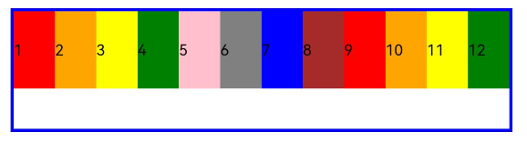
columns默认值为12,当未设置columns时,在任何断点下,栅格布局被分成12列。
GridRow() {
 ForEach(this.bgColors, (item, index) => {
   GridCol() {
     Row() {
       Text(`${index + 1}`)
     }.width("100%").height("50")
   }.backgroundColor(item)
 })
}
-
当columns类型为number时,栅格布局在任何尺寸设备下都被分为columns列。下面分别设置栅格布局列数为4和8,子元素默认占一列,效果如下:
Row() {
  GridRow({ columns: 4 }) {
    ForEach(this.bgColors, (item, index) => {
      GridCol() {
        Row() {
          Text(`${index + 1}`)
        }.width("100%").height("50")
      }.backgroundColor(item)
    })
  }
  .width("100%").height("100%")
  .onBreakpointChange((breakpoint) => {
    this.currentBp = breakpoint
  })
}
.height(160)
.border({ color: Color.Blue, width: 2 })
.width('90%')

Row() {
  GridRow({ columns: 8 }) {
    ForEach(this.bgColors, (item, index) => {
      GridCol() {
        Row() {
          Text(`${index + 1}`)
        }.width("100%").height("50")
      }.backgroundColor(item)
    })
  }
  .width("100%").height("100%")
  .onBreakpointChange((breakpoint) => {
    this.currentBp = breakpoint
  })
}
.height(160)
.border({ color: Color.Blue, width: 2 })
.width('90%')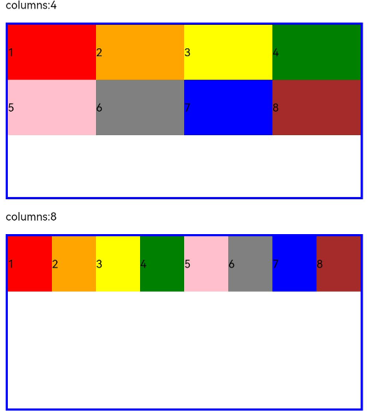
-
当columns类型为GridRowColumnOption时,支持下面六种不同尺寸(xs, sm, md, lg, xl, xxl)设备的总列数设置,各个尺寸下数值可不同。
GridRow({ columns: { sm: 4, md: 8 }, breakpoints: { value: ['200vp', '300vp', '400vp', '500vp', '600vp'] } }) {
  ForEach(this.bgColors, (item, index) => {
    GridCol() {
      Row() {
        Text(`${index + 1}`)
      }.width("100%").height("50")
    }.backgroundColor(item)
  })
}
如上,若只设置sm, md的栅格总列数,则较小的尺寸使用默认columns值12,较大的尺寸使用前一个尺寸的columns。这里只设置sm:8, md:10,则较小尺寸的xs:12,较大尺寸的参照md的设置,lg:10, xl:10, xxl:10。
栅格子组件间距
GridRow中通过gutter设置子元素在水平和垂直方向的间距。
-
当gutter类型为number时,同时设置栅格子组件间水平和垂直方向边距且相等。下例中,设置子组件水平与垂直方向距离相邻元素的间距为10。
GridRow({ gutter: 10 }){}
-
当gutter类型为GutterOption时,单独设置栅格子组件水平垂直边距,x属性为水平方向间距,y为垂直方向间距。
GridRow({ gutter: { x: 20, y: 50 } }){}
排列方向
通过GridRow的direction属性设置栅格子组件在栅格容器中的排列方向。
-
子组件默认从左往右排列。
GridRow({ direction: GridRowDirection.Row }){}
-
子组件从右往左排列。
GridRow({ direction: GridRowDirection.RowReverse }){}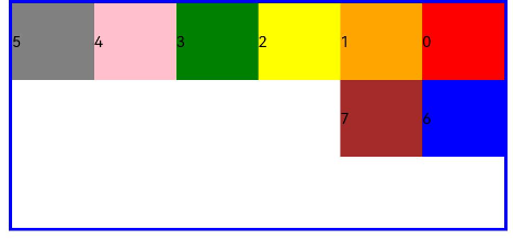
栅格子组件GridCol
GridCol组件作为GridRow组件的子组件,通过给GridCol传参或者设置属性两种方式,设置span,offset,order的值。
-
span的设置
GridCol({ span: 2 }){} GridCol({ span: { xs: 1, sm: 2, md: 3, lg: 4 } }){} GridCol(){}.span(2) GridCol(){}.span({ xs: 1, sm: 2, md: 3, lg: 4 }) -
offset的设置
GridCol({ offset: 2 }){} GridCol({ offset: { xs: 2, sm: 2, md: 2, lg: 2 } }){} GridCol(){}.offset(2) GridCol(){}.offset({ xs: 1, sm: 2, md: 3, lg: 4 }) -
order的设置
GridCol({ order: 2 }){}
GridCol({ order: { xs: 1, sm: 2, md: 3, lg: 4 } }){}
GridCol(){}.order(2)
GridCol(){}.order({ xs: 1, sm: 2, md: 3, lg: 4 })
下面使用传参的方式演示各属性的使用。
span
子组件占栅格布局的列数,决定了子组件的宽度,默认为1。
-
当类型为number时,子组件在所有尺寸设备下占用的列数相同。
GridRow({ columns: 8 }) {
  ForEach(this.bgColors, (color, index) => {
    GridCol({ span: 2 }) {
      Row() {
        Text(`${index}`)
      }.width("100%").height("50vp")
    }
    .backgroundColor(color)
  })
}
-
当类型为GridColColumnOption时,支持六种不同尺寸(xs, sm, md, lg, xl, xxl)设备中子组件所占列数设置,各个尺寸下数值可不同。
GridRow({ columns: 8 }) {
  ForEach(this.bgColors, (color, index) => {
    GridCol({ span: { xs: 1, sm: 2, md: 3, lg: 4 } }) {
      Row() {
        Text(`${index}`)
      }.width("100%").height("50vp")
    }
    .backgroundColor(color)
  })
}
offset
栅格子组件相对于前一个子组件的偏移列数,默认为0。
-
当类型为number时,子组件偏移相同列数。
GridRow() {
  ForEach(this.bgColors, (color, index) => {
    GridCol({ offset: 2 }) {
      Row() {
        Text("" + index)
      }.width("100%").height("50vp")
    }
    .backgroundColor(color)
  })
}
栅格默认分成12列,每一个子组件默认占1列,偏移2列,每个子组件及间距共占3列,一行放四个子组件。
-
当类型为GridColColumnOption时,支持六种不同尺寸(xs, sm, md, lg, xl, xxl)设备中子组件所占列数设置,各个尺寸下数值可不同。
GridRow() {
  ForEach(this.bgColors, (color, index) => {
    GridCol({ offset: { xs: 1, sm: 2, md: 3, lg: 4 } }) {
      Row() {
        Text("" + index)
      }.width("100%").height("50vp")
    }
    .backgroundColor(color)
  })
}
order
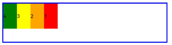
栅格子组件的序号,决定子组件排列次序。当子组件不设置order或者设置相同的order, 子组件按照代码顺序展示。当子组件设置不同的order时,order较小的组件在前,较大的在后。 当子组件部分设置order,部分不设置order时,未设置order的子组件依次排序靠前,设置了order的子组件按照数值从小到大排列。
-
当类型为number时,子组件在任何尺寸下排序次序一致。
GridRow() {
  GridCol({ order: 5 }) {
    Row() {
      Text("1")
    }.width("100%").height("50vp")
  }.backgroundColor(Color.Red)
  GridCol({ order: 4 }) {
    Row() {
      Text("2")
    }.width("100%").height("50vp")
  }.backgroundColor(Color.Orange)
  GridCol({ order: 3 }) {
    Row() {
      Text("3")
    }.width("100%").height("50vp")
  }.backgroundColor(Color.Yellow)
  GridCol({ order: 2 }) {
    Row() {
      Text("4")
    }.width("100%").height("50vp")
  }.backgroundColor(Color.Green)
}
-
当类型为GridColColumnOption时,支持六种不同尺寸(xs, sm, md, lg, xl, xxl)设备中子组件排序次序设置。
GridRow() {
  GridCol({ order: { xs:1, sm:5, md:3, lg:7}}) {
    Row() {
      Text("1")
    }.width("100%").height("50vp")
  }.backgroundColor(Color.Red)
  GridCol({ order: { xs:2, sm:2, md:6, lg:1} }) {
    Row() {
      Text("2")
    }.width("100%").height("50vp")
  }.backgroundColor(Color.Orange)
  GridCol({ order: { xs:3, sm:3, md:1, lg:6} }) {
    Row() {
      Text("3")
    }.width("100%").height("50vp")
  }.backgroundColor(Color.Yellow)
  GridCol({ order: { xs:4, sm:4, md:2, lg:5} }) {
    Row() {
      Text("4")
    }.width("100%").height("50vp")
  }.backgroundColor(Color.Green)
}