divider
NOTE
This component is supported since API version 4. Updates will be marked with a superscript to indicate their earliest API version.
The <divider> component is used to separate content blocks and content elements. It can be used for the list or UI layout.
Required Permissions
None
Child Components
Not supported
Attributes
In addition to the universal attributes, the following attributes are supported.
| Name | Type | Default Value | Mandatory | Description |
|---|---|---|---|---|
| vertical | boolean | false | No | Whether to use the vertical divider. The default value is false, indicating that the horizontal divider is used. |
NOTE
The focusable and disabled attributes are not supported.
Styles
Only the following styles are supported.
| Name | Type | Default Value | Mandatory | Description |
|---|---|---|---|---|
| margin | <length> | 0 | No | Shorthand attribute to set the margin for all sides in a declaration. The attribute can have one to four values. |
| margin-[left|top|right|bottom] | <length> | 0 | No | Shorthand attribute of the length type to set left, top, right, and bottom margins attributes. Its unit is px and default value is 0. |
| color | <color> | #08000000 | No | Color of the divider. |
| stroke-width | <length> | 1 | No | Width of the divider. |
| display | string | flex | No | Type of the bounding box generated by the divider. The value can be flex or none. The default value is flex. |
| visibility | string | visible | No | Whether to display the divider. Invisible dividers also occupy space. visible indicates that the divider is displayed, and hidden indicates that the divider is not displayed. |
| line-cap | string | butt | No | Cap style of the divider. The default value is butt. Available values are as follows: - butt: The ends of the divider are squared off. - round: A rounded cap is added to each end of the divider. The divider length will increase by the stroke width. - square: A square cap is added to each end of the divider. The divider length will increase by the stroke width. |
| flex | number | - | No | How to divide available space of the parent component for each child component. This is a shorthand attribute to set the flex-grow attribute. This attribute takes effect only when the parent component is <div>, <list-item>, or <tabs>. |
| flex-grow | number | 0 | No | How much a child component will grow. The value specifies allocation of the available space on the main axis of the parent component. Size of available space = Container size - Total size of all child components. Value 0 indicates that the child component does not grow. This attribute takes effect only when the parent component is <div>, <list-item>, or <tabs>. |
| flex-shrink | number | 1 | No | How much a child component will shrink. The shrink occurs only when the sum of default element widths is greater than that of the parent component. Value 0 indicates that the child component does not shrink. This attribute takes effect only when the parent component is <div>, <list-item>, or <tabs>. |
| flex-basis | <length> | - | No | Initial length of a child component on the main axis. This attribute takes effect only when the parent component is <div>, <list-item>, or <tabs>. |
Events
Not supported
Methods
Not supported
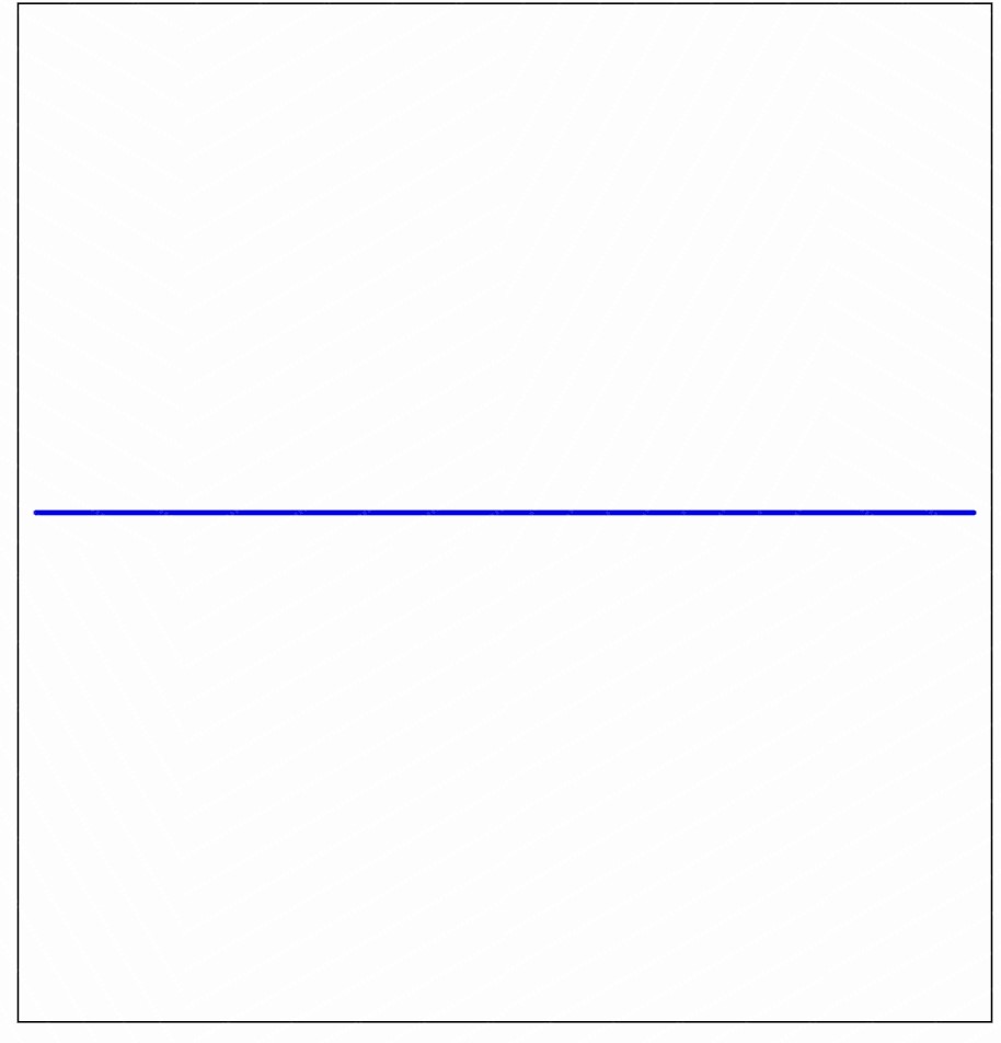
Example
<!-- xxx.hml -->
<div class="container">
  <div class="content">
    <divider class="divider" vertical="false"></divider>
  </div>
</div>
/* xxx.css */
.container {
  margin: 20px;
  flex-direction:column;
  width:100%;
  height:100%;
  align-items:center;
}
.content{
  width:80%;
  height:40%;
  border:1px solid #000000;
  align-items: center;
  justify-content: center;
  flex-direction:column;
}
.divider {
  margin: 10px;
  color: #ff0000ff;
  stroke-width: 3px;
  line-cap: round;
}
你可能感兴趣的鸿蒙文章
harmony 鸿蒙JavaScript-compatible Web-like Development Paradigm