harmony 鸿蒙State Management with Page-level Variables
State Management with Page-level Variables
This topic covers how to manage the states with page-level variables with the @State, @Prop, @Link, @Provide, @Consume, @ObjectLink, @Observed, and @Watch decorators.
For details about the constraints of the @State, @Provide, @Link, and @Consume decorated state variables, see Restrictions on Data Type Declarations of State Variables.
@State
The @State decorated variable is the internal state data of the component. When the state data is modified, the build method of the component is called to refresh the UI.
The @State data has the following features:
- Support for multiple types: The following types are supported: strong types by value and by reference, including class, number, boolean, string, as well as arrays of these types, that is, Array<class>, Array<number>, Array<boolean>, and Array<string>. object and any are not supported.
- Support for multiple instances: Multiple instances can coexist in a component. The internal state data of different instances is independent.
- Private: An attribute marked with @State can only be accessed within the component.
- Local initialization required: Initial values must be allocated to all @State decorated variables. Uninitialized variables may cause undefined framework exceptions.
- Support for setting of initial attribute values based on the state variable name: When creating a component instance, you can explicitly specify the initial value of the @State decorated attribute based on the variable name.
Example
In the following example:
Two @State decorated variables, count and title, have been defined for MyComponent. If the value of count or title changes, the build method of MyComponent needs to be called to render the component again.
The EntryComponent has multiple MyComponent instances. The internal status change of the first MyComponent instance does not affect the second MyComponent instance.
When creating a MyComponent instance, initialize the variables in the component based on the variable name. For example:
MyComponent({ title: { value: 'Hello World 2' }, count: 7 })
// xxx.ets
class Model {
  value: string

  constructor(value: string) {
    this.value = value
  }
}

@Entry
@Component
struct EntryComponent {
  build() {
    Column() {
      MyComponent ({ count: 1,increaseBy:2 }) // First MyComponent instance
      MyComponent({ title: { value:'Hello World 2' }, count: 7 }) // Second MyComponent instance
    }
  }
}

@Component
struct MyComponent {
  @State title: Model = { value: 'Hello World' }
  @State count: number = 0
  private toggle: string = 'Hello World'
  private increaseBy: number = 1

  build() {
    Column() {
      Text(`${this.title.value}`).fontSize(30)
      Button('Click to change title')
        .margin(20)
        .onClick(() => {
          // Change the value of the internal status variable title.
          this.title.value = (this.toggle == this.title.value) ? 'Hello World' : 'Hello ArkUI'
        })

      Button(`Click to increase count=${this.count}`)
        .margin(20)
        .onClick(() => {
          // Change the value of the internal status variable count.
          this.count += this.increaseBy
        })
    }
  }
}
@Prop
@Prop and @State have the same semantics but different initialization modes. A @Prop decorated variable in a component must be initialized using the @State decorated variable in its parent component. The @Prop decorated variable can be modified in the component, but the modification is not updated to the parent component; the modification to the @State decorated variable is synchronized to the @Prop decorated variable. That is, @Prop establishes one-way data binding.
The @Prop decorated state variable has the following features:
- Support for simple types: The number, string, and boolean types are supported.
- Private: Data is accessed only within the component.
- Support for multiple instances: A component can have multiple attributes decorated by @Prop.
- Support for initialization with a value passed to the @Prop decorated variable: When a new instance of the component is created, all @Prop variables must be initialized. Initialization inside the component is not supported.
NOTE
A @Prop decorated variable cannot be initialized inside the component.
Example
In the following example, when the user presses +1 or -1, the status of the parent component changes and the build method is executed again. In this case, a new CountDownComponent instance is created. The countDownStartValue attribute of the parent component is used to initialize the @Prop decorated variable of the child component. When the count - costOfOneAttempt button of the child component is touched, the value of the @Prop decorated variable count is changed. As a result, the CountDownComponent is rendered again. However, the change of the count value does not affect the countDownStartValue value of the parent component.
// xxx.ets
@Entry
@Component
struct ParentComponent {
  @State countDownStartValue: number = 10 // Initialize countDownStartValue

  build() {
    Column() {
      Text(`Grant ${this.countDownStartValue} nuggets to play.`).fontSize(18)
      Button('+1 - Nuggets in New Game')
        .margin(15)
        .onClick(() => {
          this.countDownStartValue += 1
        })

      Button('-1  - Nuggets in New Game')
        .margin(15)
        .onClick(() => {
          this.countDownStartValue -= 1
        })
      // When creating a child component, you must provide the initial value of its @Prop decorated variable count in the constructor parameter and initialize the regular variable costOfOneAttempt (not @Prop decorated).
      CountDownComponent({ count: this.countDownStartValue, costOfOneAttempt: 2 })
    }
  }
}

@Component
struct CountDownComponent {
  @Prop count: number
  private costOfOneAttempt: number

  build() {
    Column() {
      if (this.count > 0) {
        Text(`You have ${this.count} Nuggets left`).fontSize(18)
      } else {
        Text('Game over!').fontSize(18)
      }

      Button('count - costOfOneAttempt')
        .margin(15)
        .onClick(() => {
          this.count -= this.costOfOneAttempt
        })
    }
  }
}
@Link
Two-way binding can be established between the @Link decorated variable and the @State decorated variable of the parent component. The @Link data has the following features:
- Support for multiple types: The @Link decorated variables support the data types the same as the @State decorated variables; that is, the value can be of the following types: class, number, string, boolean, or arrays of these types.
- Private: Data is accessed only within the component.
- Single data source: The variable used to initialize the @Link decorated variable in a component must be a state variable defined in the parent component.
- Two-way binding: When a child component changes the @Link decorated variable, the @State decorated variable of its parent component is also changed.
- Support for initialization with the variable reference passed to the @Link decorated variable: When creating an instance of the component, you must use the naming parameter to initialize all @Link decorated variables. @Link decorated variables can be initialized by using the reference of the @State or @Link decorated variable. Wherein, the @State decorated variables can be referenced using the ’$’ operator.
NOTE
A @Link decorated variable cannot be initialized inside the component.
Simple Type Example
The @Link semantics are derived from the ‘$’ operator. In other words, $isPlaying is the two-way binding of the internal state this.isPlaying. When the button in the PlayButton child component is touched, the value of the @Link decorated variable is changed, and PlayButton together with the <Text> and <Button> components of the parent component is refreshed. Similarly, when the button in the parent component is touched, the value of this.isPlaying is changed, and PlayButton together with the <Text> and <Button> components of the parent component is refreshed.
// xxx.ets
@Entry
@Component
struct Player {
  @State isPlaying: boolean = false

  build() {
    Column() {
      PlayButton({ buttonPlaying: $isPlaying })
      Text(`Player is ${this.isPlaying ? '' : 'not'} playing`).fontSize(18)
      Button('Parent:' + this.isPlaying)
        .margin(15)
        .onClick(() => {
          this.isPlaying = !this.isPlaying
        })
    }
  }
}

@Component
struct PlayButton {
  @Link buttonPlaying: boolean

  build() {
    Column() {
      Button(this.buttonPlaying ? 'pause' : 'play')
        .margin(20)
        .onClick(() => {
          this.buttonPlaying = !this.buttonPlaying
        })
    }
  }
}
Complex Type Example
// xxx.ets
@Entry
@Component
struct Parent {
  @State arr: number[] = [1, 2, 3]

  build() {
    Column() {
      Child({ items: $arr })
      Button('Parent Button: splice')
        .margin(10)
        .onClick(() => {
          this.arr.splice(0, 1, 60)
        })
      ForEach(this.arr, item => {
        Text(item.toString()).fontSize(18).margin(10)
      }, item => item.toString())
    }
  }
}


@Component
struct Child {
  @Link items: number[]

  build() {
    Column() {
      Button('Child Button1: push')
        .margin(15)
        .onClick(() => {
          this.items.push(100)
        })
      Button('Child Button2: replace whole item')
        .margin(15)
        .onClick(() => {
          this.items = [100, 200, 300]
        })
    }
  }
}
Example of Using @Link, @State, and @Prop Together
In the following example, ParentView contains two child components: ChildA and ChildB. The counter state variable of ParentView is used to initialize the @Prop decorated variable of ChildA and the @Link decorated variable of ChildB.
- @Link establishes two-way binding between ChildB and ParentView.Value changes of the counterRef state variable in ChildB will be synchronized to ParentView and ChildA.
- @Prop establishes one-way binding between ChildA and ParentView. Value changes of the counterVal state variable in ChildA will trigger a re-render of ChildA, but will not be synchronized to ParentView or ChildB.
// xxx.ets
@Entry
@Component
struct ParentView {
  @State counter: number = 0

  build() {
    Column() {
      ChildA({ counterVal: this.counter })
      ChildB({ counterRef: $counter })
    }
  }
}

@Component
struct ChildA {
  @Prop counterVal: number

  build() {
    Button(`ChildA: (${this.counterVal}) + 1`)
      .margin(15)
      .onClick(() => {
        this.counterVal += 1
      })
  }
}

@Component
struct ChildB {
  @Link counterRef: number

  build() {
    Button(`ChildB: (${this.counterRef}) + 1`)
      .margin(15)
      .onClick(() => {
        this.counterRef += 1
      })
  }
}
@Observed and @ObjectLink
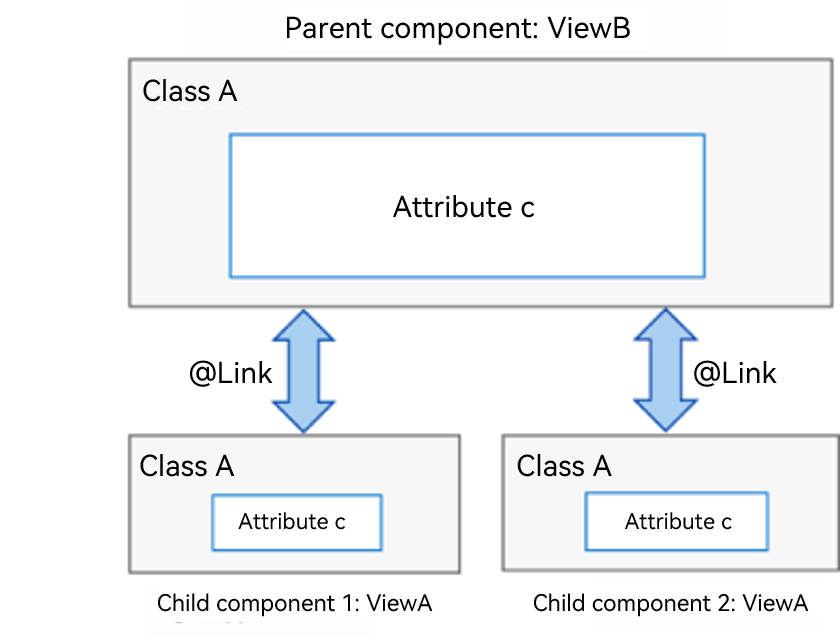
When you need to set up bidirectional synchronization for a parent variable (parent_a) between the parent and child components, you can use @State to decorate the variable (parent_a) in the parent component and use @Link to decorate the corresponding variable (child_a) in the child component. In this way, data can be synchronized between the parent component and the specific child component, and between the parent component and its other child components. As shown below, bidirectional synchronization is configured for variables of ClassA in the parent and child components. If attribute c of the variable in child component 1 has its value changed, the parent component will be notified to synchronize the change. If attribute c in the parent component has its value changed, all child components will be notified to synchronize the change.
In the preceding example, full synchronization is performed for a data object. If you want to synchronize partial information of a data object in a parent component, and if the information is a class object, use @ObjectLink and @Observed instead, as shown below.
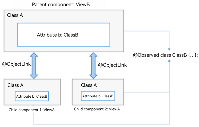
Configuration Requirements
@Observed applies to classes, and @ObjectLink applies to variables.
The variables decorated by @ObjectLink must be of the class type.
- The classes must be decorated by @Observed.
- Parameters of the simple types are not supported. You can use @Prop to perform unidirectional synchronization.
@ObjectLink decorated variables are immutable.
- Attribute changes are allowed. If an object is referenced by multiple @ObjectLink decorated variables, all custom components that have these variables will be notified for re-rendering.
Default values cannot be set for @ObjectLink decorated variables.
- The parent component must be initialized with a TypeScript expression that involves variables decorated by @State, @Link, @StorageLink, @Provide, or @Consume.
@ObjectLink decorated variables are private variables and can be accessed only within the component.
Example
// xxx.ets
// Use @ObjectLink and @Observed to set up bidirectional synchronization for the class object ClassA between the parent component ViewB and the child component ViewA. In this way, changes made to ClassA in ViewA will be synchronized to ViewB and other child components bound to ClassA.
var nextID: number = 0

@Observed
class ClassA {
  public name: string
  public c: number
  public id: number

  constructor(c: number, name: string = 'OK') {
    this.name = name
    this.c = c
    this.id = nextID++
  }
}

@Component
struct ViewA {
  label: string = 'ViewA1'
  @ObjectLink a: ClassA

  build() {
    Row() {
      Button(`ViewA [${this.label}] this.a.c= ${this.a.c} +1`)
        .onClick(() => {
          this.a.c += 1
        })
    }.margin({ top: 10 })
  }
}

@Entry
@Component
struct ViewB {
  @State arrA: ClassA[] = [new ClassA(0), new ClassA(0)]

  build() {
    Column() {
      ForEach(this.arrA, (item) => {
        ViewA({ label: `#${item.id}`, a: item })
      }, (item) => item.id.toString())
      ViewA({ label: `this.arrA[first]`, a: this.arrA[0] })
      ViewA({ label: `this.arrA[last]`, a: this.arrA[this.arrA.length - 1] })

      Button(`ViewB: reset array`)
        .margin({ top: 10 })
        .onClick(() => {
          this.arrA = [new ClassA(0), new ClassA(0)]
        })
      Button(`ViewB: push`)
        .margin({ top: 10 })
        .onClick(() => {
          this.arrA.push(new ClassA(0))
        })
      Button(`ViewB: shift`)
        .margin({ top: 10 })
        .onClick(() => {
          this.arrA.shift()
        })
    }.width('100%')
  }
}
@Provide and @Consume
As the data provider, @Provide can update the data of child nodes and trigger page rendering. After @Consume detects that the @Provide decorated variable is updated, it will initiate re-rendering of the current custom component.
NOTE
When using @Provide and @Consume, avoid circular reference that may lead to infinite loops.
@Provide
| Name | Description |
|---|---|
| Decorator parameter | A constant of the string type, which is used to set an alias for a decorated variable. If an alias is specified, implement the data update for this alias. If there is no alias, use the variable name as the alias. @Provide(‘alias’) is recommended. |
| Synchronization mechanism | The @Provide decorated variable is similar to the @State decorated variable. You can change the value of the variable to trigger a re-render. You can also modify the @Consume decorated variable to modify the @State decorated variable reversely. |
| Initial value | The initial value must be set. |
| Page re-rendering scenarios | Page re-rendering is triggered in the following scenarios: - Changes of variables of simple types (boolean, string, and number) - Changes of the @Observed decorated classes or their attributes - Addition, deletion, or updating of elements in an array |
@Consume
| Type | Description |
|---|---|
| Initial value | The default initial value cannot be set. |
Example
// xxx.ets
@Entry
@Component
struct CompA {
  @Provide("reviewVote") reviewVotes: number = 0;

  build() {
    Column() {
      CompB()
      Button(`CompA: ${this.reviewVotes}`)
        .margin(10)
        .onClick(() => {
          this.reviewVotes += 1;
        })
    }
  }
}

@Component
struct CompB {
  build() {
    Column() {
      CompC()
    }
  }
}

@Component
struct CompC {
  @Consume("reviewVote") reviewVotes: number

  build() {
    Column() {
      Button(`CompC: ${this.reviewVotes}`)
        .margin(10)
        .onClick(() => {
          this.reviewVotes += 1
        })
    }.width('100%')
  }
}
@Watch
@Watch is used to listen for changes of state variables. The syntax structure is as follows:
@State @Watch("onChanged") count : number = 0
As shown above, add an @Watch decorator to the target state variable to register an onChanged callback. When the state variable count is changed, the onChanged callback will be triggered.
@Watch can be used to listen for value changes of variables decorated by @State, @Prop, @Link, @ObjectLink, @Provide, @Consume, @StorageProp, and @StorageLink.
NOTE
@Watch cannot be used to listen for in-depth data modification, such as changes of object values in an array.
// xxx.ets
@Entry
@Component
struct CompA {
  @State @Watch('onBasketUpdated') shopBasket: Array<number> = [7, 12, 47, 3]
  @State totalPurchase: number = 0
  @State addPurchase: number = 0

  aboutToAppear() {
    this.updateTotal()
  }

  updateTotal(): number {
    let sum = 0;
    this.shopBasket.forEach((i) => {
      sum += i
    })
    // Calculate the total amount of items in the shopping basket. If the amount exceeds 100, the specified discount will be applied.
    this.totalPurchase = (sum < 100) ? sum : 0.9 * sum
    return this.totalPurchase
  }

  // This method is triggered when the value of shopBasket is changed.
  onBasketUpdated(propName: string): void {
    this.updateTotal()
  }

  build() {
    Column() {
      Button('add to basket ' + this.addPurchase)
        .margin(15)
        .onClick(() => {
          this.addPurchase = Math.round(100 * Math.random())
          this.shopBasket.push(this.addPurchase)
        })
      Text(`${this.totalPurchase}`)
        .fontSize(30)
    }
  }
}
你可能感兴趣的鸿蒙文章
harmony 鸿蒙app.json5 Configuration File
harmony 鸿蒙Internal Structure of the app Tag
harmony 鸿蒙Application Configuration File Overview (FA Model)
harmony 鸿蒙Application Configuration File Overview (Stage Model)
harmony 鸿蒙Application Installation and Uninstallation Process
harmony 鸿蒙Application Package Overview
harmony 鸿蒙Application Package Structure in FA Model
- 所属分类: 后端技术
- 本文标签:
热门推荐
-
2、 - 优质文章
-
3、 gate.io
-
8、 golang
-
9、 openharmony
-
10、 Vue中input框自动聚焦