Popup Mask Control
You can customize not only the content of popups but also their mask behavior. This topic introduces ArkUI's popup mask control capabilities, including dismiss-on-click behavior, mask area, mask color, and mask animations.
Constraints
ArkUI provides various popup types with different mask customization capabilities as detailed below.
| API & Component | autoCancel | maskRect | isModal | immersiveMode |
|---|---|---|---|---|
| openCustomDialog | Supported | Supported | Supported | Supported |
| openCustomDialogWithController | Supported | Supported | Supported | Supported |
| presentCustomDialog | Supported | Supported | Supported | Supported |
| updateCustomDialog | Supported | Not supported | Not supported | Not supported |
| CustomDialog | Supported | Supported | Supported | Supported |
| showDialog | Not supported | Supported | Supported | Supported |
| showAlertDialog | Supported | Supported | Supported | Supported |
| showActionSheet | Supported | Supported | Supported | Supported |
| showActionMenu | Not supported | Not supported | Supported | Supported |
| showDatePickerDialog | Not supported | Supported | Not supported | Not supported |
| CalendarPickerDialog | Not supported | Not supported | Not supported | Not supported |
| showTimePickerDialog | Not supported | Supported | Not supported | Not supported |
| showTextPickerDialog | Not supported | Supported | Not supported | Not supported |
NOTE
autoCancel: controls whether clicking the mask dismisses the popup.
maskRect: customizes the mask size and position. Events within the mask area are blocked.
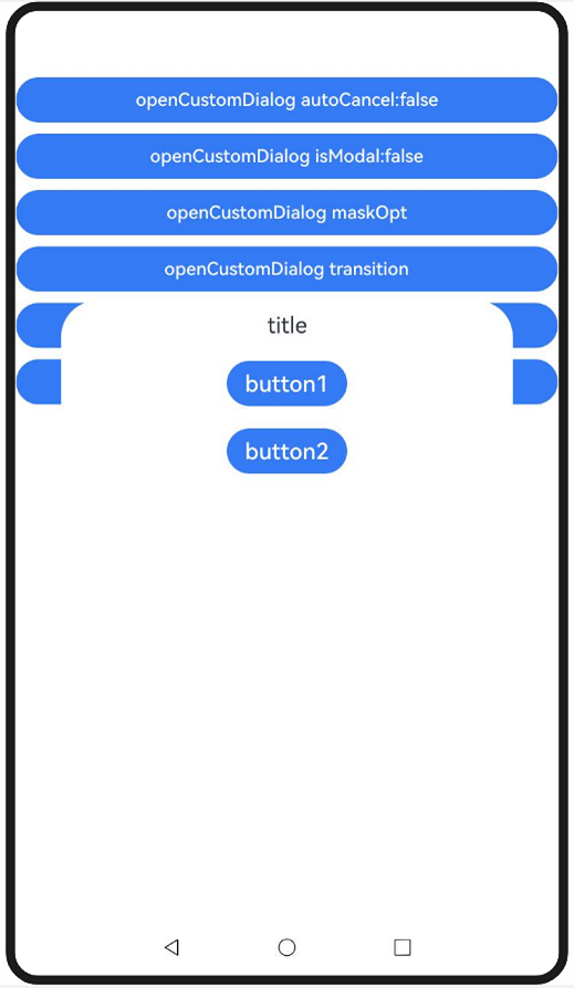
isModal: specifies whether the popup is a modal. Non-modal popups have no mask and allow background interactions, while modal popups have a mask and block background interactions.
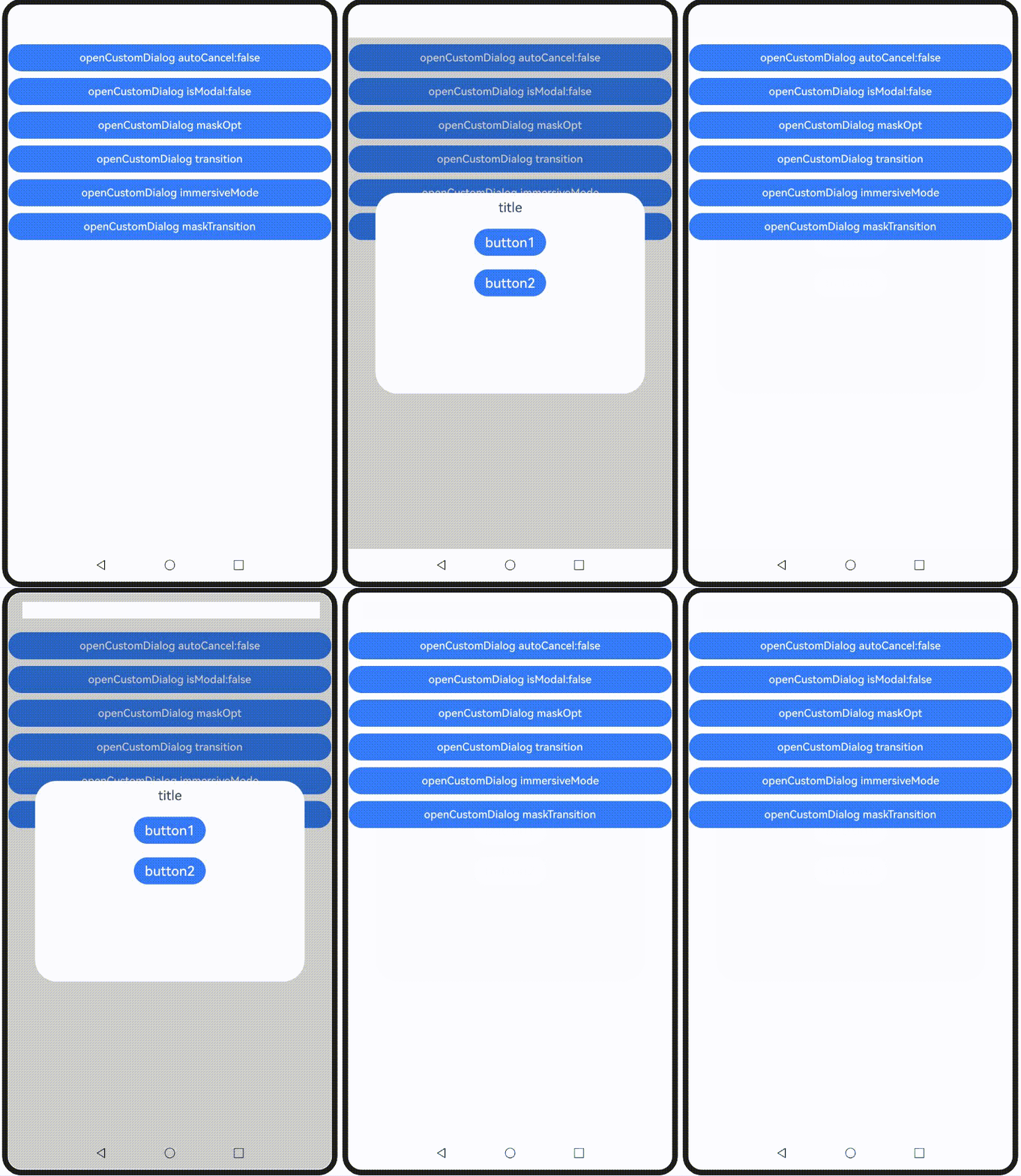
immersiveMode (supported since API version 15): extends the mask to the status and navigation bars when levelMode is set to LevelMode.EMBEDDED.
| API & Component | maskColor | transition | maskTransition |
|---|---|---|---|
| openCustomDialog | Supported | Supported | Supported |
| openCustomDialogWithController | Supported | Supported | Supported |
| presentCustomDialog | Supported | Supported | Supported |
| updateCustomDialog | Supported | Not supported | Not supported |
| CustomDialog | Supported | Not supported (use openAnimation and closeAnimation) | Not supported |
| showDialog | Not supported | Not supported | Not supported |
| showAlertDialog | Not supported | Supported | Not supported |
| showActionSheet | Not supported | Supported | Not supported |
| showActionMenu | Not supported | Not supported | Not supported |
| showDatePickerDialog | Not supported | Not supported | Not supported |
| CalendarPickerDialog | Not supported | Not supported | Not supported |
| showTimePickerDialog | Not supported | Not supported | Not supported |
| showTextPickerDialog | Not supported | Not supported | Not supported |
NOTE
maskColor: customizes the color of the popup mask.
openAnimation: customizes the popup entry animation, which also affects the mask animation. This API only supports simple animation settings and does not support complex animation customization.
closeAnimation: customizes the popup exit animation, which also affects the mask animation. This API only supports simple animation settings and does not support complex animation customization.
transition: customizes the popup entry and exit animation, which also affect the mask animation.
maskTransition (supported since API version 19): customizes the popup mask animation.
Popup Mask Visibility Control

The autoCancel and isModal attributes control the visibility of the popup mask.
Set autoCancel to false to disable the default behavior of dismissing the popup when the mask is touched.
  autoCancelOpt: promptAction.CustomDialogOptions = {
    builder: () => {
      this.myBuilder();
    },
    autoCancel: false,
  } as promptAction.CustomDialogOptions;
  // ···
  build() {
    NavDestination() {
      Column() {
        Button('openCustomDialog autoCancel:false')
          .width('100%')
          .margin({ top: 10 })
          .onClick(() => {
            this.getUIContext().getPromptAction().openCustomDialog(this.autoCancelOpt)
          })

        // ···
      }
      .width('100%')
      .height('100%')
    }
  }
Set isModal to false to change the default modal popup to a non-modal popup.
  modalOpt: promptAction.CustomDialogOptions = {
    builder: () => {
      this.myBuilder();
    },
    isModal: false,
  } as promptAction.CustomDialogOptions;
  // ···
  build() {
    NavDestination() {
      Column() {
        // ···
        Button('openCustomDialog isModal:false')
          .width('100%')
          .margin({ top: 10 })
          .onClick(() => {
            this.getUIContext().getPromptAction().openCustomDialog(this.modalOpt)
          })

        // ···
      }
      .width('100%')
      .height('100%')
    }
  }
Popup Mask Style Control
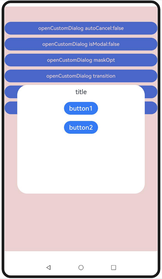
This example demonstrates the popup's mask style control capabilities using maskRect, immersiveMode, and maskColor.
Set maskRect and maskColor to set the mask area and mask color.
  maskOpt: promptAction.CustomDialogOptions = {
    builder: () => {
      this.myBuilder();
    },
    maskRect: {
      x: 0,
      y: 10,
      width: '100%',
      height: '90%'
    },
    maskColor: '#33AA0000'
  } as promptAction.CustomDialogOptions;
  // ···
  build() {
    NavDestination() {
      Column() {
        // ···
        Button('openCustomDialog maskOpt')
          .width('100%')
          .margin({ top: 10 })
          .onClick(() => {
            this.getUIContext().getPromptAction().openCustomDialog(this.maskOpt)
          })

        // ···
      }
      .width('100%')
      .height('100%')
    }
  }
When levelMode is set to LevelMode.EMBEDDED, the following example shows how different immersiveMode values affect the mask's extension to the navigation bar and status bar.
  @State immersiveMode: ImmersiveMode = ImmersiveMode.DEFAULT;
  // ···
  build() {
    NavDestination() {
      Column() {
        // ···
        Button('openCustomDialog immersiveMode')
          .width('100%')
          .margin({ top: 10 })
          .onClick(() => {
            this.immersiveMode =
              this.immersiveMode == ImmersiveMode.DEFAULT ? ImmersiveMode.EXTEND : ImmersiveMode.DEFAULT;
            this.getUIContext().getPromptAction().openCustomDialog({
              builder: () => {
                this.myBuilder();
              },
              levelMode: LevelMode.EMBEDDED,
              immersiveMode: this.immersiveMode,
            })
          })

        // ···
      }
      .width('100%')
      .height('100%')
    }
  }
Popup Mask Animation Control
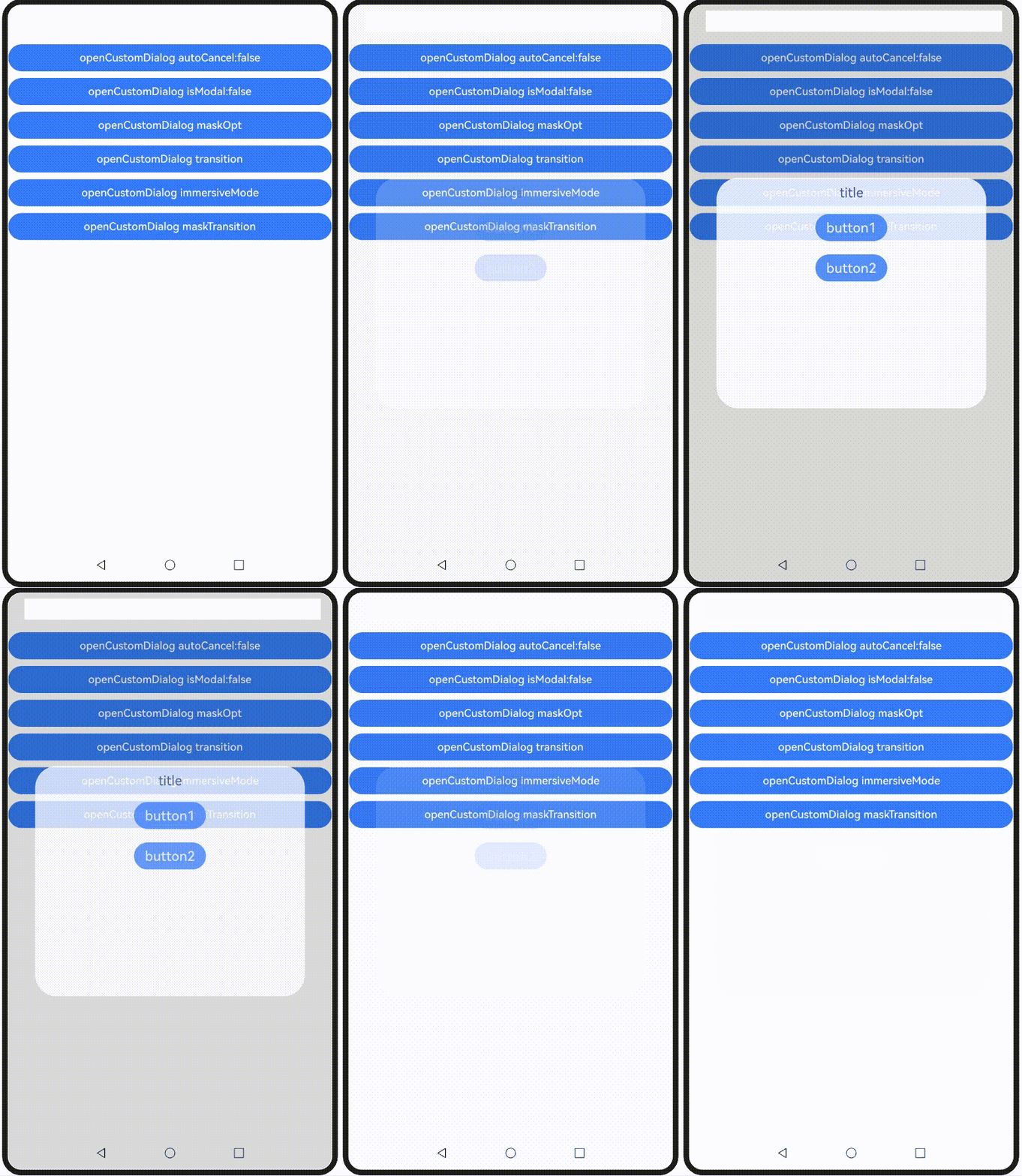
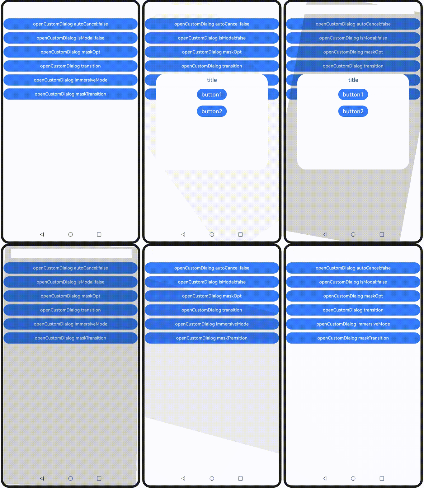
This example demonstrates the popup's mask animation capabilities using transition and maskTransition.
Set transition to implement a unified animation for both the popup and its mask.
  transitionOpt: promptAction.CustomDialogOptions = {
    builder: () => {
      this.myBuilder();
    },
    transition: TransitionEffect.OPACITY.animation({ duration: 3000 })
  } as promptAction.CustomDialogOptions;
  // ···
  build() {
    NavDestination() {
      Column() {
        // ···
        Button('openCustomDialog transition')
          .width('100%')
          .margin({ top: 10 })
          .onClick(() => {
            this.getUIContext().getPromptAction().openCustomDialog(this.transitionOpt);
          })

        // ···
      }
      .width('100%')
      .height('100%')
    }
  }
Sets maskTransition to implement independent animation customization for the popup's mask.
Button('openCustomDialog maskTransition')
  .width('100%')
  .margin({ top: 10 })
  .onClick(() => {
    this.getUIContext().getPromptAction().openCustomDialog({
      builder: () => {
        this.myBuilder();
      },
      maskTransition: TransitionEffect.OPACITY.animation({ duration: 2000 })
        .combine(TransitionEffect.rotate({ z: 1, angle: 180 })),
    });
  })
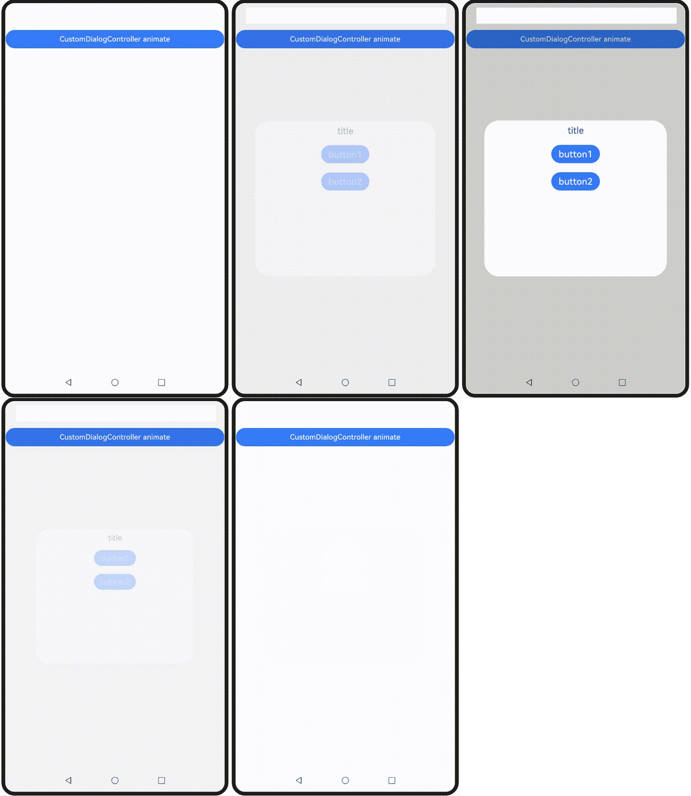
Although CustomDialog does not support the transition API, the corresponding openAnimation and closeAnimation APIs can be used to customize the animation for opening and closing the popup. Example code is as follows:
// xxx.ets

@CustomDialog
@Component
struct CustomDialogAnimationBuilder {
  controller?: CustomDialogController;

  build() {
    Column() {
      Text('title')
        .margin(10)
        .fontSize(20)
      Button('button1')
        .margin(10)
        .fontSize(20)
        .onClick(() => {
          this.controller?.close();
        })
      Button('button2')
        .margin(10)
        .fontSize(20)
        .onClick(() => {
          this.controller?.close();
        })
    }.width('100%')
    .height('50%')
  }
}

@Entry
@Component
export struct CustomDialogAnimation {
  animationController: CustomDialogController|null =
    new CustomDialogController({
      builder: CustomDialogAnimationBuilder(),
      closeAnimation: { duration: 2000 },
      openAnimation: { duration: 2000 }
    });

  aboutToDisappear(): void {
    this.animationController = null;
  }

  build() {
    NavDestination() {
      Column() {
        Button('CustomDialogController animate')
          .width('100%')
          .margin({ top: 10 })
          .onClick(() => {
            this.animationController?.open();
          })
      }
    }
  }
}
Complete Sample Code
// xxx.ets
import { ImmersiveMode, LevelMode, promptAction } from '@kit.ArkUI';

@Entry
@Component
export struct CustomDialogControl {
  @State immersiveMode: ImmersiveMode = ImmersiveMode.DEFAULT;

  autoCancelOpt: promptAction.CustomDialogOptions = {
    builder: () => {
      this.myBuilder();
    },
    autoCancel: false,
  } as promptAction.CustomDialogOptions;

  modalOpt: promptAction.CustomDialogOptions = {
    builder: () => {
      this.myBuilder();
    },
    isModal: false,
  } as promptAction.CustomDialogOptions;

  maskOpt: promptAction.CustomDialogOptions = {
    builder: () => {
      this.myBuilder();
    },
    maskRect: {
      x: 0,
      y: 10,
      width: '100%',
      height: '90%'
    },
    maskColor: '#33AA0000'
  } as promptAction.CustomDialogOptions;

  transitionOpt: promptAction.CustomDialogOptions = {
    builder: () => {
      this.myBuilder();
    },
    transition: TransitionEffect.OPACITY.animation({ duration: 3000 })
  } as promptAction.CustomDialogOptions;

  @Builder
  myBuilder() {
    Column() {
      Text('title').margin(10).fontSize(20)
      Button('button1').margin(10).fontSize(20)
      Button('button2').margin(10).fontSize(20)
    }.width('100%').height('50%')
  }

  build() {
    NavDestination() {
      Column() {
        Button('openCustomDialog autoCancel:false')
          .width('100%')
          .margin({ top: 10 })
          .onClick(() => {
            this.getUIContext().getPromptAction().openCustomDialog(this.autoCancelOpt)
          })

        Button('openCustomDialog isModal:false')
          .width('100%')
          .margin({ top: 10 })
          .onClick(() => {
            this.getUIContext().getPromptAction().openCustomDialog(this.modalOpt)
          })

        Button('openCustomDialog maskOpt')
          .width('100%')
          .margin({ top: 10 })
          .onClick(() => {
            this.getUIContext().getPromptAction().openCustomDialog(this.maskOpt)
          })

        Button('openCustomDialog transition')
          .width('100%')
          .margin({ top: 10 })
          .onClick(() => {
            this.getUIContext().getPromptAction().openCustomDialog(this.transitionOpt);
          })

        Button('openCustomDialog immersiveMode')
          .width('100%')
          .margin({ top: 10 })
          .onClick(() => {
            this.immersiveMode =
              this.immersiveMode == ImmersiveMode.DEFAULT ? ImmersiveMode.EXTEND : ImmersiveMode.DEFAULT;
            this.getUIContext().getPromptAction().openCustomDialog({
              builder: () => {
                this.myBuilder();
              },
              levelMode: LevelMode.EMBEDDED,
              immersiveMode: this.immersiveMode,
            })
          })

        Button('openCustomDialog maskTransition')
          .width('100%')
          .margin({ top: 10 })
          .onClick(() => {
            this.getUIContext().getPromptAction().openCustomDialog({
              builder: () => {
                this.myBuilder();
              },
              maskTransition: TransitionEffect.OPACITY.animation({ duration: 2000 })
                .combine(TransitionEffect.rotate({ z: 1, angle: 180 })),
            });
          })
      }
      .width('100%')
      .height('100%')
    }
  }
}

你可能感兴趣的鸿蒙文章
openharmony 鸿蒙 arkts-common-components-text-input
openharmony 鸿蒙 arkts-select-component-faq
openharmony 鸿蒙 js-framework-syntax-css
openharmony 鸿蒙 arkts-popup-and-menu-components-popup
openharmony 鸿蒙 arkts-navigation-animation-faq
openharmony 鸿蒙 arkts-rotation-transition-animation
openharmony 鸿蒙 ndk-inspector-component-observer
openharmony 鸿蒙 arkts-popup-and-menu-components-uicontext-popup