SegmentButtonV2(系统接口)
分段按钮组件用于创建页签型、单选或多选的胶囊型分段按钮。
说明:
该组件从API version 18开始支持。后续版本如有新增内容,则采用上角标单独标记该内容的起始版本。
当前页面仅包含本模块的系统接口,其他公开接口参见SegmentButtonV2。
导入模块
import { TabSegmentButtonV2, CapsuleSegmentButtonV2, MultiCapsuleSegmentButtonV2, SegmentButtonV2Items } from '@kit.ArkUI';
TabSegmentButtonV2
页签型分段按钮。
装饰器类型: @ComponentV2
系统能力: SystemCapability.ArkUI.ArkUI.Full
模型约束: 此接口仅可在Stage模型下使用。
设备行为差异: 该接口在Wearable设备上使用时,应用程序运行异常,异常信息中提示接口未定义,在其他设备中可正常调用。
| 名称 | 类型 | 必填 | 装饰器类型 | 说明 |
|---|---|---|---|---|
| backgroundSystemMaterial23+ | uiMaterial.Material | 否 | @Param | 分段按钮组件的背景板的系统材质。不同系统材质包含不同的属性影响效果。 默认值:无材质效果 该成员只读,不支持更改。 系统接口: 此接口为系统接口。 |
CapsuleSegmentButtonV2
胶囊型分段按钮。
装饰器类型: @ComponentV2
系统能力: SystemCapability.ArkUI.ArkUI.Full
模型约束: 此接口仅可在Stage模型下使用。
设备行为差异: 该接口在Wearable设备上使用时,应用程序运行异常,异常信息中提示接口未定义,在其他设备中可正常调用。
| 名称 | 类型 | 必填 | 装饰器类型 | 说明 |
|---|---|---|---|---|
| backgroundSystemMaterial23+ | uiMaterial.Material | 否 | @Param | 分段按钮组件的背景板的系统材质。不同系统材质包含不同的属性影响效果。 默认值:无材质效果 该成员只读,不支持更改。 系统接口: 此接口为系统接口。 |
示例
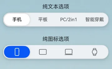
示例1(设置背景板材质)
以下示例通过backgroundSystemMaterial属性,为分段按钮设置了半透明的背景板材质。
从API version 23开始,TabSegmentButtonV2和CapsuleSegmentButtonV2中新增backgroundSystemMaterial属性。
import { SegmentButtonV2Items, TabSegmentButtonV2, CapsuleSegmentButtonV2 } from '@kit.ArkUI';
import uiMaterial from '@ohos.arkui.uiMaterial';

@Entry
@ComponentV2
struct SegmentButtonV2Example {
  @Local textItems: SegmentButtonV2Items = new SegmentButtonV2Items([
    { text: '手机' },
    { text: '平板' },
    { text: 'PC/2in1' },
    { text: '智能穿戴' },
  ]);
  @Local textSelectedIndex: number = 0;

  @Local imageItems: SegmentButtonV2Items = new SegmentButtonV2Items([
    { icon: $r('sys.media.ohos_ic_public_device_phone') },
    { icon: $r('sys.media.ohos_ic_public_device_pad') },
    { icon: $r('sys.media.ohos_ic_public_device_matebook') },
    { icon: $r('sys.media.ohos_ic_public_device_watch') },
  ]);
  @Local imageSelectedIndex: number = 0;

  build() {
    Scroll() {
      Stack() {
        // 作为分段按钮的背景,其中('app.media.pic')需要替换为开发者所需的图片
        Image($r('app.media.pic'))
        Column({ space: 12 }) {
          VCard({ title: '纯文本选项' }) {
            TabSegmentButtonV2({
              items: this.textItems,
              selectedIndex: this.textSelectedIndex!!,
              // 设置为半透明材质
              backgroundSystemMaterial:
              new uiMaterial.Material({ type: uiMaterial.MaterialType.SEMI_TRANSPARENT } as uiMaterial.MaterialOptions)
            })
          }

          VCard({ title: '纯图标选项' }) {
            CapsuleSegmentButtonV2({
              items: this.imageItems,
              selectedIndex: this.imageSelectedIndex!!,
              // 设置为半透明材质
              backgroundSystemMaterial:
              new uiMaterial.Material({ type: uiMaterial.MaterialType.SEMI_TRANSPARENT } as uiMaterial.MaterialOptions)
            })
          }

        }
        .constraintSize({ minHeight: '100%' })
        .justifyContent(FlexAlign.Start)
        .padding(16)
      }
      .backgroundColor('#f1f3f5')
      .width('100%')
      .height('100%')
    }
  }
}

@Builder
function Noop() {
}

@Component
export struct VCard {
  @Prop
  title: ResourceStr;
  @BuilderParam
  content: () => void = Noop;

  build() {
    Column({ space: 8 }) {
      if (this.title) {
        Text(this.title)
          .maxLines(1)
          .textOverflow({ overflow: TextOverflow.Ellipsis })
          .constraintSize({ maxWidth: '80%' })
      }
      this.content()
    }
    .backgroundColor(Color.Transparent)
    .borderRadius(8)
    .padding(8)
    .width('100%')
  }
}
你可能感兴趣的鸿蒙文章
openharmony 鸿蒙 ts-drawing-components-shape
openharmony 鸿蒙 ts-universal-attributes-sharp-clipping
openharmony 鸿蒙 ts-universal-attributes-toolbar
openharmony 鸿蒙 ts-container-lazyvgridlayout
openharmony 鸿蒙 ohos-arkui-advanced-FoldSplitContainer
openharmony 鸿蒙 ts-methods-calendarpicker-dialog
openharmony 鸿蒙 ts-uicommonevent
openharmony 鸿蒙 ts-basic-gestures-tapgesture