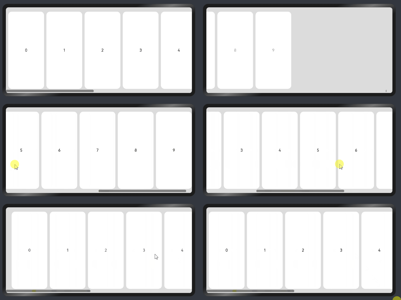
线性布局
线性布局(LinearLayout)是开发中最常用的布局。线性布局的子组件在线性方向上(水平方向和垂直方向)依次排列。
通过线性容器Row和Column实现线性布局。Column容器内子组件按照垂直方向排列,Row组件中,子组件按照水平方向排列。
线性布局的排列
线性布局的排列方向由所选容器组件决定。根据不同的排列方向,选择使用Row或Column容器创建线性布局,通过调整space,alignItems,justifyContent属性调整子组件的间距,水平垂直方向的对齐方式。
- 通过space参数设置主轴(排列方向)上子组件的间距。达到各子组件在排列方向上的等间距效果。
- 通过alignItems属性设置子组件在交叉轴(排列方向的垂直方向)的对齐方式。且在各类尺寸屏幕中,表现一致。其中,交叉轴为垂直方向时,取值为VerticalAlign类型,水平方向取值为HorizontalAlign类型。
- 通过justifyContent属性设置子组件在主轴(排列方向)上的对齐方式。实现布局的自适应均分能力。取值为FlexAlign类型。
具体使用以及效果如下表所示:
| 属性名 | 描述 | Row效果图 | Column效果图 |
|---|---|---|---|
| space | - 横向布局中各子组件的在水平方向的间距 - 纵向布局中个子组件垂直方向间距 | 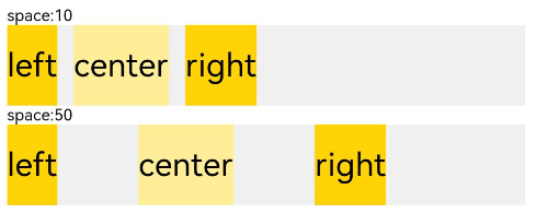 | 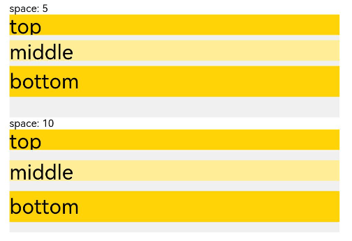 |
| alignItems | 容器排列方向的垂直方向上,子组件在父容器中的对齐方式 | 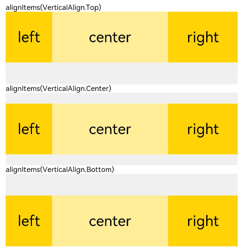 | 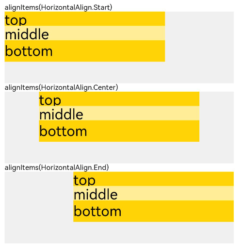 |
| justifyContent | 容器排列方向上,子组件在父容器中的对齐方式 | 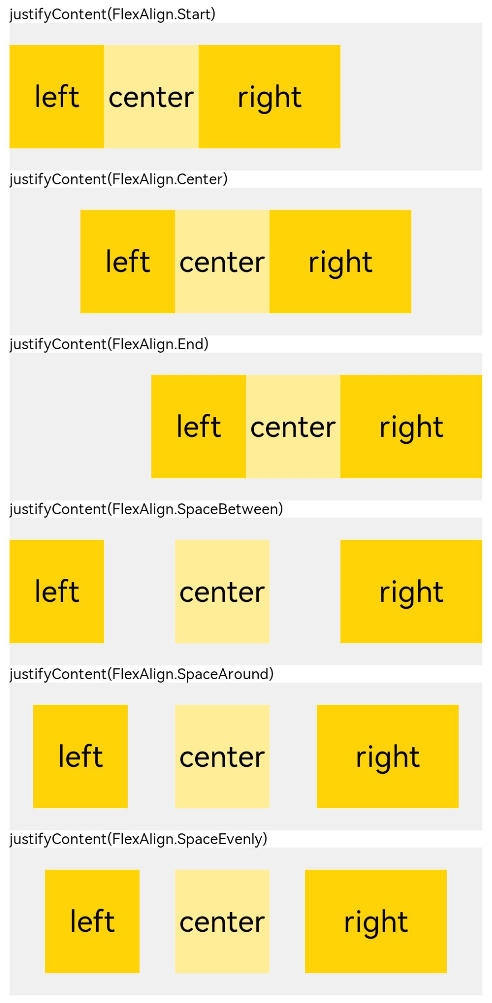 | 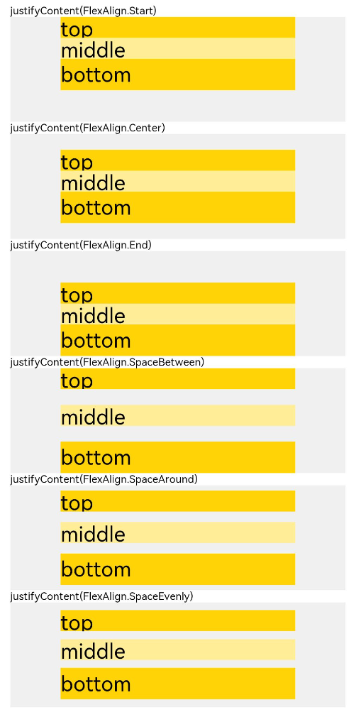 |
自适应拉伸
在线性布局下,常用空白填充组件Blank,在容器主轴方向自动填充空白空间,达到自适应拉伸效果。
@Entry
@Component
struct BlankExample {
  build() {
    Column() {
      Row() {
        Text('Bluetooth').fontSize(18)
        Blank()
        Toggle({ type: ToggleType.Switch, isOn: true })
      }.backgroundColor(0xFFFFFF).borderRadius(15).padding({ left: 12 }).width('100%')
    }.backgroundColor(0xEFEFEF).padding(20).width('100%')
  }
}

自适应缩放
自适应缩放是指在各种不同大小设备中,子组件按照预设的比例,尺寸随容器尺寸的变化而变化。在线性布局中有下列方法实现:
-
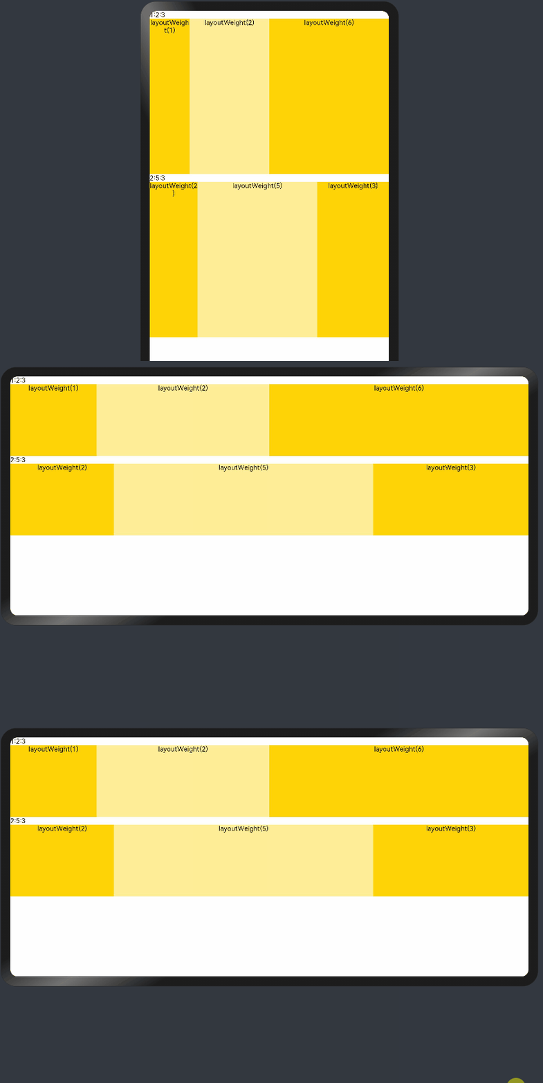
父容器尺寸确定时,设置了layoutWeight属性的子组件与兄弟元素占主轴尺寸按照权重进行分配,忽略元素本身尺寸设置,在任意尺寸设备下,自适应占满剩余空间。
@Entry
@Component
struct layoutWeightExample {
  build() {
    Column() {
      Text('1:2:3').width('100%')
      Row() {
        Column() {
          Text('layoutWeight(1)')
            .textAlign(TextAlign.Center)
        }.layoutWeight(2).backgroundColor(0xffd306).height('100%')

        Column() {
          Text('layoutWeight(2)')
            .textAlign(TextAlign.Center)
        }.layoutWeight(4).backgroundColor(0xffed97).height('100%')

        Column() {
          Text('layoutWeight(6)')
            .textAlign(TextAlign.Center)
        }.layoutWeight(6).backgroundColor(0xffd306).height('100%')

      }.backgroundColor(0xffd306).height('30%')

      Text('2:5:3').width('100%')
      Row() {
        Column() {
          Text('layoutWeight(2)')
            .textAlign(TextAlign.Center)
        }.layoutWeight(2).backgroundColor(0xffd306).height('100%')

        Column() {
          Text('layoutWeight(5)')
            .textAlign(TextAlign.Center)
        }.layoutWeight(5).backgroundColor(0xffed97).height('100%')

        Column() {
          Text('layoutWeight(3)')
            .textAlign(TextAlign.Center)
        }.layoutWeight(3).backgroundColor(0xffd306).height('100%')
      }.backgroundColor(0xffd306).height('30%')
    }
  }
}
-
父容器尺寸确定时,使用百分比设置子组件以及兄弟组件的width宽度,可以保证各自元素在任意尺寸下的自适应占比。
@Entry
@Component
struct WidthExample {
  build() {
    Column() {
      Row() {
        Column() {
          Text('left width 20%')
            .textAlign(TextAlign.Center)
        }.width('20%').backgroundColor(0xffd306).height('100%')

        Column() {
          Text('center width 50%')
            .textAlign(TextAlign.Center)
        }.width('50%').backgroundColor(0xffed97).height('100%')

        Column() {
          Text('right width 30%')
            .textAlign(TextAlign.Center)
        }.width('30%').backgroundColor(0xffd306).height('100%')
      }.backgroundColor(0xffd306).height('30%')
    }
  }
}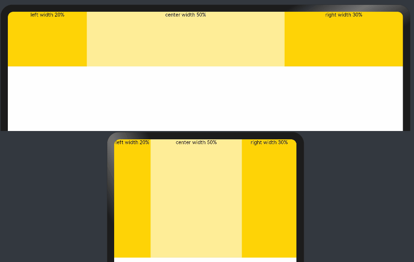
上例中,在任意大小的设备中,子组件的宽度占比固定。
定位能力
-
相对定位
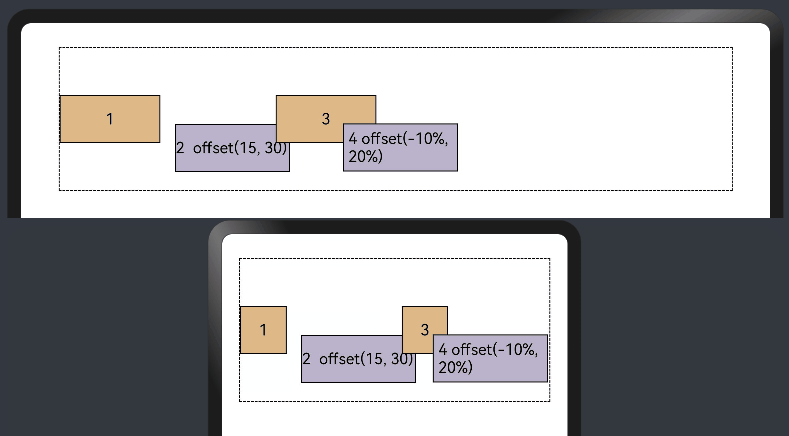
使用组件的offset属性可以实现相对定位,设置元素相对于自身的偏移量。设置该属性,不影响父容器布局,仅在绘制时进行位置调整。使用线性布局和offset可以实现大部分布局的开发。
@Entry
@Component
struct OffsetExample {
  @Styles eleStyle() {
    .size({ width: 120, height: '50' })
    .backgroundColor(0xbbb2cb)
    .border({ width: 1 })
  }

  build() {
    Column({ space: 20 }) {
      Row() {
        Text('1').size({ width: '15%', height: '50' }).backgroundColor(0xdeb887).border({ width: 1 }).fontSize(16)
        Text('2  offset(15, 30)')
          .eleStyle()
          .fontSize(16)
          .align(Alignment.Start)
          .offset({ x: 15, y: 30 })
        Text('3').size({ width: '15%', height: '50' }).backgroundColor(0xdeb887).border({ width: 1 }).fontSize(16)
        Text('4 offset(-10%, 20%)')
          .eleStyle()
          .fontSize(16)
          .offset({ x: '-5%', y: '20%' })
      }.width('90%').height(150).border({ width: 1, style: BorderStyle.Dashed })
    }
    .width('100%')
    .margin({ top: 25 })
  }
}
-
绝对定位
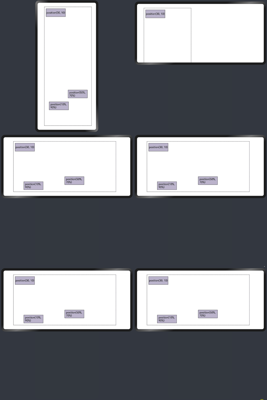
线性布局中可以使用组件的positon属性实现绝对布局(AbsoluteLayout),设置元素左上角相对于父容器左上角偏移位置。对于不同尺寸的设备,使用绝对定位的适应性会比较差,在屏幕的适配上有缺陷。
@Entry
@Component
struct PositionExample {
  @Styles eleStyle(){
    .backgroundColor(0xbbb2cb)
    .border({ width: 1 })
    .size({ width: 120, height: 50 })
  }

  build() {
    Column({ space: 20 }) {
      // 设置子组件左上角相对于父组件左上角的偏移位置
      Row() {
        Text('position(30, 10)')
          .eleStyle()
          .fontSize(16)
          .position({ x: 10, y: 10 })

        Text('position(50%, 70%)')
          .eleStyle()
          .fontSize(16)
          .position({ x: '50%', y: '70%' })

        Text('position(10%, 90%)')
          .eleStyle()
          .fontSize(16)
          .position({ x: '10%', y: '80%' })
      }.width('90%').height('100%').border({ width: 1, style: BorderStyle.Dashed })
    }
    .width('90%').margin(25)
  }
}
自适应延伸
自适应延伸是在不同尺寸设备下,当页面显示内容个数不一并延伸到屏幕外时,可通过滚动条拖动展示。适用于线性布局中内容无法一屏展示的场景。常见以下两类实现方法。
-
List组件
List子项过多一屏放不下时,未展示的子项通过滚动条拖动显示。通过scrollBar属性设置滚动条的常驻状态,edgeEffect属性设置拖动到极限的回弹效果。
纵向List:
  @Entry
  @Component
  struct ListExample1 {
    @State arr: string[] = ["0", "1", "2", "3", "4", "5", "6", "7", "8", "9", "10", "11", "12", "13", "14", "15"]
    @State alignListItem: ListItemAlign = ListItemAlign.Start

    build() {
      Column() {
        List({ space: 20, initialIndex: 0 }) {
          ForEach(this.arr, (item) => {
            ListItem() {
              Text('' + item)
                .width('100%')
                .height(100)
                .fontSize(16)
                .textAlign(TextAlign.Center)
                .borderRadius(10)
                .backgroundColor(0xFFFFFF)
            }
            .border({ width: 2, color: Color.Green })
          }, item => item)
        }
        .border({ width: 2, color: Color.Red, style: BorderStyle.Dashed })
        .scrollBar(BarState.On) // 滚动条常驻
        .edgeEffect(EdgeEffect.Spring) // 滚动到边缘再拖动回弹效果

      }.width('100%').height('100%').backgroundColor(0xDCDCDC).padding(20)
    }
  }
横向List:
  @Entry
  @Component
  struct ListExample2 {
    @State arr: string[] = ["0", "1", "2", "3", "4", "5", "6", "7", "8", "9", "10", "11", "12", "13", "14", "15"]
    @State alignListItem: ListItemAlign = ListItemAlign.Start

    build() {
      Column() {
        List({ space: 20, initialIndex: 0 }) {
          ForEach(this.arr, (item) => {
            ListItem() {
              Text('' + item)
                .height('100%')
                .width(100)
                .fontSize(16)
                .textAlign(TextAlign.Center)
                .borderRadius(10)
                .backgroundColor(0xFFFFFF)
            }
            .border({ width: 2, color: Color.Green })
          }, item => item)
        }
        .border({ width: 2, color: Color.Red, style: BorderStyle.Dashed })
        .scrollBar(BarState.On) // 滚动条常驻
        .edgeEffect(EdgeEffect.Spring) // 滚动到边缘再拖动回弹效果
        .listDirection(Axis.Horizontal)  // 列表水平排列
      }.width('100%').height('100%').backgroundColor(0xDCDCDC).padding(20)
    }
  }
-
Scroll组件
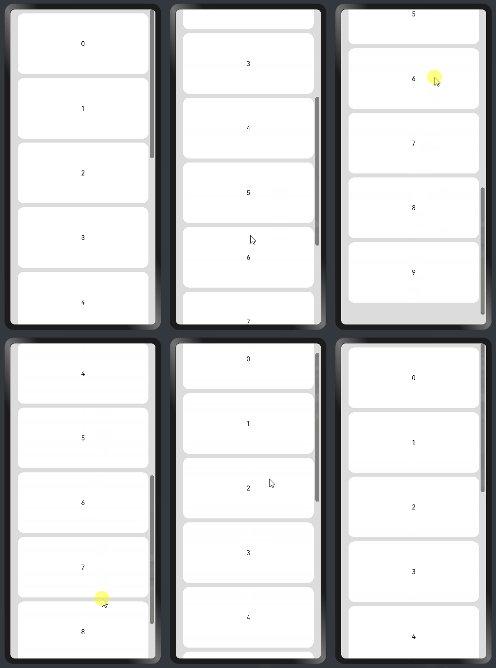
线性布局中,当子组件的布局尺寸超过父组件的尺寸时,内容可以滚动。在Column或者Row外层包裹一个可滚动的容器组件Scroll实现。
纵向Scroll:
@Entry
@Component
struct ScrollExample {
  scroller: Scroller = new Scroller();
  private arr: number[] = [0, 1, 2, 3, 4, 5, 6, 7, 8, 9];

  build() {
    Scroll(this.scroller) {
      Column() {
        ForEach(this.arr, (item) => {
          Text(item.toString())
            .width('90%')
            .height(150)
            .backgroundColor(0xFFFFFF)
            .borderRadius(15)
            .fontSize(16)
            .textAlign(TextAlign.Center)
            .margin({ top: 10 })
        }, item => item)
      }.width('100%')
    }
    .backgroundColor(0xDCDCDC)
    .scrollable(ScrollDirection.Vertical) // 滚动方向纵向
    .scrollBar(BarState.On) // 滚动条常驻显示
    .scrollBarColor(Color.Gray) // 滚动条颜色
    .scrollBarWidth(30) // 滚动条宽度
    .edgeEffect(EdgeEffect.Spring) // 滚动到边沿后回弹
  }
}
横向Scroll:
@Entry
@Component
struct ScrollExample {
  scroller: Scroller = new Scroller();
  private arr: number[] = [0, 1, 2, 3, 4, 5, 6, 7, 8, 9];

  build() {
    Scroll(this.scroller) {
      Row() {
        ForEach(this.arr, (item) => {
          Text(item.toString())
            .height('90%')
            .width(150)
            .backgroundColor(0xFFFFFF)
            .borderRadius(15)
            .fontSize(16)
            .textAlign(TextAlign.Center)
            .margin({ left: 10 })
        }, item => item)
      }.height('100%')
    }
    .backgroundColor(0xDCDCDC)
    .scrollable(ScrollDirection.Horizontal) // 滚动方向横向
    .scrollBar(BarState.On) // 滚动条常驻显示
    .scrollBarColor(Color.Gray) // 滚动条颜色
    .scrollBarWidth(30) // 滚动条宽度
    .edgeEffect(EdgeEffect.Spring) // 滚动到边沿后回弹
  }
}