ArkUI子系统Changelog
cl.arkui.1 Progress组件color属性设置渐变色规格变更
访问级别
公开接口
变更原因
Progress的渐变色能力增强,新增支持通过color设置Linear和Capsule进度条前景色为渐变色。
变更影响
此变更涉及应用适配。
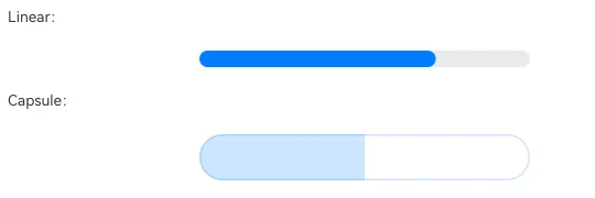
变更前:Progress进度条的Linear和Capsule样式通过color设置渐变色,设置后仅会显示为默认主题色。
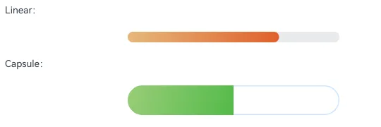
变更后:Progress进度条的Linear和Capsule样式通过color设置渐变色,设置后会显示为指定的渐变色。
例如使用下面代码,通过color设置Linear和Capsule样式进度条的前景色为渐变色,变更前均显示为默认主题色蓝色,变更后可以显示为实际的设置效果。
// xxx.ets
@Entry
@Component
struct ProgressExample {
  private gradientColor: LinearGradient = new LinearGradient([{ color: "#E5B87B", offset: 0.5 },
    { color: "#E05F2A", offset: 1.0 }])
  public gradientColor2: LinearGradient = new LinearGradient([{ color: "#99CD78", offset: 0.5 },
    { color: "#53BA49", offset: 1.0 }])

  build() {
    Column({ space: 15 }) {
      Text('Linear:').fontSize(9).width('90%')
      Progress({ value: 70, total: 100, type: ProgressType.Linear })
        .width(200).style({ strokeWidth: 10 })
        .color(this.gradientColor)

      Text('Capsule:').fontSize(9).width('90%')
      Progress({ value: 50, total: 100, type: ProgressType.Capsule })
        .width(200).style({ strokeWidth: 40 })
        .color(this.gradientColor2)
    }.width('100%').padding({ top: 5 })
  }
}
| 变更前 | 变更后 |
|---|---|
 |  |
起始API Level
7
变更发生版本
从OpenHarmony SDK 6.1.0.20开始。
变更的接口/组件
Progress组件的color属性。
适配指导
开发者需根据实际需求进行适配,如果期望进度条设置为单色,color中value参数的类型需为ResourceColor,参考示例如下。如果期望设置为渐变色,value参数的类型需为LinearGradient。
// xxx.ets
@Entry
@Component
struct ProgressExample {
  build() {
    Column({ space: 15 }) {
      Text('Linear Progress').fontSize(9).fontColor(0xCCCCCC).width('90%')
      Progress({ value: 20, total: 150, type: ProgressType.Linear }).color(Color.Grey).value(50).width(200)

      Text('Capsule Progress').fontSize(9).fontColor(0xCCCCCC).width('90%')
      Row({ space: 40 }) {
        Progress({ value: 20, total: 150, type: ProgressType.Capsule }).color(Color.Grey).value(50).width(100).height(50)
      }
    }.width('100%').margin({ top: 30 })
  }
}