harmony 鸿蒙@ohos.arkui.advanced.Counter(计数器组件)
@ohos.arkui.advanced.Counter(计数器组件)
Counter是用于精确调节数值的组件。
说明:
该组件从API Version 11开始支持。后续版本如有新增内容,则采用上角标单独标记该内容的起始版本。
导入模块
import {CounterType, CounterComponent, CounterOptions, DateData} from '@ohos.arkui.advanced.Counter';
子组件
无
CounterComponent
CounterComponent({options:CounterOptions} )
装饰器类型:@Component
系统能力: SystemCapability.ArkUI.ArkUI.Full
参数:
| 名称 | 类型 | 必填 | 装饰器类型 | 说明 |
|---|---|---|---|---|
| options | CounterOptions | 是 | @Prop | 定义counter组件的类型。 |
CounterOptions
CounterOptions定义Counter的类型及具体式样参数。
系统能力: SystemCapability.ArkUI.ArkUI.Full
| 名称 | 类型 | 必填 | 说明 |
|---|---|---|---|
| type | CounterTyle | 是 | 指定当前Counter的类型。 |
| numberOptions | NumberStyleOptions | 否 | 列表型和紧凑型counter的式样。 |
| inlineOptions | InlineStyleOptions | 否 | 数值型内联型counter的式样。 |
| dateOptions | DateStyleOptions | 否 | 日期型内联型counter的式样。 |
CounterTyle
CounterTyle指定Counter的类型,如列表型Counter。
系统能力: SystemCapability.ArkUI.ArkUI.Full
| 名称 | 说明 |
|---|---|
| LIST | 列表型Counter。 |
| COMPACT | 紧凑型Counter。 |
| INLINE | 普通数字内联调节型Counter。 |
| INLINE_DATE | 日期型内联型Counter。 |
CommonOptions
CommonOptions定义Counter的共通属性和事件。
系统能力: SystemCapability.ArkUI.ArkUI.Full
| 名称 | 类型 | 必填 | 默认值 | 说明 |
|---|---|---|---|---|
| focusable | boolean | 否 | true | 设置Counter是否可以获焦。 |
| step | number | 否 | 1 | 设置Counter的步长。 |
| onHoverIncrease | (isHover: boolean) =>void | 否 | - | 鼠标进入或退出Counter组件的增加按钮触发该回调。 isHover:表示鼠标是否悬浮在组件上,鼠标进入时为true, 退出时为false。 |
| onHoverDecrease | (isHover: boolean) =>void | 否 | - | 鼠标进入或退出Counter组件的减小按钮触发该回调。 isHover:表示鼠标是否悬浮在组件上,鼠标进入时为true, 退出时为false。 |
InlineStyleOptions
InlineStyleOptions定义Inline Style(数值内联型Counter)的属性和事件。
系统能力: SystemCapability.ArkUI.ArkUI.Full
| 名称 | 类型 | 必填 | 默认值 | 说明 |
|---|---|---|---|---|
| value | number | 否 | 0 | 设置Counter的初始值。 |
| min | number | 否 | 0 | 设置Counter的最小值。 |
| max | number | 否 | 999 | 设置Counter的最大值。 |
| textWidth | number | 否 | 0 | 设置数值文本的宽度。 |
| onChange | (value: number) =>void | 否 | - | 当数值改变时,返回当前值。 value:当前显示的数值。 |
NumberStyleOptions
NumberStyleOptions定义Number style(列表型Counter和紧凑型Counter)的属性和事件。
系统能力: SystemCapability.ArkUI.ArkUI.Full
| 名称 | 类型 | 必填 | 默认值 | 说明 |
|---|---|---|---|---|
| label | ResourceStr | 否 | - | 设置Counter的说明文本。 |
| onFocusIncrease | () =>void | 否 | - | 当前Counter组件增加按钮获取焦点时触发的回调。 |
| onFocusDecrease | () =>void | 否 | - | 当前Counter组件减小按钮获取焦点时触发的回调。 |
| onBlurIncrease | () =>void | 否 | - | 当前Counter组件增加按钮失去焦点时触发的回调。 |
| onBlurDecrease | () =>void | 否 | - | 当前Counter组件减小按钮失去焦点时触发的回调。 |
DateStyleOptions
DateStyleOptions定义Date style(日期内联型Counter)的属性和事件。
系统能力: SystemCapability.ArkUI.ArkUI.Full
| 名称 | 类型 | 必填 | 默认值 | 说明 |
|---|---|---|---|---|
| year | number | 否 | 1 | 设置日期内联型初始年份。 |
| month | number | 否 | 1 | 设置日期内联型初始月份。 |
| day | number | 否 | 1 | 设置日期内联型初始日。 |
| onDateChange | (date: DateData)=>void | 否 | - | 当日期改变时,返回当前日期。 date:当前显示的日期值。 |
DateData
DateData定义Date通用属性和方法,如年、月、日。
系统能力: SystemCapability.ArkUI.ArkUI.Full
| 名称 | 类型 | 必填 | 默认值 | 说明 |
|---|---|---|---|---|
| year | number | 是 | 1 | 设置日期内联型初始年份。 |
| month | number | 是 | 1 | 设置日期内联型初始月份。 |
| day | number | 是 | 1 | 设置日期内联型初始日。 |
| toString() | string | 是 | - | 以字符串格式返回当前日期值。 |
示例
示例1
import {CounterType, CounterComponent, CounterOptions, DateData} from '@ohos.arkui.advanced.Counter';
@Entry
@Component
struct ListCounterExample {
build() {
Column() {
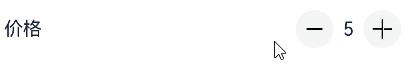
//列表型Counter
CounterComponent({ options: {
type: CounterType.LIST,
numberOptions: {
label: "价格",
min: 0,
value: 5,
max: 10,
}
}
})
}
}
}
示例2
import {CounterType, CounterComponent, CounterOptions, DateData} from '@ohos.arkui.advanced.Counter';
@Entry
@Component
struct CompactCounterExample {
  build() {
    Column() {
      //紧凑型Counter
      CounterComponent({ options: {
        type: CounterType.COMPACT,
        numberOptions: {
          label: "数量",
          value: 10,
          min: 0,
          max: 100,
          step: 10
        }
      }
      })
    }
  }
}

示例3
import {CounterType, CounterComponent, CounterOptions, DateData} from '@ohos.arkui.advanced.Counter';
@Entry
@Component
struct NumberStyleExample {
  build() {
    Column() {
      //数值内联型Counter
      CounterComponent({ options: {
        type: CounterType.INLINE,
        inlineOptions: {
          value: 100,
          min: 10,
          step: 2,
          max: 1000,
          textWidth: 100,
          onChange: (value: number) => {
          }
        } }
       })
    }
  }
}

示例4
import {CounterType, CounterComponent, CounterOptions, DateData} from '@ohos.arkui.advanced.Counter';
@Entry
@Component
struct DataStyleExample {
  build() {
    Column() {
      //日期内联型counter
      CounterComponent({ options: {
        type: CounterType.INLINE_DATE,
        dateOptions: {
          year: 2016,
          onDateChange: (date: DateData) => {
            console.log("onDateChange Date: " + date.toString());
          }
        } }
       })
    }
  }
}

你可能感兴趣的鸿蒙文章
harmony 鸿蒙@ohos.arkui.advanced.SegmentButton(分段按钮)
- 所属分类: 后端技术
- 本文标签:
热门推荐
-
2、 优质文章
-
3、 gt
-
7、 openharmony
-
9、 golang
-
10、 Vue中input框自动聚焦