属性字符串
方便灵活应用文本样式的对象,可通过TextController中的setStyledString方法与Text组件绑定,可通过RichEditorStyledStringController中的setStyledString方法与RichEditor组件绑定。
说明:
从API version 12开始支持。后续版本如有新增内容,则采用上角标单独标记该内容的起始版本。
属性字符串目前不支持在worker线程中使用。
属性字符串通过controller绑定时,需要等待布局完成后,绑定生效。当measure和setStyledString同时使用,开发者需要通过@ohos.arkui.inspector (布局回调)判断布局完成,再绑定属性字符串。
规则说明
- 当组件样式和属性字符串中的样式冲突时,冲突部分以属性字符串设置的样式为准,未冲突部分则生效组件的样式。
- 当属性字符串和Text子组件冲突时,属性字符串优先级高,即当Text组件中绑定了属性字符串,忽略Text组件下包含Span等子组件的情况。
- 不支持@State修饰。
- 建议将StyledString定义为成员变量,从而避免应用退后台后被销毁。
StyledString
constructor
constructor(value: string|ImageAttachment|CustomSpan , styles?: Array<StyleOptions>)
属性字符串的构造函数。
原子化服务API: 从API version 12开始,该接口支持在原子化服务中使用。
系统能力: SystemCapability.ArkUI.ArkUI.Full
参数:
| 参数名 | 类型 | 必填 | 说明 |
|---|---|---|---|
| value | string |ImageAttachment |CustomSpan | 是 | 属性字符串文本内容。 说明: 当value值为ImageAttachment或CustomSpan时,styles参数不生效。 |
| styles | Array<StyleOptions> | 否 | 属性字符串初始化选项。 说明: start为异常值时,按默认值0处理。 当start的值合法且length为异常值时,length的值为属性字符串长度与start的值的差值。 StyledStringKey与StyledStringValue不匹配时,不生效。 styledKey参数无默认值。 |
属性
原子化服务API: 从API version 12开始,该接口支持在原子化服务中使用。
系统能力: SystemCapability.ArkUI.ArkUI.Full
| 名称 | 类型 | 只读 | 可选 | 说明 |
|---|---|---|---|---|
| length | number | 是 | 否 | 属性字符串字符的长度。 说明: 当属性字符串中包含图片或者CustomSpan时,其返回的长度按1计算。 |
getString
getString(): string
获取字符串信息。
原子化服务API: 从API version 12开始,该接口支持在原子化服务中使用。
系统能力: SystemCapability.ArkUI.ArkUI.Full
返回值:
| 类型 | 说明 |
|---|---|
| string | 属性字符串文本内容。 说明: 当属性字符串中包含图片时,其返回的结果用空格表示。 |
equals
equals(other: StyledString): boolean
判断两个属性字符串是否相等。
原子化服务API: 从API version 12开始,该接口支持在原子化服务中使用。
系统能力: SystemCapability.ArkUI.ArkUI.Full
参数:
| 参数名 | 类型 | 必填 | 说明 |
|---|---|---|---|
| other | StyledString | 是 | StyledString类型的比较对象。 |
返回值:
| 类型 | 说明 |
|---|---|
| boolean | 两个属性字符串是否相等。 true表示相等,false表示不相等。 说明: 当属性字符串的文本及样式均一致,视为相等。 不比较GestureStyle,当属性字符串配置了不同事件,文本和其他样式相同时,亦视为相等。 当比较CustomSpan时,比较的是地址,地址相等,视为相等。 |
subStyledString
subStyledString(start: number, length?: number): StyledString
获取属性字符串的子字符串。
原子化服务API: 从API version 12开始,该接口支持在原子化服务中使用。
系统能力: SystemCapability.ArkUI.ArkUI.Full
参数:
| 参数名 | 类型 | 必填 | 说明 |
|---|---|---|---|
| start | number | 是 | 子属性字符串开始位置的下标。 |
| length | number | 否 | 子属性字符串的长度。 |
返回值:
| 类型 | 说明 |
|---|---|
| StyledString | 子属性字符串。 说明: 当start为合法入参时,length的默认值是被查询属性字符串对象的长度与start的值的差。 当start和length越界或者必填传入undefined时,会抛出异常。 |
错误码:
以下错误码详细介绍请参考通用错误码。
| 错误码ID | 错误信息 |
|---|---|
| 401 | Parameter error. Possible causes: 1. Mandatory parameters are left unspecified; 2.Incorrect parameters types; 3. Parameter verification failed. |
getStyles
getStyles(start: number , length: number , styledKey?: StyledStringKey): Array<SpanStyle>
获取指定范围属性字符串的样式集合。
原子化服务API: 从API version 12开始,该接口支持在原子化服务中使用。
系统能力: SystemCapability.ArkUI.ArkUI.Full
参数:
| 参数名 | 类型 | 必填 | 说明 |
|---|---|---|---|
| start | number | 是 | 指定范围属性字符串的下标。 |
| length | number | 是 | 指定范围属性字符串的长度。 |
| styledKey | StyledStringKey | 否 | 指定范围属性字符串样式的枚举值。 |
返回值:
| 类型 | 说明 |
|---|---|
| Array<SpanStyle> | 各样式对象的数组。 说明: 当指定范围属性字符串未设置任何样式,则返回空数组。 当start和length越界或者必填传入undefined时,会抛出异常; 当styledKey传入异常值或undefined时,会抛出异常。 当styledKey为CustomSpan时,返回的是创建CustomSpan时传入的样式对象,即修改该样式对象也会影响实际的显示效果。 |
错误码:
以下错误码详细介绍请参考通用错误码。
| 错误码ID | 错误信息 |
|---|---|
| 401 | Parameter error. Possible causes: 1. Mandatory parameters are left unspecified; 2.Incorrect parameters types; 3. Parameter verification failed. |
fromHtml
static fromHtml(html: string): Promise<StyledString>
将HTML格式字符串转换成属性字符串,当前支持转换的HTML标签范围:<p>、<span>、<img>、<br>、<strong>、<b>、<a>、<i>、<em>、<s>、<u>、<del>、<sup>、<sub>。支持将标签中的style属性样式转换成对应的属性字符串样式。
使用方法参考示例8(支持转换HTML格式字符串)。
| 标签名称 | 说明 |
|---|---|
| <p> | 段落,分隔文本段落 |
| <span> | 行内文本,支持样式设置 |
| <img> | 插入图片 |
| <strong> | 加粗文本 |
| <br>20+ | 换行 |
| <b>20+ | 加粗文本 |
| <a>20+ | 超链接 |
| <i>20+ | 斜体文本 |
| <em>20+ | 斜体文本 |
| <s>20+ | 删除线(中划线) |
| <u>20+ | 下划线 |
| <del>20+ | 删除线(中划线) |
| <sup>20+ | 上标文本 |
| <sub>20+ | 下标文本 |
原子化服务API: 从API version 12开始,该接口支持在原子化服务中使用。
系统能力: SystemCapability.ArkUI.ArkUI.Full
参数:
| 参数名 | 类型 | 必填 | 说明 |
|---|---|---|---|
| html | string | 是 | html格式的字符串。 |
返回值:
| 类型 | 说明 |
|---|---|
| StyledString | 属性字符串。 |
错误码:
| 错误码ID | 错误信息 |
|---|---|
| 401 | Parameter error. Possible causes: 1. Mandatory parameters are left unspecified; 2.Incorrect parameters types; 3. Parameter verification failed. |
| 170001 | Convert Error. |
toHtml14+
static toHtml(styledString: StyledString): string
将属性字符串转换成HTML格式字符串。支持转换的属性字符串StyledStringKey包括:StyledStringKey.FONT、StyledStringKey.DECORATION、StyledStringKey.LETTER_SPACING、StyledStringKey.TEXT_SHADOW、StyledStringKey.LINE_HEIGHT、StyledStringKey.IMAGE。
使用方法参考示例8(支持转换HTML格式字符串)。
原子化服务API: 从API version 14开始,该接口支持在原子化服务中使用。
系统能力: SystemCapability.ArkUI.ArkUI.Full
参数:
| 参数名 | 类型 | 必填 | 说明 |
|---|---|---|---|
| styledString | StyledString | 是 | 属性字符串。 |
返回值:
| 类型 | 说明 |
|---|---|
| string | HTML格式字符串。 |
错误码:
以下错误码详细介绍请参考通用错误码。
| 错误码ID | 错误信息 |
|---|---|
| 401 | Parameter error. Possible causes: 1. Mandatory parameters are left unspecified; 2.Incorrect parameters types; 3. Parameter verification failed. |
MutableStyledString
继承于StyledString类。
以下接口异常入参处理统一说明:
当start和length越界或者必填传入undefined时,会抛出异常;
当styledKey和styledValue传入异常值或者两者对应关系不匹配时,会抛出异常。
replaceString
replaceString(start: number , length: number , other: string): void
替换指定范围的字符串。
原子化服务API: 从API version 12开始,该接口支持在原子化服务中使用。
系统能力: SystemCapability.ArkUI.ArkUI.Full
参数:
| 参数名 | 类型 | 必填 | 说明 |
|---|---|---|---|
| start | number | 是 | 指定范围的下标。 |
| length | number | 是 | 指定范围的长度。 |
| other | string | 是 | 替换的新文本内容。 说明: 替换的字符串使用的是start位置字符的样式。 |
错误码:
以下错误码详细介绍请参考通用错误码。
| 错误码ID | 错误信息 |
|---|---|
| 401 | Parameter error. Possible causes: 1. Mandatory parameters are left unspecified; 2.Incorrect parameters types; 3. Parameter verification failed. |
insertString
insertString(start: number , other: string): void
插入字符串。
原子化服务API: 从API version 12开始,该接口支持在原子化服务中使用。
系统能力: SystemCapability.ArkUI.ArkUI.Full
参数:
| 参数名 | 类型 | 必填 | 说明 |
|---|---|---|---|
| start | number | 是 | 插入位置的下标。 |
| other | string | 是 | 插入的新文本内容。 说明: 插入的字符串使用的是start-1位置字符的样式。若start-1位置字符未设置样式,则使用start位置字符样式。 |
错误码:
以下错误码详细介绍请参考通用错误码。
| 错误码ID | 错误信息 |
|---|---|
| 401 | Parameter error. Possible causes: 1. Mandatory parameters are left unspecified; 2.Incorrect parameters types; 3. Parameter verification failed. |
removeString
removeString(start: number , length: number): void
移除指定范围的字符串。
当属性字符串中包含图片时,同样生效。
原子化服务API: 从API version 12开始,该接口支持在原子化服务中使用。
系统能力: SystemCapability.ArkUI.ArkUI.Full
参数:
| 参数名 | 类型 | 必填 | 说明 |
|---|---|---|---|
| start | number | 是 | 指定范围的下标。 |
| length | number | 是 | 指定范围的长度。 |
错误码:
以下错误码详细介绍请参考通用错误码。
| 错误码ID | 错误信息 |
|---|---|
| 401 | Parameter error. Possible causes: 1. Mandatory parameters are left unspecified; 2.Incorrect parameters types; 3. Parameter verification failed. |
replaceStyle
replaceStyle(spanStyle: SpanStyle): void
替换指定范围内容为指定类型新样式。
原子化服务API: 从API version 12开始,该接口支持在原子化服务中使用。
系统能力: SystemCapability.ArkUI.ArkUI.Full
参数:
| 参数名 | 类型 | 必填 | 说明 |
|---|---|---|---|
| spanStyle | SpanStyle | 是 | 样式对象。 说明: 默认清空原有样式,替换为新样式。 当SpanStyle的styledKey为IMAGE或CUSTOM_SPAN时,只有当start的位置当前是image或CustomSpan且长度为1,才会生效,其余情况无效果。 |
错误码:
以下错误码详细介绍请参考通用错误码。
| 错误码ID | 错误信息 |
|---|---|
| 401 | Parameter error. Possible causes: 1. Mandatory parameters are left unspecified; 2.Incorrect parameters types; 3. Parameter verification failed. |
setStyle
setStyle(spanStyle: SpanStyle): void
为指定范围内容设置指定类型新样式。
原子化服务API: 从API version 12开始,该接口支持在原子化服务中使用。
系统能力: SystemCapability.ArkUI.ArkUI.Full
参数:
| 参数名 | 类型 | 必填 | 说明 |
|---|---|---|---|
| spanStyle | SpanStyle | 是 | 样式对象。 说明: 默认不清空原有样式,叠加新样式。若是已有样式,则更新。 当SpanStyle的styledKey为IMAGE或CUSTOM_SPAN时,只有当start的位置当前是image或者CustomSpan且长度为1,才会生效,其余情况无效果。 |
错误码:
以下错误码详细介绍请参考通用错误码。
| 错误码ID | 错误信息 |
|---|---|
| 401 | The parameter check failed. |
removeStyle
removeStyle(start: number , length: number , styledKey: StyledStringKey): void
清除指定范围内容的指定类型样式。
被清空样式类型对象属性使用的是对应Text组件属性的设置值,若Text组件未设置值,则使用对应Text组件属性的默认值。
当属性字符串中包含图片时,同样生效。
原子化服务API: 从API version 12开始,该接口支持在原子化服务中使用。
系统能力: SystemCapability.ArkUI.ArkUI.Full
参数:
| 参数名 | 类型 | 必填 | 说明 |
|---|---|---|---|
| start | number | 是 | 指定范围开始位置的下标。 |
| length | number | 是 | 指定范围的长度。 |
| styledKey | StyledStringKey | 是 | 样式类型枚举值。 |
错误码:
以下错误码详细介绍请参考通用错误码。
| 错误码ID | 错误信息 |
|---|---|
| 401 | Parameter error. Possible causes: 1. Mandatory parameters are left unspecified; 2.Incorrect parameters types; 3. Parameter verification failed. |
removeStyles
removeStyles(start: number , length: number): void
清除指定范围内容的所有样式。
被清空样式类型对象属性使用的是对应Text组件属性的设置值,若Text组件未设置值,则使用对应Text组件属性的默认值。
当属性字符串中包含图片时,同样生效。
原子化服务API: 从API version 12开始,该接口支持在原子化服务中使用。
系统能力: SystemCapability.ArkUI.ArkUI.Full
参数:
| 参数名 | 类型 | 必填 | 说明 |
|---|---|---|---|
| start | number | 是 | 指定范围开始位置的下标。 |
| length | number | 是 | 指定范围的长度。 |
错误码:
以下错误码详细介绍请参考通用错误码。
| 错误码ID | 错误信息 |
|---|---|
| 401 | Parameter error. Possible causes: 1. Mandatory parameters are left unspecified; 2.Incorrect parameters types; 3. Parameter verification failed. |
clearStyles
clearStyles(): void
清除属性字符串对象的所有样式。
被清空样式类型对象属性使用的是对应Text组件属性的设置值,若Text组件未设置值,则使用对应Text组件属性的默认值。
原子化服务API: 从API version 12开始,该接口支持在原子化服务中使用。
系统能力: SystemCapability.ArkUI.ArkUI.Full
replaceStyledString
replaceStyledString(start: number , length: number , other: StyledString): void
替换指定范围为新的属性字符串。
原子化服务API: 从API version 12开始,该接口支持在原子化服务中使用。
系统能力: SystemCapability.ArkUI.ArkUI.Full
参数:
| 参数名 | 类型 | 必填 | 说明 |
|---|---|---|---|
| start | number | 是 | 指定范围开始位置的下标。 |
| length | number | 是 | 指定范围的长度。 |
| other | StyledString | 是 | 新的属性字符串对象。 |
错误码:
以下错误码详细介绍请参考通用错误码。
| 错误码ID | 错误信息 |
|---|---|
| 401 | Parameter error. Possible causes: 1. Mandatory parameters are left unspecified; 2.Incorrect parameters types; 3. Parameter verification failed. |
insertStyledString
insertStyledString(start: number , other: StyledString): void
在指定位置插入新的属性字符串。
原子化服务API: 从API version 12开始,该接口支持在原子化服务中使用。
系统能力: SystemCapability.ArkUI.ArkUI.Full
参数:
| 参数名 | 类型 | 必填 | 说明 |
|---|---|---|---|
| start | number | 是 | 开始插入位置的下标。 |
| other | StyledString | 是 | 新的属性字符串对象。 |
错误码:
以下错误码详细介绍请参考通用错误码。
| 错误码ID | 错误信息 |
|---|---|
| 401 | Parameter error. Possible causes: 1. Mandatory parameters are left unspecified; 2.Incorrect parameters types; 3. Parameter verification failed. |
appendStyledString
appendStyledString(other: StyledString): void
在末尾位置追加新的属性字符串。
原子化服务API: 从API version 12开始,该接口支持在原子化服务中使用。
系统能力: SystemCapability.ArkUI.ArkUI.Full
参数:
| 参数名 | 类型 | 必填 | 说明 |
|---|---|---|---|
| other | StyledString | 是 | 新的属性字符串对象。 |
StyledStringValue
type StyledStringValue = TextStyle|DecorationStyle|BaselineOffsetStyle|LetterSpacingStyle| TextShadowStyle|GestureStyle|ImageAttachment|ParagraphStyle|LineHeightStyle|UrlStyle|CustomSpan|UserDataSpan|BackgroundColorStyle
样式对象类型,用于设置属性字符串的样式。
原子化服务API: 从API version 12开始,该接口支持在原子化服务中使用。
系统能力: SystemCapability.ArkUI.ArkUI.Full
| 类型 | 说明 |
|---|---|
| TextStyle | 文本字体样式。 |
| DecorationStyle | 文本装饰线样式。 |
| BaselineOffsetStyle | 文本基线偏移量样式。 |
| LetterSpacingStyle | 文本字符间距样式。 |
| LineHeightStyle | 文本行高样式。 |
| TextShadowStyle | 文本阴影样式。 |
| GestureStyle | 事件手势样式。 |
| ParagraphStyle | 文本段落样式。 |
| ImageAttachment | 图片样式。 |
| CustomSpan | 自定义绘制Span样式。 |
| UserDataSpan | UserDataSpan样式。 |
| UrlStyle | 超链接样式。 |
| BackgroundColorStyle | 文本背景颜色样式。 |
StyleOptions对象说明
原子化服务API: 从API version 12开始,该接口支持在原子化服务中使用。
系统能力: SystemCapability.ArkUI.ArkUI.Full
| 名称 | 类型 | 必填 | 说明 |
|---|---|---|---|
| start | number | 否 | 设置属性字符串样式的开始位置。 当start的值小于0或超出字符串长度时,按0处理。 |
| length | number | 否 | 设置属性字符串样式的长度。 当length的值小于0或超出字符串长度与start的差值时,按字符串长度与start的差值处理。 |
| styledKey | StyledStringKey | 是 | 样式类型的枚举值。 |
| styledValue | StyledStringValue | 是 | 样式对象。 |
SpanStyle对象说明
原子化服务API: 从API version 12开始,该接口支持在原子化服务中使用。
系统能力: SystemCapability.ArkUI.ArkUI.Full
| 名称 | 类型 | 必填 | 说明 |
|---|---|---|---|
| start | number | 是 | 匹配属性字符串样式的开始位置。 |
| length | number | 是 | 匹配属性字符串样式的长度。 |
| styledKey | StyledStringKey | 是 | 样式类型的枚举值。 |
| styledValue | StyledStringValue | 是 | 样式对象。 |
TextStyle
文本字体样式对象说明。
系统能力: SystemCapability.ArkUI.ArkUI.Full
属性
系统能力: SystemCapability.ArkUI.ArkUI.Full
| 名称 | 类型 | 只读 | 可选 | 说明 |
|---|---|---|---|---|
| fontColor | ResourceColor | 是 | 是 | 获取属性字符串的文本颜色。 原子化服务API: 从API version 12开始,该接口支持在原子化服务中使用。 |
| fontFamily | string | 是 | 是 | 获取属性字符串的文本字体。 默认返回undefined。 原子化服务API: 从API version 12开始,该接口支持在原子化服务中使用。 |
| fontSize | number | 是 | 是 | 获取属性字符串的文本字体大小。 单位:fp 原子化服务API: 从API version 12开始,该接口支持在原子化服务中使用。 |
| fontWeight | number | 是 | 是 | 获取属性字符串的文本字体粗细。 原子化服务API: 从API version 12开始,该接口支持在原子化服务中使用。 |
| fontStyle | FontStyle | 是 | 是 | 获取属性字符串的文本字体样式。 原子化服务API: 从API version 12开始,该接口支持在原子化服务中使用。 |
| strokeWidth20+ | number | 是 | 是 | 获取属性字符串的文本描边宽度。 默认返回0,单位为vp。 原子化服务API: 从API version 20开始,该接口支持在原子化服务中使用。 |
| strokeColor20+ | ResourceColor | 是 | 是 | 获取属性字符串的文本描边颜色。 默认返回字体颜色。 原子化服务API: 从API version 20开始,该接口支持在原子化服务中使用。 |
| superscript20+ | SuperscriptStyle | 是 | 是 | 获取属性字符串的文本上下角标。 默认值:SuperscriptStyle.NORMAL。 原子化服务API: 从API version 20开始,该接口支持在原子化服务中使用。 |
constructor
constructor(value?: TextStyleInterface)
文本字体样式的构造函数。
原子化服务API: 从API version 12开始,该接口支持在原子化服务中使用。
系统能力: SystemCapability.ArkUI.ArkUI.Full
参数:
| 参数名 | 类型 | 必填 | 说明 |
|---|---|---|---|
| value | TextStyleInterface | 否 | 字体样式设置项。 |
TextStyleInterface对象说明
系统能力: SystemCapability.ArkUI.ArkUI.Full
| 名称 | 类型 | 必填 | 说明 |
|---|---|---|---|
| fontColor | ResourceColor | 否 | 字体颜色。 原子化服务API: 从API version 12开始,该接口支持在原子化服务中使用。 |
| fontFamily | ResourceStr | 否 | 文本字体。 原子化服务API: 从API version 12开始,该接口支持在原子化服务中使用。 |
| fontSize | LengthMetrics | 否 | 字体大小。如果LengthMetrics的unit值是percent,当前设置不生效,处理为16fp。 单位:fp 原子化服务API: 从API version 12开始,该接口支持在原子化服务中使用。 |
| fontWeight | number|FontWeight |string | 否 | 字体粗细。 number类型取值[100, 900],取值间隔为100,默认为400,取值越大,字体越粗。string类型仅支持number类型取值的字符串形式,例如"400",以及"bold"、"bolder"、"lighter"、"regular"、"medium",分别对应FontWeight中相应的枚举值。 原子化服务API: 从API version 12开始,该接口支持在原子化服务中使用。 |
| fontStyle | FontStyle | 否 | 字体样式。 原子化服务API: 从API version 12开始,该接口支持在原子化服务中使用。 |
| strokeWidth20+ | LengthMetrics | 否 | 文本描边宽度。如果LengthMetrics的unit值是percent,当前设置不生效,处理为0。 设置值小于0时为实心字,大于0时为空心字。 默认值为0。 原子化服务API: 从API version 20开始,该接口支持在原子化服务中使用。 |
| strokeColor20+ | ResourceColor | 否 | 文本描边颜色。 默认值为字体颜色,设置异常值时取字体颜色。 原子化服务API: 从API version 20开始,该接口支持在原子化服务中使用。 |
| superscript20+ | SuperscriptStyle | 否 | 文本上下角标。 默认值:SuperscriptStyle.NORMAL。 原子化服务API: 从API version 20开始,该接口支持在原子化服务中使用。 |
GestureStyle
事件手势对象说明。
系统能力: SystemCapability.ArkUI.ArkUI.Full
constructor
constructor(value?: GestureStyleInterface)
事件手势的构造函数。
原子化服务API: 从API version 12开始,该接口支持在原子化服务中使用。
系统能力: SystemCapability.ArkUI.ArkUI.Full
参数:
| 参数名 | 类型 | 必填 | 说明 |
|---|---|---|---|
| value | GestureStyleInterface | 否 | 事件设置项。 |
GestureStyleInterface对象说明
系统能力: SystemCapability.ArkUI.ArkUI.Full
| 名称 | 类型 | 必填 | 说明 |
|---|---|---|---|
| onClick | Callback<ClickEvent> | 否 | 设置点击事件。 原子化服务API: 从API version 12开始,该接口支持在原子化服务中使用。 |
| onLongPress | Callback<GestureEvent> | 否 | 设置长按事件。 原子化服务API: 从API version 12开始,该接口支持在原子化服务中使用。 |
| onTouch20+ | Callback<TouchEvent> | 否 | 设置触摸事件。 原子化服务API: 从API version 20开始,该接口支持在原子化服务中使用。 |
DecorationOptions20+
文本装饰线样式的额外配置选项对象说明。
原子化服务API: 从API version 20开始,该接口支持在原子化服务中使用。
系统能力: SystemCapability.ArkUI.ArkUI.Full
| 名称 | 类型 | 必填 | 说明 |
|---|---|---|---|
| enableMultiType | boolean | 否 | 是否开启多装饰线显示。 默认值:undefined。设置为true开启,设置为false/undefined关闭。 所有需要显示的装饰线都必须启用此选项,在这些装饰线的交集区域显示多装饰线效果,样式、颜色和粗细将采用最后设置的装饰线的效果。 |
DecorationStyle
文本装饰线样式对象说明。
系统能力: SystemCapability.ArkUI.ArkUI.Full
属性
系统能力: SystemCapability.ArkUI.ArkUI.Full
| 名称 | 类型 | 只读 | 可选 | 说明 |
|---|---|---|---|---|
| type | TextDecorationType | 是 | 否 | 获取属性字符串的文本装饰线类型。 原子化服务API: 从API version 12开始,该接口支持在原子化服务中使用。 |
| color | ResourceColor | 是 | 是 | 获取属性字符串的文本装饰线颜色。 原子化服务API: 从API version 12开始,该接口支持在原子化服务中使用。 |
| style | TextDecorationStyle | 是 | 是 | 获取属性字符串的文本装饰线样式。 原子化服务API: 从API version 12开始,该接口支持在原子化服务中使用。 |
| thicknessScale20+ | number | 是 | 是 | 获取属性字符串的文本装饰线粗细缩放值。 原子化服务API: 从API version 20开始,该接口支持在原子化服务中使用。 |
| options20+ | DecorationOptions | 是 | 是 | 获取属性字符串的文本装饰线样式的额外配置选项。 原子化服务API: 从API version 20开始,该接口支持在原子化服务中使用。 |
constructor
constructor(value: DecorationStyleInterface)
文本装饰线样式的构造函数。
原子化服务API: 从API version 12开始,该接口支持在原子化服务中使用。
系统能力: SystemCapability.ArkUI.ArkUI.Full
参数:
| 参数名 | 类型 | 必填 | 说明 |
|---|---|---|---|
| value | DecorationStyleInterface | 是 | 文本装饰线设置项。 默认值: { type: TextDecorationType.None, color: Color.Black, style: TextDecorationStyle.SOLID } |
constructor20+
constructor(value: DecorationStyleInterface, options?: DecorationOptions)
文本装饰线样式的构造函数,包含额外配置选项。
原子化服务API: 从API version 20开始,该接口支持在原子化服务中使用。
系统能力: SystemCapability.ArkUI.ArkUI.Full
参数:
| 参数名 | 类型 | 必填 | 说明 |
|---|---|---|---|
| value | DecorationStyleInterface | 是 | 文本装饰线设置项。 默认值: { type: TextDecorationType.None, color: Color.Black, style: TextDecorationStyle.SOLID } |
| options | DecorationOptions | 否 | 文本装饰线额外配置选项。 默认值: { enableMultiType: undefined } |
DecorationStyleInterface
文本装饰线样式接口对象说明。
系统能力: SystemCapability.ArkUI.ArkUI.Full
| 名称 | 类型 | 必填 | 说明 |
|---|---|---|---|
| type | TextDecorationType | 是 | 装饰线类型。 默认值:TextDecorationType.None 原子化服务API: 从API version 12开始,该接口支持在原子化服务中使用。 |
| color | ResourceColor | 否 | 装饰线颜色。 默认值:Color.Black 原子化服务API: 从API version 12开始,该接口支持在原子化服务中使用。 |
| style | TextDecorationStyle | 否 | 装饰线样式。 默认值:TextDecorationStyle.SOLID 原子化服务API: 从API version 12开始,该接口支持在原子化服务中使用。 |
| thicknessScale20+ | number | 否 | 装饰线粗细缩放。 默认值:1.0 取值范围:[0, +∞) 原子化服务API: 从API version 20开始,该接口支持在原子化服务中使用。 |
BaselineOffsetStyle
文本基线偏移量对象说明。
系统能力: SystemCapability.ArkUI.ArkUI.Full
属性
原子化服务API: 从API version 12开始,该接口支持在原子化服务中使用。
系统能力: SystemCapability.ArkUI.ArkUI.Full
| 名称 | 类型 | 只读 | 可选 | 说明 |
|---|---|---|---|---|
| baselineOffset | number | 是 | 否 | 获取属性字符串的文本基线偏移量。 单位:vp |
constructor
constructor(value: LengthMetrics)
文本基线偏移的构造函数。
原子化服务API: 从API version 12开始,该接口支持在原子化服务中使用。
系统能力: SystemCapability.ArkUI.ArkUI.Full
参数:
| 参数名 | 类型 | 必填 | 说明 |
|---|---|---|---|
| value | LengthMetrics | 是 | 文本基线偏移量设置项。如果LengthMetrics的unit值是percent,该设置不生效。 |
LetterSpacingStyle
文本字符间距对象说明。
系统能力: SystemCapability.ArkUI.ArkUI.Full
属性
原子化服务API: 从API version 12开始,该接口支持在原子化服务中使用。
系统能力: SystemCapability.ArkUI.ArkUI.Full
| 名称 | 类型 | 只读 | 可选 | 说明 |
|---|---|---|---|---|
| letterSpacing | number | 是 | 否 | 获取属性字符串的文本字符间距。 单位:vp |
constructor
constructor(value: LengthMetrics)
文本字符间距的构造函数。
原子化服务API: 从API version 12开始,该接口支持在原子化服务中使用。
系统能力: SystemCapability.ArkUI.ArkUI.Full
参数:
| 参数名 | 类型 | 必填 | 说明 |
|---|---|---|---|
| value | LengthMetrics | 是 | 文本字符间距设置项。如果LengthMetrics的unit值是percent,该设置不生效。 |
LineHeightStyle
文本行高对象说明。
系统能力: SystemCapability.ArkUI.ArkUI.Full
属性
原子化服务API: 从API version 12开始,该接口支持在原子化服务中使用。
系统能力: SystemCapability.ArkUI.ArkUI.Full
| 名称 | 类型 | 只读 | 可选 | 说明 |
|---|---|---|---|---|
| lineHeight | number | 是 | 否 | 获取属性字符串的文本行高。 单位:vp |
constructor
constructor(lineHeight: LengthMetrics)
文本行高的构造函数。
原子化服务API: 从API version 12开始,该接口支持在原子化服务中使用。
系统能力: SystemCapability.ArkUI.ArkUI.Full
参数:
| 参数名 | 类型 | 必填 | 说明 |
|---|---|---|---|
| lineHeight | LengthMetrics | 是 | 文本行高设置项。如果LengthMetrics的value值不大于0时,不限制文本行高,自适应字体大小。 |
TextShadowStyle
文本阴影对象说明。
系统能力: SystemCapability.ArkUI.ArkUI.Full
属性
原子化服务API: 从API version 12开始,该接口支持在原子化服务中使用。
系统能力: SystemCapability.ArkUI.ArkUI.Full
| 名称 | 类型 | 只读 | 可选 | 说明 |
|---|---|---|---|---|
| textShadow | Array<ShadowOptions> | 是 | 否 | 获取属性字符串的文本阴影。 |
constructor
constructor(value: ShadowOptions|Array<ShadowOptions>)
文本阴影对象的构造函数。
ShadowOptions对象中不支持fill字段。
原子化服务API: 从API version 12开始,该接口支持在原子化服务中使用。
系统能力: SystemCapability.ArkUI.ArkUI.Full
参数:
| 参数名 | 类型 | 必填 | 说明 |
|---|---|---|---|
| value | ShadowOptions |Array<ShadowOptions> | 是 | 文本阴影设置项。 |
ImageAttachment
图片对象说明。
系统能力: SystemCapability.ArkUI.ArkUI.Full
属性
系统能力: SystemCapability.ArkUI.ArkUI.Full
| 名称 | 类型 | 只读 | 可选 | 说明 |
|---|---|---|---|---|
| value | PixelMap | 是 | 否 | 获取属性字符串的图片数据源。原子化服务API: 从API version 12开始,该接口支持在原子化服务中使用。 |
| size | SizeOptions | 是 | 是 | 获取属性字符串的图片尺寸。原子化服务API: 从API version 12开始,该接口支持在原子化服务中使用。 返回number类型值的单位为 px。 |
| verticalAlign | ImageSpanAlignment | 是 | 是 | 获取属性字符串的图片对齐方式。原子化服务API: 从API version 12开始,该接口支持在原子化服务中使用。 |
| objectFit | ImageFit | 是 | 是 | 获取属性字符串的图片缩放类型。原子化服务API: 从API version 12开始,该接口支持在原子化服务中使用。 |
| layoutStyle | ImageAttachmentLayoutStyle | 是 | 是 | 获取属性字符串的图片布局。原子化服务API: 从API version 12开始,该接口支持在原子化服务中使用。 |
| colorFilter15+ | ColorFilterType | 是 | 是 | 获取属性字符串的图片颜色滤镜效果。原子化服务API: 从API version 15开始,该接口支持在原子化服务中使用。 |
constructor
constructor(value: ImageAttachmentInterface)
图片对象的构造函数。
原子化服务API: 从API version 12开始,该接口支持在原子化服务中使用。
系统能力: SystemCapability.ArkUI.ArkUI.Full
参数:
| 参数名 | 类型 | 必填 | 说明 |
|---|---|---|---|
| value | ImageAttachmentInterface | 是 | 图片设置项。 |
constructor15+
constructor(attachment: Optional<AttachmentType>)
图片对象的构造函数。与value类型入参构造函数相比,attachment参数增加了对undefined类型和ResourceStr类型图片的支持。
原子化服务API: 从API version 15开始,该接口支持在原子化服务中使用。
系统能力: SystemCapability.ArkUI.ArkUI.Full
参数:
| 参数名 | 类型 | 必填 | 说明 |
|---|---|---|---|
| attachment | Optional<AttachmentType> | 是 | PixelMap类型或ResourceStr类型图片设置项。 |
AttachmentType15+
type AttachmentType = ImageAttachmentInterface|ResourceImageAttachmentOptions
图片设置项类型,用于设置属性字符串PixelMap类型或ResourceStr类型图片。
原子化服务API: 从API version 15开始,该接口支持在原子化服务中使用。
系统能力: SystemCapability.ArkUI.ArkUI.Full
| 类型 | 说明 |
|---|---|
| ImageAttachmentInterface | PixelMap类型图片设置项。 |
| ResourceImageAttachmentOptions | ResourceStr类型图片设置项。 |
ColorFilterType15+
type ColorFilterType = ColorFilter|DrawingColorFilter
图片颜色滤镜设置项类型。
原子化服务API: 从API version 15开始,该接口支持在原子化服务中使用。
系统能力: SystemCapability.ArkUI.ArkUI.Full
| 类型 | 说明 |
|---|---|
| ColorFilter | ColorFilter类型图片颜色滤镜设置项。 |
| DrawingColorFilter | DrawingColorFilter类型图片颜色滤镜设置项。 |
ImageAttachmentInterface对象说明
系统能力: SystemCapability.ArkUI.ArkUI.Full
| 名称 | 类型 | 必填 | 说明 |
|---|---|---|---|
| value | PixelMap | 是 | 设置图片数据源。原子化服务API: 从API version 12开始,该接口支持在原子化服务中使用。 |
| size | SizeOptions | 否 | 设置图片大小。 原子化服务API: 从API version 12开始,该接口支持在原子化服务中使用。 size的默认值与objectFit的值有关,不同的objectFit的值对应size的默认值不同。比如当objectFit的值为Cover时,图片高度为组件高度减去组件上下的内边距,图片宽度为组件宽度减去组件左右的内边距。 |
| verticalAlign | ImageSpanAlignment | 否 | 设置图片基于文本的对齐方式。原子化服务API: 从API version 12开始,该接口支持在原子化服务中使用。 默认值:ImageSpanAlignment.BOTTOM |
| objectFit | ImageFit | 否 | 设置图片的缩放类型。 原子化服务API: 从API version 12开始,该接口支持在原子化服务中使用。 默认值:ImageFit.Cover |
| layoutStyle | ImageAttachmentLayoutStyle | 否 | 设置图片布局。原子化服务API: 从API version 12开始,该接口支持在原子化服务中使用。 |
| colorFilter15+ | ColorFilterType | 否 | 设置属性字符串的图片颜色滤镜效果。原子化服务API: 从API version 15开始,该接口支持在原子化服务中使用。 |
ImageAttachmentLayoutStyle对象说明
原子化服务API: 从API version 12开始,该接口支持在原子化服务中使用。
系统能力: SystemCapability.ArkUI.ArkUI.Full
| 名称 | 类型 | 必填 | 说明 |
|---|---|---|---|
| margin | LengthMetrics |Margin | 否 | 设置图片外边距。 默认值:0 单位:vp |
| padding | LengthMetrics |Padding | 否 | 设置图片内边距。 默认值:0 单位:vp |
| borderRadius | LengthMetrics |BorderRadiuses | 否 | 设置圆角。 默认值:0 单位:vp |
ResourceImageAttachmentOptions15+
ResourceStr类型图片设置项。
原子化服务API: 从API version 15开始,该接口支持在原子化服务中使用。
系统能力: SystemCapability.ArkUI.ArkUI.Full
| 名称 | 类型 | 必填 | 说明 |
|---|---|---|---|
| resourceValue | Optional<ResourceStr> | 是 | 设置图片数据源。 |
| size | SizeOptions | 否 | 设置图片大小。 |
| verticalAlign | ImageSpanAlignment | 否 | 设置图片基于文本的对齐方式。 默认值:ImageSpanAlignment.BOTTOM |
| objectFit | ImageFit | 否 | 设置图片的缩放类型。 默认值:ImageFit.Cover |
| layoutStyle | ImageAttachmentLayoutStyle | 否 | 设置图片布局。 |
| colorFilter | ColorFilterType | 否 | 设置属性字符串的图片颜色滤镜效果。 |
| syncLoad | boolean | 否 | 是否同步加载图片,默认是异步加载。同步加载时阻塞UI线程,不会显示占位图。 默认值:false |
CustomSpan
自定义绘制Span,仅提供基类,具体实现由开发者定义。
自定义绘制Span拖拽显示的缩略图为空白。
系统能力: SystemCapability.ArkUI.ArkUI.Full
onMeasure
abstract onMeasure(measureInfo: CustomSpanMeasureInfo): CustomSpanMetrics
获取自定义绘制Span的尺寸大小。
原子化服务API: 从API version 12开始,该接口支持在原子化服务中使用。
系统能力: SystemCapability.ArkUI.ArkUI.Full
参数:
| 参数名 | 类型 | 必填 | 说明 |
|---|---|---|---|
| measureInfo | CustomSpanMeasureInfo | 是 | 文本的字体大小。 |
返回值:
| 类型 | 说明 |
|---|---|
| CustomSpanMetrics | 自定义绘制Span的尺寸信息。 说明: 最终的CustomSpan的高度是由当前Text组件的行高所决定的。当height不传值,则默认取Text组件的fontSize的值作为CustomSpan的高度;当height大于当前行的其他子组件的高度时,此时height即为Text组件的行高。 |
onDraw
abstract onDraw(context: DrawContext, drawInfo: CustomSpanDrawInfo): void
绘制自定义绘制Span。
原子化服务API: 从API version 12开始,该接口支持在原子化服务中使用。
系统能力: SystemCapability.ArkUI.ArkUI.Full
参数:
| 参数名 | 类型 | 必填 | 说明 |
|---|---|---|---|
| context | DrawContext | 是 | 图形绘制上下文。 说明: DrawContext的canvas方法获取的画布是Text组件的画布,绘制时不会超出Text组件的范围。 |
| drawInfo | CustomSpanDrawInfo | 是 | 自定义绘制Span的绘制信息。 |
invalidate13+
invalidate(): void
主动刷新使用CustomSpan的Text组件。
原子化服务API: 从API version 13开始,该接口支持在原子化服务中使用。
系统能力: SystemCapability.ArkUI.ArkUI.Full
CustomSpanMeasureInfo对象说明
原子化服务API: 从API version 12开始,该接口支持在原子化服务中使用。
系统能力: SystemCapability.ArkUI.ArkUI.Full
| 名称 | 类型 | 必填 | 说明 |
|---|---|---|---|
| fontSize | number | 是 | 设置文本字体大小。 单位:fp |
CustomSpanMetrics对象说明
原子化服务API: 从API version 12开始,该接口支持在原子化服务中使用。
系统能力: SystemCapability.ArkUI.ArkUI.Full
| 名称 | 类型 | 必填 | 说明 |
|---|---|---|---|
| width | number | 是 | 自定义绘制Span的宽。 单位:vp |
| height | number | 否 | 自定义绘制Span的高。 单位:vp |
CustomSpanDrawInfo对象说明
原子化服务API: 从API version 12开始,该接口支持在原子化服务中使用。
系统能力: SystemCapability.ArkUI.ArkUI.Full
| 名称 | 类型 | 必填 | 说明 |
|---|---|---|---|
| x | number | 是 | 自定义绘制Span相对于挂载组件的偏移。 单位:px |
| lineTop | number | 是 | 自定义绘制Span相对于Text组件的上边距。 单位:px |
| lineBottom | number | 是 | 自定义绘制Span相对于Text组件的下边距。 单位:px |
| baseline | number | 是 | 自定义绘制Span的所在行的基线偏移量。 单位:px |
ParagraphStyle
文本段落样式对象说明。
除首个段落外,后续段落按'\n'划分。
每个段落的段落样式按首个占位设置的段落样式生效,未设置时,段落按被绑定组件的段落样式生效。
系统能力: SystemCapability.ArkUI.ArkUI.Full
属性
系统能力: SystemCapability.ArkUI.ArkUI.Full
| 名称 | 类型 | 只读 | 可选 | 说明 |
|---|---|---|---|---|
| textAlign | TextAlign | 是 | 是 | 获取属性字符串文本段落在水平方向的对齐方式。 原子化服务API: 从API version 12开始,该接口支持在原子化服务中使用。 |
| textIndent | number | 是 | 是 | 获取属性字符串文本段落的首行文本缩进。单位VP 原子化服务API: 从API version 12开始,该接口支持在原子化服务中使用。 |
| maxLines | number | 是 | 是 | 获取属性字符串文本段落的最大行数。 原子化服务API: 从API version 12开始,该接口支持在原子化服务中使用。 |
| overflow | TextOverflow | 是 | 是 | 获取属性字符串文本段落超长时的显示方式。 原子化服务API: 从API version 12开始,该接口支持在原子化服务中使用。 |
| wordBreak | WordBreak | 是 | 是 | 获取属性字符串文本段落的断行规则。 原子化服务API: 从API version 12开始,该接口支持在原子化服务中使用。 |
| leadingMargin | number |LeadingMarginPlaceholder | 是 | 是 | 获取属性字符串文本段落的缩进。 原子化服务API: 从API version 12开始,该接口支持在原子化服务中使用。 |
| paragraphSpacing19+ | number | 是 | 是 | 获取属性字符串文本段落的段落间距。单位VP。 原子化服务API: 从API version 19开始,该接口支持在原子化服务中使用。 |
| textVerticalAlign20+ | TextVerticalAlign | 是 | 是 | 获取属性字符串文本段落在垂直方向的对齐方式。 原子化服务API: 从API version 20开始,该接口支持在原子化服务中使用。 |
说明:
属性字符串的maxLines和overflow仅在Text中生效,建议在组件侧设置。
constructor
constructor(value?: ParagraphStyleInterface)
文本段落样式的构造函数。
原子化服务API: 从API version 12开始,该接口支持在原子化服务中使用。
系统能力: SystemCapability.ArkUI.ArkUI.Full
参数:
| 参数名 | 类型 | 必填 | 说明 |
|---|---|---|---|
| value | ParagraphStyleInterface | 否 | 段落样式设置项。 |
ParagraphStyleInterface对象说明
系统能力: SystemCapability.ArkUI.ArkUI.Full
| 名称 | 类型 | 必填 | 说明 |
|---|---|---|---|
| textAlign | TextAlign | 否 | 设置文本段落在水平方向的对齐方式。 原子化服务API: 从API version 12开始,该接口支持在原子化服务中使用。 |
| textIndent | LengthMetrics | 否 | 设置文本段落的首行文本缩进。不支持百分比。 原子化服务API: 从API version 12开始,该接口支持在原子化服务中使用。 |
| maxLines | number | 否 | 设置文本段落的最大行数。 原子化服务API: 从API version 12开始,该接口支持在原子化服务中使用。 |
| overflow | TextOverflow | 否 | 设置文本段落超长时的显示方式。 需配合maxLines使用,单独设置不生效。不支持TextOverflow.MARQUEE。 原子化服务API: 从API version 12开始,该接口支持在原子化服务中使用。 |
| wordBreak | WordBreak | 否 | 设置文本段落的断行规则。 原子化服务API: 从API version 12开始,该接口支持在原子化服务中使用。 |
| leadingMargin | LengthMetrics |LeadingMarginPlaceholder | 否 | 设置文本段落的缩进。不支持百分比。 原子化服务API: 从API version 12开始,该接口支持在原子化服务中使用。 |
| paragraphSpacing19+ | LengthMetrics | 否 | 设置文本段落的段落间距。 段落间距默认大小为0。不支持百分比。 原子化服务API: 从API version 19开始,该接口支持在原子化服务中使用。 |
| textVerticalAlign20+ | TextVerticalAlign | 否 | 设置文本段落在垂直方向的对齐方式。 原子化服务API: 从API version 20开始,该接口支持在原子化服务中使用。 |
UserDataSpan
支持存储自定义扩展信息,用于存储和获取用户数据,仅提供基类,具体实现由开发者定义。
扩展信息不影响实际显示效果。
原子化服务API: 从API version 12开始,该接口支持在原子化服务中使用。
系统能力: SystemCapability.ArkUI.ArkUI.Full
StyledStringKey枚举说明
系统能力: SystemCapability.ArkUI.ArkUI.Full
| 名称 | 值 | 说明 |
|---|---|---|
| FONT | 0 | 字体样式键。TextStyle所属键。 原子化服务API: 从API version 12开始,该接口支持在原子化服务中使用。 |
| DECORATION | 1 | 文本装饰线样式键。DecorationStyle所属键。 原子化服务API: 从API version 12开始,该接口支持在原子化服务中使用。 |
| BASELINE_OFFSET | 2 | 文本基线偏移量样式键。BaselineOffsetStyle所属键。 原子化服务API: 从API version 12开始,该接口支持在原子化服务中使用。 |
| LETTER_SPACING | 3 | 文本字符间距样式键。LetterSpacingStyle所属键。 原子化服务API: 从API version 12开始,该接口支持在原子化服务中使用。 |
| TEXT_SHADOW | 4 | 文本阴影样式键。TextShadowStyle所属键。 原子化服务API: 从API version 12开始,该接口支持在原子化服务中使用。 |
| LINE_HEIGHT | 5 | 文本行高样式键。LineHeightStyle所属键。 原子化服务API: 从API version 12开始,该接口支持在原子化服务中使用。 |
| BACKGROUND_COLOR14+ | 6 | 文本背景色样式键。BackgroundColorStyle所属键。 原子化服务API: 从API version 14开始,该接口支持在原子化服务中使用。 |
| URL14+ | 7 | 超链接样式键。UrlStyle所属键。 原子化服务API: 从API version 14开始,该接口支持在原子化服务中使用。 |
| GESTURE | 100 | 事件手势键。GestureStyle所属键。 原子化服务API: 从API version 12开始,该接口支持在原子化服务中使用。 |
| PARAGRAPH_STYLE | 200 | 段落样式键。ParagraphStyle所属键。 原子化服务API: 从API version 12开始,该接口支持在原子化服务中使用。 |
| IMAGE | 300 | 图片键。ImageAttachment所属键。 原子化服务API: 从API version 12开始,该接口支持在原子化服务中使用。 |
| CUSTOM_SPAN | 400 | 自定义绘制Span键。CustomSpan所属键。 原子化服务API: 从API version 12开始,该接口支持在原子化服务中使用。 |
| USER_DATA | 500 | UserDataSpan键。UserDataSpan所属键。 原子化服务API: 从API version 12开始,该接口支持在原子化服务中使用。 |
BackgroundColorStyle14+
文本背景颜色对象说明。
系统能力: SystemCapability.ArkUI.ArkUI.Full
属性
原子化服务API: 从API version 14开始,该接口支持在原子化服务中使用。
系统能力: SystemCapability.ArkUI.ArkUI.Full
| 名称 | 类型 | 只读 | 可选 | 说明 |
|---|---|---|---|---|
| textBackgroundStyle | TextBackgroundStyle | 是 | 否 | 获取属性字符串的文本背景颜色。 默认值: { color: Color.Transparent, radius: 0 } |
constructor14+
constructor(textBackgroundStyle: TextBackgroundStyle)
文本背景颜色的构造函数。
原子化服务API: 从API version 14开始,该接口支持在原子化服务中使用。
系统能力: SystemCapability.ArkUI.ArkUI.Full
参数:
| 参数名 | 类型 | 必填 | 说明 |
|---|---|---|---|
| textBackgroundStyle | TextBackgroundStyle | 是 | 文本背景色设置项。 默认值: { color: Color.Transparent, radius: 0 } |
UrlStyle14+
超链接对象说明。
默认颜色、字号、字重分别是'#ff0a59f7'、'16fp'、'FontWeight.Regular',若属性字符串设置TextStyle,则TextStyle优先级更高。
系统能力: SystemCapability.ArkUI.ArkUI.Full
属性
原子化服务API: 从API version 14开始,该接口支持在原子化服务中使用。
系统能力: SystemCapability.ArkUI.ArkUI.Full
| 名称 | 类型 | 只读 | 可选 | 说明 |
|---|---|---|---|---|
| url | string | 是 | 否 | 获取属性字符串的超链接内容。 |
constructor14+
constructor(url: string)
超链接对象的构造函数。
原子化服务API: 从API version 14开始,该接口支持在原子化服务中使用。
系统能力: SystemCapability.ArkUI.ArkUI.Full
参数:
| 参数名 | 类型 | 必填 | 说明 |
|---|---|---|---|
| url | string | 是 | 超链接设置项。 |
示例
示例1(属性字符串处理)
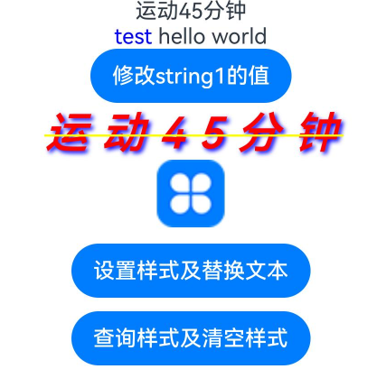
该示例通过insertString、removeStyles、replaceStyle、getStyles接口实现属性字符串的插入、删除、替换、查看。
// xxx.ets
@Entry
@Component
struct styled_string_demo1 {
  @State height1: number = 450;
  @State fontSize1: number = 16;
  @State fontWeight1: number = 400;
  @State color1: Color = Color.Blue;
  scroll: Scroller = new Scroller();
  fontStyleAttr1: TextStyle = new TextStyle({ fontColor: Color.Blue });
  fontStyleAttr2: StyledStringValue = new TextStyle({ fontColor: Color.Orange });
  // 创建可读写属性字符串的对象mutableStyledString1
  mutableStyledString1: MutableStyledString = new MutableStyledString("运动45分钟");
  // 创建构造入参有字符串和样式的对象mutableStyledString2
  mutableStyledString2: MutableStyledString = new MutableStyledString("test hello world", [{
    start: 0,
    length: 5,
    styledKey: StyledStringKey.FONT,
    styledValue: this.fontStyleAttr1
  }]);
  // 创建只读属性字符串对象styledString2
  styledString2: StyledString = new StyledString("运动45分钟");
  spanStyle1: SpanStyle = {
    start: 0,
    length: 5,
    styledKey: StyledStringKey.FONT,
    styledValue: new TextStyle({ fontColor: Color.Pink })
  };
  spanStyle2: SpanStyle = {
    start: 0,
    length: 2,
    styledKey: StyledStringKey.FONT,
    styledValue: new TextStyle({ fontColor: Color.Red })
  };
  @State string1: string = '';
  @State fontColor1: ResourceColor = Color.Red;
  controller1: TextController = new TextController();
  controller2: TextController = new TextController();
  controller3: TextController = new TextController();

  async onPageShow() {
    this.controller1.setStyledString(this.styledString2);
    this.controller2.setStyledString(this.mutableStyledString1);
    this.controller3.setStyledString(this.mutableStyledString2);
  }

  build() {
    Column() {
      Scroll(this.scroll) {
        Column() {
          // 显示属性字符串
          Text(undefined, { controller: this.controller1 })
          Text(undefined, { controller: this.controller3 }).key('mutableStyledString2')
          Button('修改string1的值')
            .onClick(() => {
              let result = this.mutableStyledString1.equals(this.styledString2);
              if (result) {
                this.string1 = this.mutableStyledString1.getString();
                console.info("mutableStyledString1 content:", this.mutableStyledString1.getString());
                console.info("mutableStyledString1 length:", this.mutableStyledString1.length);
              }
            })

          // 属性字符串与Span冲突时忽略Span,以及样式与Text组件属性未冲突部分生效Text设置的属性
          Text(undefined, { controller: this.controller2 }) {
            Span("span and styledString test")
              .fontColor(Color.Yellow)
              .decoration({ type: TextDecorationType.LineThrough })
            ImageSpan($r('app.media.app_icon'))
          }
          .key('styledString2')
          .fontColor(this.fontColor1)
          .letterSpacing(10)
          .fontSize(32)
          .fontWeight(600)
          .fontStyle(FontStyle.Italic)
          .lineHeight(30)
          .textShadow({
            radius: 5,
            color: Color.Blue,
            offsetX: 5,
            offsetY: 5
          })
          .textCase(TextCase.UpperCase)
          .decoration({ type: TextDecorationType.LineThrough, color: Color.Yellow })
          .baselineOffset(2)
          .copyOption(CopyOptions.InApp)
          .margin({ top: 10 })
          .draggable(true)

          // 以上冲突测试对照组
          Text() {
            Span(this.string1)
              .fontColor(this.color1)
              .decoration({ type: TextDecorationType.LineThrough })
            ImageSpan($r('app.media.app_icon'))
              .width(50).height(50)
          }
          .letterSpacing(10)
          .fontSize(32)
          .fontWeight(600)
          .fontStyle(FontStyle.Italic)
          .lineHeight(30)
          .textShadow({
            radius: 5,
            color: Color.Blue,
            offsetX: 5,
            offsetY: 5
          })
          .textCase(TextCase.UpperCase)
          .decoration({ type: TextDecorationType.LineThrough, color: Color.Yellow })
          .baselineOffset(2)

          Button('设置样式及替换文本')
            .onClick(() => {
              this.mutableStyledString1.replaceStyle({
                start: 2,
                length: 2,
                styledKey: StyledStringKey.FONT,
                styledValue: this.fontStyleAttr1
              });
              this.mutableStyledString1.insertString(0, "压力85偏高,");
              this.mutableStyledString1.setStyle({
                start: 2,
                length: 2,
                styledKey: StyledStringKey.FONT,
                styledValue: this.fontStyleAttr2
              });
              this.controller2.setStyledString(this.mutableStyledString1);
            })
            .margin({ top: 10 })

          Button('查询样式及清空样式')
            .onClick(() => {
              let styles = this.mutableStyledString1.getStyles(0, this.mutableStyledString1.length);
              if (styles.length == 2) {
                for (let i = 0; i < styles.length; i++) {
                  console.info('StyledString style object start:' + styles[i].start);
                  console.info('StyledString style object length:' + styles[i].length);
                  console.info('StyledString style object key:' + styles[i].styledKey);
                  if (styles[i].styledKey === 0) {
                    let fontAttr = styles[i].styledValue as TextStyle;
                    console.info('StyledString fontColor:' + fontAttr.fontColor);
                  }
                }
              }
              if (styles[0] !== undefined) {
                this.mutableStyledString2.setStyle(styles[0]);
                this.controller3.setStyledString(this.mutableStyledString2);
              }
              this.mutableStyledString1.removeStyles(2, 3);
              this.controller2.setStyledString(this.mutableStyledString1);
            })
            .margin({ top: 10 })
        }.width('100%')

      }
      .expandSafeArea([SafeAreaType.KEYBOARD])
      .scrollable(ScrollDirection.Vertical)
      .scrollBar(BarState.On)
      .scrollBarColor(Color.Gray)
      .scrollBarWidth(10)
      .edgeEffect(EdgeEffect.None)
    }
    .width('100%')
  }
}
示例2(设置事件)
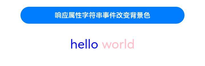
该示例通过styledKey、styledValue接口实现属性字符串绑定事件。
// xxx.ets
@Entry
@Component
struct styled_string_demo2 {
  scroll: Scroller = new Scroller();
  fontStyleAttr1: TextStyle = new TextStyle({ fontColor: Color.Blue });
  private uiContext: UIContext = this.getUIContext();
  clickGestureAttr: GestureStyle = new GestureStyle({
    onClick: () => {
      this.uiContext.getPromptAction().showToast({ message: 'clickGestureAttr object trigger click event' });
      this.backgroundColor1 = Color.Yellow;
    }
  })
  gestureStyleAttr: GestureStyle = new GestureStyle({
    onClick: () => {
      this.uiContext.getPromptAction().showToast({ message: 'gestureStyleAttr object trigger click event' });
      this.backgroundColor1 = Color.Green;
    },
    onLongPress: () => {
      this.uiContext.getPromptAction().showToast({ message: 'gestureStyleAttr object trigger long press event' });
      this.backgroundColor1 = Color.Orange;
    },
    onTouch: () => {
      this.uiContext.getPromptAction().showToast({ message: 'gestureStyleAttr object trigger touch event' });
      this.backgroundColor1 = Color.Red;
    }
  });
  // 创建事件的对象mutableStyledString3
  mutableStyledString3: MutableStyledString = new MutableStyledString("hello world", [{
    start: 0,
    length: 5,
    styledKey: StyledStringKey.GESTURE,
    styledValue: this.clickGestureAttr
  },
    {
      start: 0,
      length: 5,
      styledKey: StyledStringKey.FONT,
      styledValue: this.fontStyleAttr1
    },
    {
      start: 6,
      length: 5,
      styledKey: StyledStringKey.GESTURE,
      styledValue: this.gestureStyleAttr
    },
    {
      start: 6,
      length: 5,
      styledKey: StyledStringKey.FONT,
      styledValue: new TextStyle({ fontColor: Color.Pink })
    }]);
  @State fontColor1: ResourceColor = Color.Red;
  @State backgroundColor1: ResourceColor|undefined = undefined;
  controller3: TextController = new TextController();

  async onPageShow() {
    this.controller3.setStyledString(this.mutableStyledString3);
  }

  build() {
    Column() {
      Scroll(this.scroll) {
        Column({ space: 30 }) {
          Button("响应属性字符串事件改变背景色").backgroundColor(this.backgroundColor1).width('80%')
          // 包含事件的属性字符串
          Text(undefined, { controller: this.controller3 }).fontSize(30)
            .copyOption(CopyOptions.InApp)
            .draggable(true)
            .clip(true)
        }.width('100%')
      }
      .expandSafeArea([SafeAreaType.KEYBOARD])
      .scrollable(ScrollDirection.Vertical)
      .scrollBar(BarState.On)
      .scrollBarColor(Color.Gray)
      .scrollBarWidth(10)
      .edgeEffect(EdgeEffect.None)
    }
    .width('100%')
  }
}
示例3(设置文本样式)
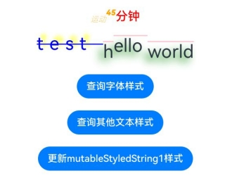
该示例通过getStyles、setStyle接口实现属性字符串查询和设置样式。
// xxx.ets
import { LengthMetrics, LengthUnit } from '@kit.ArkUI';

@Entry
@Component
struct styled_string_demo3 {
  fontStyleAttr1: TextStyle = new TextStyle({ fontColor: Color.Blue });
  fontStyleAttr2: StyledStringValue = new TextStyle({
    fontColor: Color.Orange,
    fontSize: LengthMetrics.vp(20),
    fontWeight: FontWeight.Bolder,
    fontStyle: FontStyle.Italic,
    fontFamily: "Arial",
    superscript: SuperscriptStyle.SUPERSCRIPT
  });
  fontStyleAttr3: StyledStringValue = new TextStyle({
    fontColor: Color.Orange,
    fontSize: LengthMetrics.vp(20),
    fontWeight: FontWeight.Lighter,
    fontStyle: FontStyle.Italic,
    fontFamily: "Arial",
    superscript: SuperscriptStyle.SUBSCRIPT
  });
  // 创建多重TextStyle样式的对象mutableStyledString1
  mutableStyledString1: MutableStyledString = new MutableStyledString("运动45分钟", [{
    start: 0,
    length: 2,
    styledKey: StyledStringKey.FONT,
    styledValue: this.fontStyleAttr3
  }, {
    start: 2,
    length: 2,
    styledKey: StyledStringKey.FONT,
    styledValue: this.fontStyleAttr2
  }
  ]);
  // 创建有多种样式组合对象mutableStyledString2
  mutableStyledString2: MutableStyledString = new MutableStyledString("test hello world", [{
    start: 0,
    length: 5,
    styledKey: StyledStringKey.FONT,
    styledValue: this.fontStyleAttr1
  }, {
    start: 0,
    length: 5,
    styledKey: StyledStringKey.DECORATION,
    styledValue: new DecorationStyle({ type: TextDecorationType.LineThrough, color: Color.Blue })
  }, {
    start: 0,
    length: 5,
    styledKey: StyledStringKey.TEXT_SHADOW,
    styledValue: new TextShadowStyle({
      radius: 5,
      type: ShadowType.COLOR,
      color: Color.Yellow,
      offsetX: 10,
      offsetY: -10
    })
  }, {
    start: 0,
    length: 5,
    styledKey: StyledStringKey.BASELINE_OFFSET,
    styledValue: new BaselineOffsetStyle(LengthMetrics.px(20))
  }, {
    start: 0,
    length: 5,
    styledKey: StyledStringKey.LETTER_SPACING,
    styledValue: new LetterSpacingStyle(new LengthMetrics(10, LengthUnit.VP))
  }, {
    start: 6,
    length: 5,
    styledKey: StyledStringKey.BASELINE_OFFSET,
    styledValue: new BaselineOffsetStyle(LengthMetrics.fp(10))
  }
  ]);
  @State fontColor1: ResourceColor = Color.Red;
  controller: TextController = new TextController();
  options: TextOptions = { controller: this.controller };
  controller2: TextController = new TextController();
  spanStyle1: SpanStyle = {
    start: 0,
    length: 5,
    styledKey: StyledStringKey.FONT,
    styledValue: new TextStyle({ fontColor: Color.Pink })
  };

  async onPageShow() {
    this.controller.setStyledString(this.mutableStyledString1);
    this.controller2.setStyledString(this.mutableStyledString2);
  }

  build() {
    Column() {
      Column({ space: 10 }) {
        // 显示配了字体各种样式的属性字符串,Text组件亦配置冲突部分生效属性字符串配置,未冲突区间生效Text组件属性设置值
        Text(undefined, this.options)
          .fontColor(this.fontColor1)
          .font({ size: 20, weight: 500, style: FontStyle.Normal })
        // 显示配置了文本阴影、划线、字符间距、基线偏移量的属性字符串,Text组件亦配置生效属性字符串配置
        Text(undefined, { controller: this.controller2 })
          .fontSize(30)
          .copyOption(CopyOptions.InApp)
          .draggable(true)
          .decoration({ type: TextDecorationType.Overline, color: Color.Pink })
          .textShadow({
            radius: 10,
            type: ShadowType.COLOR,
            color: Color.Green,
            offsetX: -10,
            offsetY: 10
          })
        Button('查询字体样式')
          .onClick(() => {
            let styles = this.mutableStyledString1.getStyles(0, this.mutableStyledString1.length);
            if (styles.length !== 0) {
              for (let i = 0; i < styles.length; i++) {
                console.info('mutableStyledString1 style object start:' + styles[i].start);
                console.info('mutableStyledString1 style object length:' + styles[i].length);
                console.info('mutableStyledString1 style object key:' + styles[i].styledKey);
                if (styles[i].styledKey === 0) {
                  let fontAttr = styles[i].styledValue as TextStyle;
                  console.info('mutableStyledString1 fontColor:' + fontAttr.fontColor);
                  console.info('mutableStyledString1 fontSize:' + fontAttr.fontSize);
                  console.info('mutableStyledString1 fontWeight:' + fontAttr.fontWeight);
                  console.info('mutableStyledString1 fontStyle:' + fontAttr.fontStyle);
                  console.info('mutableStyledString1 fontStyle:' + fontAttr.fontFamily);
                  console.info('mutableStyledString1 superscript:' + fontAttr.superscript);
                }
              }
            }
          })
          .margin({ top: 10 })
        Button('查询其他文本样式')
          .onClick(() => {
            let styles = this.mutableStyledString2.getStyles(0, this.mutableStyledString2.length);
            if (styles.length !== 0) {
              for (let i = 0; i < styles.length; i++) {
                console.info('mutableStyledString2 style object start:' + styles[i].start);
                console.info('mutableStyledString2 style object length:' + styles[i].length);
                console.info('mutableStyledString2 style object key:' + styles[i].styledKey);
                if (styles[i].styledKey === 1) {
                  let decoAttr = styles[i].styledValue as DecorationStyle;
                  console.info('mutableStyledString2 decoration type:' + decoAttr.type);
                  console.info('mutableStyledString2 decoration color:' + decoAttr.color);
                }
                if (styles[i].styledKey === 2) {
                  let baselineAttr = styles[i].styledValue as BaselineOffsetStyle;
                  console.info('mutableStyledString2 baselineOffset:' + baselineAttr.baselineOffset);
                }
                if (styles[i].styledKey === 3) {
                  let letterAttr = styles[i].styledValue as LetterSpacingStyle;
                  console.info('mutableStyledString2 letterSpacing:' + letterAttr.letterSpacing);
                }
                if (styles[i].styledKey === 4) {
                  let textShadowAttr = styles[i].styledValue as TextShadowStyle;
                  let shadowValues = textShadowAttr.textShadow;
                  if (shadowValues.length > 0) {
                    for (let j = 0; j < shadowValues.length; j++) {
                      console.info('mutableStyledString2 textShadow type:' + shadowValues[j].type);
                      console.info('mutableStyledString2 textShadow radius:' + shadowValues[j].radius);
                      console.info('mutableStyledString2 textShadow color:' + shadowValues[j].color);
                      console.info('mutableStyledString2 textShadow offsetX:' + shadowValues[j].offsetX);
                      console.info('mutableStyledString2 textShadow offsetY:' + shadowValues[j].offsetY);
                    }
                  }
                }
              }
            }
          })
          .margin({ top: 10 })
        Button('更新mutableStyledString1样式')
          .onClick(() => {
            this.mutableStyledString1.setStyle(this.spanStyle1);
            this.controller.setStyledString(this.mutableStyledString1);
          })
          .margin({ top: 10 })
      }.width('100%')
    }
    .width('100%')
  }
}
示例4(设置图片)
该示例通过ImageAttachment接口实现属性字符串设置图片。
// xxx.ets
import { image } from '@kit.ImageKit';
import { LengthMetrics } from '@kit.ArkUI';

@Entry
@Component
struct styled_string_demo4 {
  @State message: string = 'Hello World';
  imagePixelMap: image.PixelMap|undefined = undefined;
  @State imagePixelMap3: image.PixelMap|undefined = undefined;
  mutableStr: MutableStyledString = new MutableStyledString('123');
  controller: TextController = new TextController();
  private uiContext: UIContext = this.getUIContext();
  mutableStr2: MutableStyledString = new MutableStyledString('This is set decoration line style to the mutableStr2', [{
    start: 0,
    length: 15,
    styledKey: StyledStringKey.DECORATION,
    styledValue: new DecorationStyle({
      type: TextDecorationType.Overline,
      color: Color.Orange,
      style: TextDecorationStyle.DOUBLE
    })
  }]);

  async aboutToAppear() {
    console.info("aboutToAppear initial imagePixelMap");
    this.imagePixelMap = await this.getPixmapFromMedia($r('app.media.app_icon'));
  }

  private async getPixmapFromMedia(resource: Resource) {
    let unit8Array = await this.uiContext.getHostContext()?.resourceManager?.getMediaContent({
      bundleName: resource.bundleName,
      moduleName: resource.moduleName,
      id: resource.id
    });
    let imageSource = image.createImageSource(unit8Array?.buffer.slice(0, unit8Array.buffer.byteLength));
    let createPixelMap: image.PixelMap = await imageSource.createPixelMap({
      desiredPixelFormat: image.PixelMapFormat.RGBA_8888
    });
    await imageSource.release();
    return createPixelMap;
  }

  build() {
    Row() {
      Column({ space: 5 }) {
        Text(undefined, { controller: this.controller })
          .copyOption(CopyOptions.InApp)
          .draggable(true)
          .fontSize(30)
        Button('设置图片')
          .onClick(() => {
            if (this.imagePixelMap !== undefined) {
              this.mutableStr = new MutableStyledString(new ImageAttachment({
                value: this.imagePixelMap,
                size: { width: 50, height: 50 },
                layoutStyle: { borderRadius: LengthMetrics.vp(10) },
                verticalAlign: ImageSpanAlignment.BASELINE,
                objectFit: ImageFit.Contain
              }));
              this.controller.setStyledString(this.mutableStr);
            }
          })
        Button('设置资源类型图片')
          .onClick(() => {
            if (this.imagePixelMap !== undefined) {
              this.mutableStr = new MutableStyledString(new ImageAttachment({
                resourceValue: $r('app.media.sky'), //建议使用自定义的本地图片
                size: { width: 50, height: 50 },
                layoutStyle: { borderRadius: LengthMetrics.vp(10) },
                verticalAlign: ImageSpanAlignment.BASELINE,
                objectFit: ImageFit.Contain,
                syncLoad: true
              }));
              this.controller.setStyledString(this.mutableStr);
            }
          })
        Button('Image之Get')
          .onClick(() => {
            let imageArray = this.mutableStr.getStyles(0, 1, StyledStringKey.IMAGE);
            for (let i = 0; i < imageArray.length; ++i) {
              console.info('mutableStr start ' + imageArray[i].start + ' length ' + imageArray[i].length + ' type ' +
              imageArray[i].styledKey);
              if (imageArray[i].styledKey === 300) {
                let attachment = imageArray[i].styledValue as ImageAttachment;
                this.imagePixelMap3 = attachment.value;
                console.info('mutableStr value ' + JSON.stringify(attachment.value));
                if (attachment.size !== undefined) {
                  console.info('mutableStr size width ' + attachment.size.width + ' height ' + attachment.size.height);
                }
                console.info('mutableStr vertical ' + attachment.verticalAlign);
                console.info('mutableStr fit ' + attachment.objectFit);
                if (attachment.layoutStyle !== undefined) {
                  let radius = attachment.layoutStyle.borderRadius as BorderRadiuses;
                  console.info('mutableStr radius ' + JSON.stringify(radius));
                }
              }
            }
          })
        Image(this.imagePixelMap3).width(50).height(50)
        Button('Image之Append')
          .onClick(() => {
            let str = new StyledString('123');
            this.mutableStr.appendStyledString(str);
            this.controller.setStyledString(this.mutableStr);
          })
        Button('Image之Insert 前')
          .onClick(() => {
            this.mutableStr.insertString(0, '123');
            this.controller.setStyledString(this.mutableStr);
          })
        Button('Image之Insert 后')
          .onClick(() => {
            this.mutableStr.insertString(1, '123');
            this.controller.setStyledString(this.mutableStr);
          })
        Button('Image之replace')
          .onClick(() => {
            this.mutableStr.replaceString(2, 5, "789");
            this.controller.setStyledString(this.mutableStr);
          })
      }
      .width('100%')
    }
    .height('100%')
  }
}
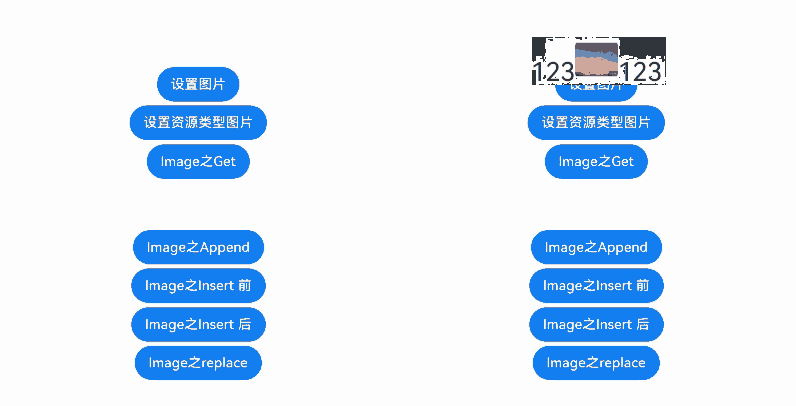
示例5(设置文本行高和段落样式)
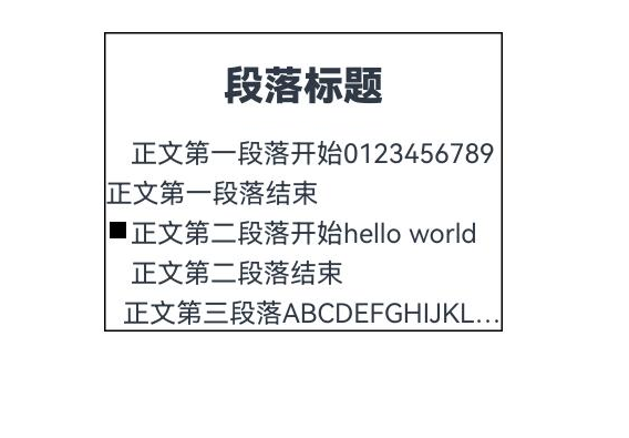
该示例通过LineHeightStyle、ParagraphStyle接口实现属性字符串设置文本行高和段落样式。
import { LengthMetrics } from '@kit.ArkUI';

const canvasWidth = 1000;
const canvasHeight = 100;

class LeadingMarginCreator {
  private settings: RenderingContextSettings = new RenderingContextSettings(true);
  private offscreenCanvas: OffscreenCanvas = new OffscreenCanvas(canvasWidth, canvasHeight);
  private offContext: OffscreenCanvasRenderingContext2D = this.offscreenCanvas.getContext("2d", this.settings);
  public static instance: LeadingMarginCreator = new LeadingMarginCreator();

  public genSquareMark(fontSize: number): PixelMap {
    this.offContext = this.offscreenCanvas.getContext("2d", this.settings);
    this.clearCanvas();
    const coordinate = fontSize * (1 - 1 / 1.5) / 2;
    const sideLength = fontSize / 1.5;
    this.offContext.fillRect(coordinate, coordinate, sideLength, sideLength);
    return this.offContext.getPixelMap(0, 0, fontSize, fontSize);
  }

  private clearCanvas() {
    this.offContext.clearRect(0, 0, canvasWidth, canvasHeight);
  }
}

@Entry
@Component
struct Index {
  private leadingMarkCreatorInstance = LeadingMarginCreator.instance;
  leadingMarginPlaceholder1: LeadingMarginPlaceholder = {
    pixelMap: this.leadingMarkCreatorInstance.genSquareMark(24),
    size: [15, 15]
  };
  titleParagraphStyleAttr: ParagraphStyle =
    new ParagraphStyle({ textAlign: TextAlign.Center, paragraphSpacing: LengthMetrics.px(10) });
  //第一段落首行缩进15vp
  paragraphStyleAttr1: ParagraphStyle = new ParagraphStyle({ textIndent: LengthMetrics.vp(15) });
  //第二段落缩进15vp且首行有placeholder占位显示
  paragraphStyleAttr2: ParagraphStyle =
    new ParagraphStyle({ textAlign: TextAlign.Start, leadingMargin: this.leadingMarginPlaceholder1 });
  //第三段落不设置缩进配置最大行数及超长显示方式
  paragraphStyleAttr3: ParagraphStyle = new ParagraphStyle({
    textAlign: TextAlign.End,
    textVerticalAlign:TextVerticalAlign.BASELINE,
    maxLines: 1,
    wordBreak: WordBreak.BREAK_ALL,
    overflow: TextOverflow.Ellipsis
  });
  //行高样式对象
  lineHeightStyle1: LineHeightStyle = new LineHeightStyle(new LengthMetrics(24));
  //创建含段落样式的对象paragraphStyledString1
  paragraphStyledString1: StyledString =
    new StyledString("段落标题\n正文第一段落开始0123456789正文第一段落结束\n正文第二段落开始hello world正文第二段落结束\n正文第三段落ABCDEFGHIJKLMNOPQRSTUVWXYZ。",
      [
        {
          start: 0,
          length: 4,
          styledKey: StyledStringKey.PARAGRAPH_STYLE,
          styledValue: this.titleParagraphStyleAttr
        },
        {
          start: 0,
          length: 4,
          styledKey: StyledStringKey.LINE_HEIGHT,
          styledValue: new LineHeightStyle(new LengthMetrics(50))
        }, {
        start: 0,
        length: 4,
        styledKey: StyledStringKey.FONT,
        styledValue: new TextStyle({ fontSize: LengthMetrics.vp(24), fontWeight: FontWeight.Bolder })
      },
        {
          start: 5,
          length: 3,
          styledKey: StyledStringKey.PARAGRAPH_STYLE,
          styledValue: this.paragraphStyleAttr1
        },
        {
          start: 5,
          length: 20,
          styledKey: StyledStringKey.LINE_HEIGHT,
          styledValue: this.lineHeightStyle1
        },
        {
          start: 32,
          length: 5,
          styledKey: StyledStringKey.PARAGRAPH_STYLE,
          styledValue: this.paragraphStyleAttr2
        },
        {
          start: 32,
          length: 20,
          styledKey: StyledStringKey.LINE_HEIGHT,
          styledValue: this.lineHeightStyle1
        },
        {
          start: 60,
          length: 5,
          styledKey: StyledStringKey.PARAGRAPH_STYLE,
          styledValue: this.paragraphStyleAttr3
        },
        {
          start: 60,
          length: 5,
          styledKey: StyledStringKey.LINE_HEIGHT,
          styledValue: this.lineHeightStyle1
        }
      ]);
  controller: TextController = new TextController();

  async onPageShow() {
    this.controller.setStyledString(this.paragraphStyledString1);
  }

  build() {
    Row() {
      Column({ space: 5 }) {
        Text(undefined, { controller: this.controller })
          .width(240)
          .borderWidth(1)
          .copyOption(CopyOptions.InApp)
          .draggable(true)

        //查询段落样式
        Text()
          .onClick(() => {
            let styles = this.paragraphStyledString1.getStyles(0, this.paragraphStyledString1.length);
            if (styles.length !== 0) {
              for (let i = 0; i < styles.length; i++) {
                console.info('paragraphStyledString1 style object start:' + styles[i].start);
                console.info('paragraphStyledString1 style object length:' + styles[i].length);
                console.info('paragraphStyledString1 style object key:' + styles[i].styledKey);
                if (styles[i].styledKey === 200) {
                  let paraAttr = styles[i].styledValue as ParagraphStyle;
                  console.info('paragraphStyledString1 textAlign:' + paraAttr.textAlign);
                  console.info('paragraphStyledString1 textIndent:' + paraAttr.textIndent);
                  console.info('paragraphStyledString1 maxLines:' + paraAttr.maxLines);
                  console.info('paragraphStyledString1 wordBreak:' + paraAttr.wordBreak);
                  console.info('paragraphStyledString1 leadingMargin:' + paraAttr.leadingMargin);
                  console.info('paragraphStyledString1 overflow:' + paraAttr.overflow);
                }
              }
            }
          })
          .margin({ top: 10 })
      }
      .width('100%')
    }
    .height('100%')
  }
}
示例6(设置自定义绘制Span)
该示例通过CustomSpan接口实现属性字符串设置自定义绘制Span。
// xxx.ets
import { drawing } from '@kit.ArkGraphics2D';
import { LengthMetrics } from '@kit.ArkUI';

let gUIContext: UIContext;

class MyCustomSpan extends CustomSpan {
  constructor(word: string, width: number, height: number) {
    super();
    this.word = word;
    this.width = width;
    this.height = height;
  }

  onMeasure(measureInfo: CustomSpanMeasureInfo): CustomSpanMetrics {
    return { width: this.width, height: this.height };
  }

  onDraw(context: DrawContext, options: CustomSpanDrawInfo) {
    let canvas = context.canvas;

    const brush = new drawing.Brush();
    brush.setColor({
      alpha: 255,
      red: 0,
      green: 74,
      blue: 175
    });
    const font = new drawing.Font();
    font.setSize(25);
    const textBlob = drawing.TextBlob.makeFromString(this.word, font, drawing.TextEncoding.TEXT_ENCODING_UTF8);
    canvas.attachBrush(brush);
    canvas.drawRect({
      left: options.x + 10,
      right: options.x + gUIContext.vp2px(this.width) - 10,
      top: options.lineTop + 10,
      bottom: options.lineBottom - 10
    });

    brush.setColor({
      alpha: 255,
      red: 23,
      green: 169,
      blue: 141
    });
    canvas.attachBrush(brush);
    canvas.drawTextBlob(textBlob, options.x + 20, options.lineBottom - 15);
    canvas.detachBrush();
  }

  setWord(word: string) {
    this.word = word;
  }

  width: number = 160;
  word: string = "drawing";
  height: number = 10;
}

@Entry
@Component
struct styled_string_demo6 {
  customSpan1: MyCustomSpan = new MyCustomSpan("Hello", 80, 10);
  customSpan2: MyCustomSpan = new MyCustomSpan("World", 80, 40);
  style: MutableStyledString = new MutableStyledString(this.customSpan1);
  textStyle: MutableStyledString = new MutableStyledString("123");
  textController: TextController = new TextController();
  isPageShow: boolean = true;

  aboutToAppear() {
    gUIContext = this.getUIContext();
  }

  async onPageShow() {
    if (!this.isPageShow) {
      return;
    }
    this.isPageShow = false;

    this.style.appendStyledString(new MutableStyledString("文本绘制 示例代码 CustomSpan", [
      {
        start: 0,
        length: 5,
        styledKey: StyledStringKey.FONT,
        styledValue: new TextStyle({ fontColor: Color.Pink })
      }, {
      start: 5,
      length: 5,
      styledKey: StyledStringKey.FONT,
      styledValue: new TextStyle({ fontColor: Color.Orange, fontStyle: FontStyle.Italic })
    }, {
      start: 10,
      length: 500,
      styledKey: StyledStringKey.FONT,
      styledValue: new TextStyle({ fontColor: Color.Green, fontWeight: FontWeight.Bold })
    }
    ]));
    this.style.appendStyledString(new StyledString(this.customSpan2));
    this.style.appendStyledString(new StyledString("自定义绘制", [{
      start: 0,
      length: 5,
      styledKey: StyledStringKey.FONT,
      styledValue: new TextStyle({ fontColor: Color.Green, fontSize: LengthMetrics.px(50) })
    }]));
    this.textController.setStyledString(this.style);
  }

  build() {
    Row() {
      Column() {
        Text(undefined, { controller: this.textController })
          .copyOption(CopyOptions.InApp)
          .fontSize(30)

        Button("invalidate").onClick(() => {
          this.customSpan1.setWord("你好");
          this.customSpan1.invalidate();
        })
      }
      .width('100%')
    }
    .height('100%')
  }
}

示例7(支持存储自定义扩展信息)
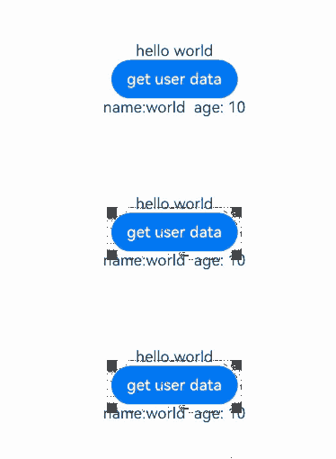
该示例通过UserDataSpan接口实现属性字符串支持存储自定义扩展信息的功能。
// xxx.ets
class MyUserDateSpan extends UserDataSpan {
  constructor(name: string, age: number) {
    super();
    this.name = name;
    this.age = age;
  }

  name: string;
  age: number;
}

@Entry
@Component
struct styled_string_demo7 {
  @State name: string = "world";
  @State age: number = 10;
  controller: TextController = new TextController();
  styleString: MutableStyledString = new MutableStyledString("hello world", [{
    start: 0,
    length: 11,
    styledKey: StyledStringKey.USER_DATA,
    styledValue: new MyUserDateSpan("hello", 21)
  }]);

  onPageShow(): void {
    this.controller.setStyledString(this.styleString);
  }

  build() {
    Column() {
      Text(undefined, { controller: this.controller })
      Button("get user data").onClick(() => {
        let arr = this.styleString.getStyles(0, this.styleString.length);
        let userDataSpan = arr[0].styledValue as MyUserDateSpan;
        this.name = userDataSpan.name;
        this.age = userDataSpan.age;
      })
      Text("name:" + this.name + "  age: " + this.age)
    }.width('100%').height(250).padding({ left: 35, right: 35, top: 35 })
  }
}
示例8(支持转换HTML格式字符串)
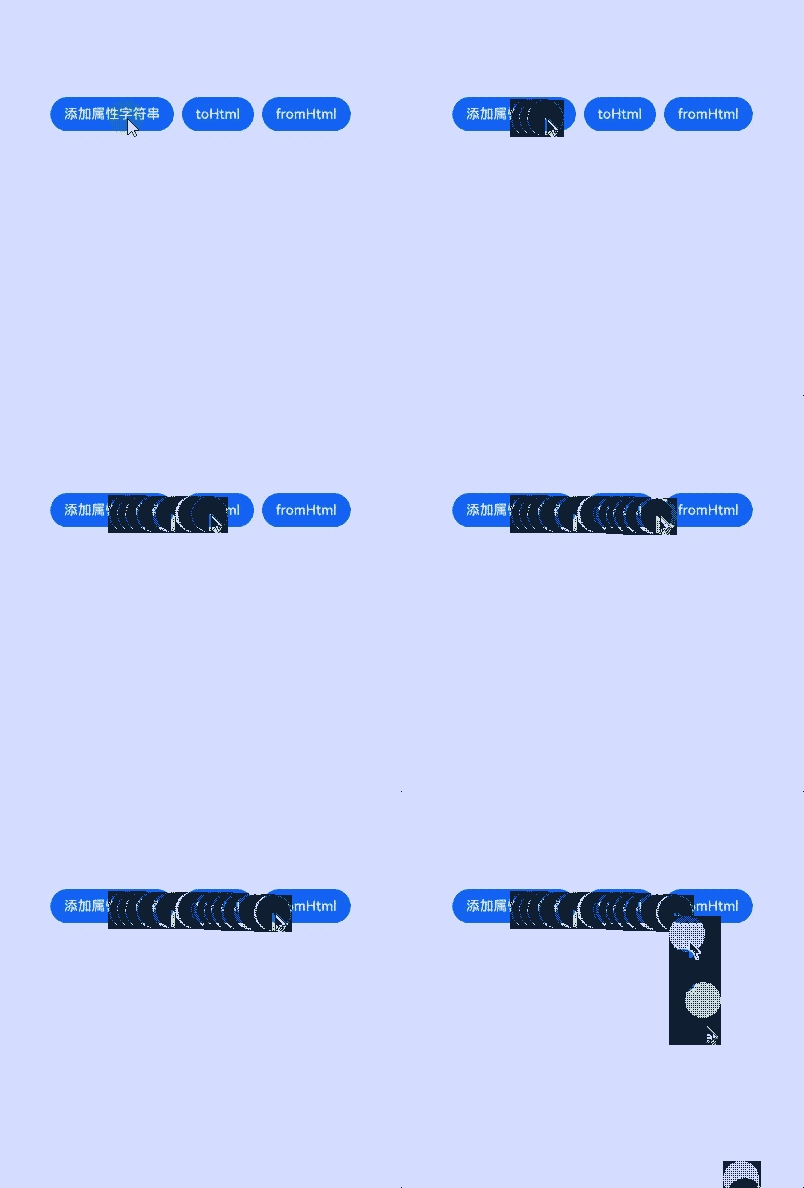
该示例通过toHtml、fromHtml接口实现属性字符串与HTML格式字符串的相关转换。
// xxx.ets
import { image } from '@kit.ImageKit';
import { LengthMetrics } from '@kit.ArkUI';

@Entry
@Component
struct styled_string_demo8 {
  imagePixelMap: image.PixelMap|undefined = undefined;
  @State html: string|undefined = undefined;
  @State styledString: StyledString|undefined = undefined;
  controller1: TextController = new TextController;
  controller2: TextController = new TextController;
  private uiContext: UIContext = this.getUIContext();

  async aboutToAppear() {
    console.info("aboutToAppear initial imagePixelMap");
    this.imagePixelMap = await this.getPixmapFromMedia($r('app.media.app_icon'));
  }

  private async getPixmapFromMedia(resource: Resource) {
    let unit8Array = await this.uiContext.getHostContext()?.resourceManager?.getMediaContent({
      bundleName: resource.bundleName,
      moduleName: resource.moduleName,
      id: resource.id
    });
    let imageSource = image.createImageSource(unit8Array?.buffer.slice(0, unit8Array.buffer.byteLength));
    let createPixelMap: image.PixelMap = await imageSource.createPixelMap({
      desiredPixelFormat: image.PixelMapFormat.RGBA_8888
    });
    await imageSource.release();
    return createPixelMap;
  }

  build() {
    Column() {
      Text(undefined, { controller: this.controller1 }).height(100)
      Row() {
        Button("添加属性字符串").onClick(() => {
          let mutableStyledString1: MutableStyledString = new MutableStyledString("属性字符串", [{
            start: 0,
            length: 6,
            styledKey: StyledStringKey.FONT,
            styledValue: new TextStyle({ fontColor: Color.Green, fontSize: LengthMetrics.px(50) })
          }]);
          if (this.imagePixelMap !== undefined) {
            let mutableStyledString2 = new MutableStyledString(new ImageAttachment({
              value: this.imagePixelMap,
              size: { width: 50, height: 50 },
            }));
            mutableStyledString1.appendStyledString(mutableStyledString2);
          }
          this.styledString = mutableStyledString1;
          this.controller1.setStyledString(mutableStyledString1);
        }).margin(5)
        Button("toHtml").onClick(() => {
          this.html = StyledString.toHtml(this.styledString);
        }).margin(5)
        Button("fromHtml").onClick(async () => {
          let styledString = await StyledString.fromHtml(this.html);
          this.controller2.setStyledString(styledString);
        }).margin(5)
      }

      Text(undefined, { controller: this.controller2 }).height(100)
      Text(this.html)
    }.width("100%")
  }
}
示例9(设置超链接)
该示例通过UrlStyle接口,实现了对属性字符串中超链接设置的支持。
// xxx.ets
@Entry
@Component
struct styled_string_demo9 {
  urlString: StyledStringValue = new UrlStyle("https://www.example.com");
  mutableStyledString: MutableStyledString = new MutableStyledString("Hello World", [{
    start: 0,
    length: "Hello".length,
    styledKey: StyledStringKey.URL,
    styledValue: this.urlString
  }]);
  controller: TextController = new TextController();

  async onPageShow() {
    this.controller.setStyledString(this.mutableStyledString);
  }

  build() {
    Column() {
      Column() {
        Text(undefined, { controller: this.controller }).key('mutableStyledString').fontSize(30)
      }
    }.width('100%').height(250).padding({ left: 35, right: 35, top: 35 })
  }
}
示例10 (给图片设置colorFilter)
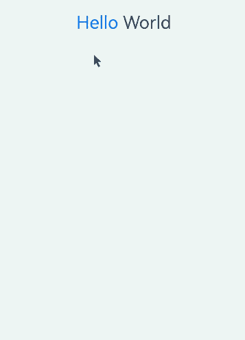
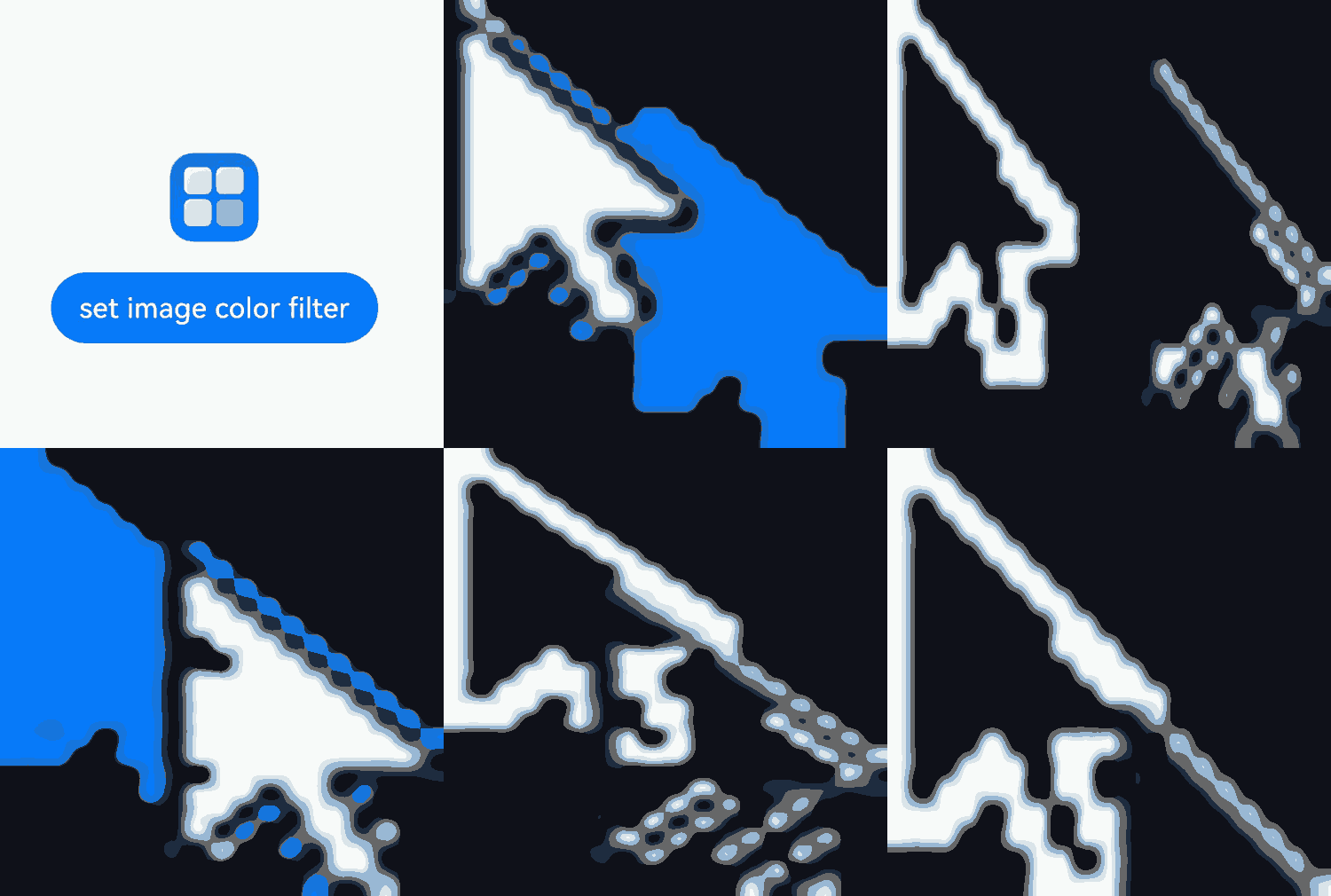
该示例通过给imageAttachment设置colorFilter实现了给图像设置颜色滤镜效果。
// xxx.ets
import { LengthMetrics } from '@kit.ArkUI';
import { drawing, common2D } from '@kit.ArkGraphics2D';

@Entry
@Component
struct styled_string_demo10 {
  @State message: string = 'Hello World';
  mutableStr: MutableStyledString = new MutableStyledString('origin image:');
  mutableStr2: MutableStyledString = new MutableStyledString('with filter:');
  controller: TextController = new TextController();
  controller2: TextController = new TextController();
  private color: common2D.Color = {
    alpha: 125,
    red: 125,
    green: 125,
    blue: 255
  };

  build() {
    Row() {
      Column({ space: 5 }) {
        Text(undefined, { controller: this.controller })
          .copyOption(CopyOptions.InApp)
          .draggable(true)
          .fontSize(30)
          .onAppear(() => {
            this.mutableStr = new MutableStyledString(new ImageAttachment({
              resourceValue: $r('app.media.startIcon'),
              size: { width: 50, height: 50 },
              layoutStyle: { borderRadius: LengthMetrics.vp(10) },
              verticalAlign: ImageSpanAlignment.BASELINE,
              objectFit: ImageFit.Contain,
              syncLoad: true
            }));
            this.controller.setStyledString(this.mutableStr);
          })
        Text(undefined, { controller: this.controller2 })
          .copyOption(CopyOptions.InApp)
          .draggable(true)
          .fontSize(30)
        Button('set image color filter')
          .onClick(() => {
            this.mutableStr2 = new MutableStyledString(new ImageAttachment({
              resourceValue: $r('app.media.startIcon'),
              size: { width: 50, height: 50 },
              layoutStyle: { borderRadius: LengthMetrics.vp(10) },
              verticalAlign: ImageSpanAlignment.BASELINE,
              objectFit: ImageFit.Contain,
              colorFilter: drawing.ColorFilter.createBlendModeColorFilter(this.color, drawing.BlendMode.SRC_IN),
              syncLoad: true
            }));
            this.controller2.setStyledString(this.mutableStr2);
          })
      }
      .width('100%')
    }
    .height('100%')
  }
}
示例11(属性字符串的插入、删除、替换)
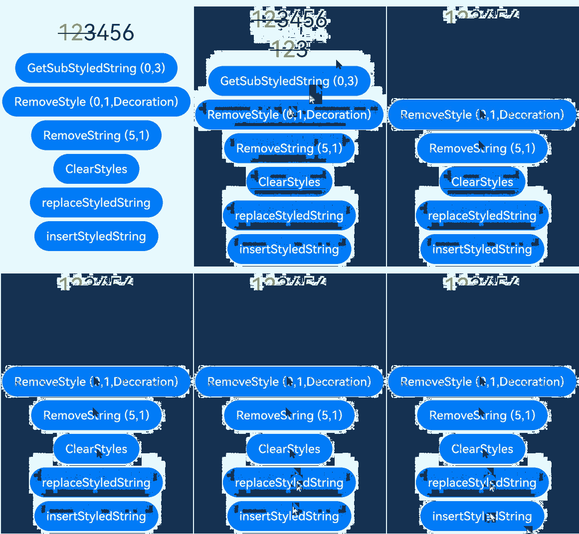
该示例通过getSubStyledString、removeString、removeStyle、clearStyles、replaceStyledString、insertStyledString接口实现属性字符串的插入、删除、替换。
// xxx.ets
@Entry
@Component
struct styled_string_demo11 {
  @State message: string = 'Hello World';
  mutableStr: MutableStyledString = new MutableStyledString('123456', [{
    start: 0,
    length: 2,
    styledKey: StyledStringKey.FONT,
    styledValue: new TextStyle({ fontColor: Color.Red })
  }, {
    start: 0,
    length: 3,
    styledKey: StyledStringKey.DECORATION,
    styledValue: new DecorationStyle({ type: TextDecorationType.LineThrough })
  }]);
  mutableStr2: MutableStyledString = new MutableStyledString('with filter:');
  controller: TextController = new TextController();
  controller2: TextController = new TextController();

  build() {
    Row() {
      Column({ space: 5 }) {
        Text(undefined, { controller: this.controller })
          .copyOption(CopyOptions.InApp)
          .draggable(true)
          .fontSize(30)
          .onAppear(() => {
            this.controller.setStyledString(this.mutableStr);
          })
        Text(undefined, { controller: this.controller2 })
          .copyOption(CopyOptions.InApp)
          .draggable(true)
          .fontSize(30)
        Button('GetSubStyledString (0,3)').onClick(() => {
          this.controller2.setStyledString(this.mutableStr.subStyledString(0, 3));
        })
        Button('RemoveStyle (0,1,Decoration)').onClick(() => {
          this.mutableStr.removeStyle(0, 1, StyledStringKey.DECORATION);
          this.controller.setStyledString(this.mutableStr);
        })
        Button('RemoveString (5,1)').onClick(() => {
          this.mutableStr.removeString(5, 1);
          this.controller.setStyledString(this.mutableStr);
        })
        Button('ClearStyles').onClick(() => {
          this.mutableStr.clearStyles();
          this.controller.setStyledString(this.mutableStr);
        })
        Button('replaceStyledString').onClick(() => {
          this.mutableStr.replaceStyledString(3, 1, new StyledString("abc", [{
            start: 0,
            length: 3,
            styledKey: StyledStringKey.FONT,
            styledValue: new TextStyle({ fontColor: Color.Blue })
          }]));
          this.controller.setStyledString(this.mutableStr);
        })
        Button('insertStyledString').onClick(() => {
          this.mutableStr.insertStyledString(4, new StyledString("A"));
          this.controller.setStyledString(this.mutableStr);
        })
      }
      .width('100%')
    }
    .height('100%')
  }
}
示例12(属性字符串的文本描边)
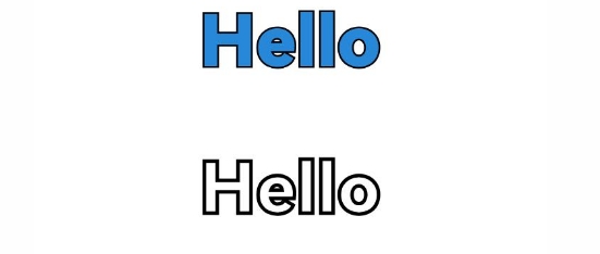
该示例通过设置strokeWidth和strokeColor接口实现属性字符串的文本描边。
// xxx.ets
import { LengthMetrics } from '@kit.ArkUI';

@Entry
@Component
struct styled_string_demo12 {
  @State string1: string = "Hello";
  spanStyle: SpanStyle = {
    start: 0,
    length: 5,
    styledKey: StyledStringKey.FONT,
    styledValue: new TextStyle({
      fontColor: '#ff2787d9',
      strokeWidth: LengthMetrics.px(-5),
      strokeColor: Color.Black,
      fontWeight: FontWeight.Bolder,
      fontSize: LengthMetrics.px(100)
    })
  };
  spanStyle1: SpanStyle = {
    start: 0,
    length: 5,
    styledKey: StyledStringKey.FONT,
    styledValue: new TextStyle({
      fontColor: '#ff2787d9',
      strokeWidth: LengthMetrics.px(5),
      strokeColor: Color.Black,
      fontWeight: FontWeight.Bolder,
      fontSize: LengthMetrics.px(100)
    })
  };

  mutableStyledString: MutableStyledString = new MutableStyledString(this.string1, []);
  controller: TextController = new TextController();

  mutableStyledString1: MutableStyledString = new MutableStyledString(this.string1, []);
  controller1: TextController = new TextController();

  async onPageShow() {
    this.mutableStyledString.setStyle(this.spanStyle)
    this.controller.setStyledString(this.mutableStyledString);

    this.mutableStyledString1.setStyle(this.spanStyle1)
    this.controller1.setStyledString(this.mutableStyledString1);
  }

  build() {
    Column() {
      //实心字
      Text(undefined, { controller: this.controller })
        .margin({ top: 10, bottom: 50 })
        .draggable(true)
        .onDragStart(() => {
        })
      //空心字
      Text(undefined, { controller: this.controller1 })
        .margin({ top: 10, bottom: 50 })
        .draggable(true)
        .onDragStart(() => {
        })
    }
    .height('100%')
    .width('100%')
  }
}
示例13(fromHtml和toHtml互相转换)
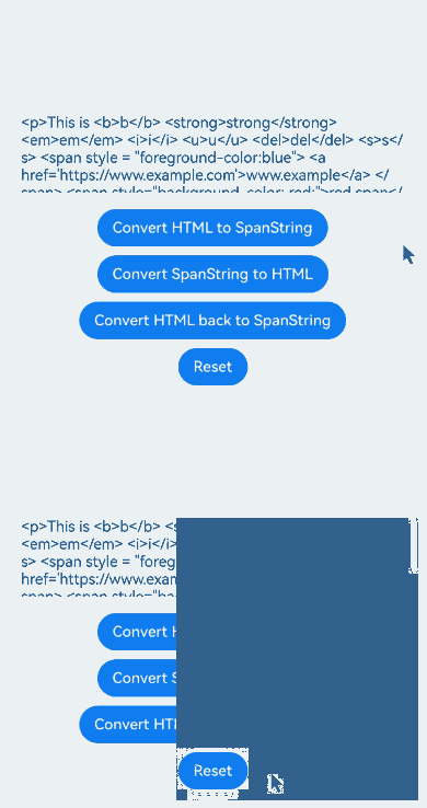
该示例通过fromHtml、toHtml接口,将HTML中b、strong、em、i、u、del、s、a、sub、sup标签及其style属性中的background-color转换为属性字符串并转回HTML。
// xxx.ets
@Entry
@Component
struct HtmlSpanStringDemo {
  @State html: string = "<p>This is <b>b</b> <strong>strong</strong> <em>em</em> <i>i</i> <u>u</u> <del>del</del> <s>s</s> <span style = \"foreground-color:blue\"> <a href='https://www.example.com'>www.example</a> </span> <span style=\"background-color: red;\">red span</span> <sup>superscript</sup> and <sub>subscript</sub></p>";
  @State spanString: StyledString|undefined = undefined;
  @State resultText: string = ""; // 保存结果文本的状态
  controller: TextController = new TextController;

  build() {
    Column() {
      // 显示转换后的spanString
      Text(undefined, { controller: this.controller }).height(100)

      // TextArea显示每个步骤的结果
      TextArea({ text: this.html })
        .width("100%")
        .height(100)
        .margin(5)

      // 按钮1:将HTML转换为SpanString
      Button("将HTML转换为SpanString").onClick(async () => {
        this.spanString = await StyledString.fromHtml(this.html);
        this.controller.setStyledString(this.spanString);
        this.resultText = "Converted HTML to SpanString successfully.";
      }).margin(5)

      // 按钮2:将SpanString转换为HTML
      Button("将SpanString转换为HTML").onClick(() => {
        if (this.spanString) {
          // 将spanString转换为HTML并替换当前的HTML状态
          const newHtml = StyledString.toHtml(this.spanString);
          if (newHtml !== this.html) { // 通过检查内容是否已经相同来防止重复
            this.html = newHtml;
          }
          this.resultText = "Converted SpanString to HTML successfully.";
        } else {
          this.resultText = "SpanString is undefined.";
        }
      }).margin(5)

      // 按钮3:将HTML转换回SpanString
      Button("将HTML转换回SpanString").onClick(async () => {
        this.spanString = await StyledString.fromHtml(this.html);
        this.controller.setStyledString(this.spanString);
        this.resultText = "Converted HTML back to SpanString successfully.";
      }).margin(5)

      // 重置:重置HTML和SpanString
      Button("重置").onClick(() => {
        this.html = "<p>This is <b>b</b> <strong>strong</strong> <em>em</em> <i>i</i> <u>u</u> <del>del</del> <s>s</s> <span style = \"foreground-color:blue\"> <a href='https://www.example.com'>www.example</a> </span> <span style=\"background-color: red;\">red span</span> <sup>superscript</sup> and <sub>subscript</sub></p>";
        this.spanString = undefined;
        this.controller.setStyledString(new StyledString("")); // 使用空的StyledString实例
        this.resultText = "Reset HTML and SpanString successfully.";
      }).margin(5)
    }.width("100%").padding(20)
  }
}
示例14(多装饰线与加粗装饰线)
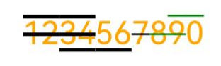
该示例通过enableMultiType、thicknessScale接口,实现多装饰线显示与加粗装饰线的效果。
// xxx.ets
import { LengthMetrics } from '@kit.ArkUI'
@Entry
@Component
struct Index {
  @State styledString : StyledString|undefined = undefined
  controller : TextController = new TextController
  thickness: number = 2.0
  mutableStyledString1: MutableStyledString = new MutableStyledString("1234567890", [
    {
      start: 0,
      length: 10,
      styledKey: StyledStringKey.FONT,
      styledValue: new TextStyle({ fontColor: Color.Orange, fontSize: LengthMetrics.vp(30) })
    },
    {
      start: 0,
      length: 4,
      styledKey: StyledStringKey.DECORATION,
      styledValue: new DecorationStyle({type: TextDecorationType.LineThrough, thicknessScale: this.thickness}, {enableMultiType: true})
    },
    {
      start: 2,
      length: 5,
      styledKey: StyledStringKey.DECORATION,
      styledValue: new DecorationStyle({type: TextDecorationType.Underline, thicknessScale: this.thickness}, {enableMultiType: true})
    },
    {
      start: 0,
      length: 4,
      styledKey: StyledStringKey.DECORATION,
      styledValue: new DecorationStyle({type: TextDecorationType.Overline, thicknessScale: this.thickness}, {enableMultiType: true})
    },
    {
      start: 6,
      length: 2,
      styledKey: StyledStringKey.DECORATION,
      styledValue: new DecorationStyle({type: TextDecorationType.LineThrough})
    },
    {
      start: 7,
      length: 2,
      styledKey: StyledStringKey.DECORATION,
      styledValue: new DecorationStyle({type: TextDecorationType.LineThrough, color: Color.Green}, {enableMultiType: true})
    },
    {
      start: 8,
      length: 2,
      styledKey: StyledStringKey.DECORATION,
      styledValue: new DecorationStyle({type: TextDecorationType.Overline, color: Color.Green}, {enableMultiType: true})
    }
  ]);
  build() {
    Column({ space:3 }) {
      Text(undefined, { controller: this.controller })
        .height(100)
        .copyOption(CopyOptions.LocalDevice)
        .onAppear(()=>{
          this.styledString = this.mutableStyledString1
          this.controller.setStyledString(this.mutableStyledString1)
        })
    }.width("100%")
  }
}