harmony 鸿蒙ArkUI Subsystem Changelog
ArkUI Subsystem Changelog
cl.arkui.1 Reporting of Unexpected Number of @Extend/@AnimatableExtend Parameters
The @Extend and @AnimatableExtend decorators allow for only one parameter.
Change Impact
When there are multiple parameters for the @Extend/@AnimatableExtend decorator, a compilation error is reported.
Example (incorrect):
// xxx.ets

@Extend(Text, Button)  // Compilation error: @Extend should have one and only one parameter.
function fancy() {
  .width(100)
}

@AnimatableExtend(Text, Polyline)  //Compilation error: @AnimatableExtend should have one and only one parameter.
function fancy2() {
  .height(100)
}

@Entry
@Component
struct Example {
  build() {
    Column() {
      Text('text')
        .fancy()
        .fancy2()
    }
  }
}
Key API/Component Changes
N/A
Adaptation Guide
Make sure the @Extend and @AnimatableExtend decorators contain only one parameter.
The code snippet is as follows:
// xxx.ets

@Extend(Text)
function fancy() {
  .width(100)
}

@AnimatableExtend(Text)
function fancy2() {
  .height(100)
}

@Entry
@Component
struct Example {
  build() {
    Column() {
      Text('text')
        .fancy()
        .fancy2()
    }
  }
}
cl.arkui.2 Reporting of @Link/@ObjectLink Member Variables Not Being Configured from Parent Components
The value of an @Link or @ObjectLink decorated member variable in a component must be from the parent component.
Change Impact
When the value of an @Link/@ObjectLink decorated member variable in a component is not configured from the parent component, a compilation error is reported.
Example (incorrect):
// xxx.ets

@Observed
class Count {
  message: string = 'count'
}

@Entry
@Component
struct Parent {
  @State state1: string = 'state1';
  @State state2: Count = new Count();
  build() {
    Column() {
      Child()  // Compilation error: Property 'link' in the custom component 'Child' is missing (mandatory to specify).
               // Compilation error: Property 'objectLink' in the custom component 'Child' is missing (mandatory to specify).
    }
  }
}

@Component
struct Child {
  @Link link: string;
  @ObjectLink objectLink: Count;
  build() {
    Column() {
      Text(this.link)
        .fontSize(50)
      Text(this.objectLink.message)
        .fontSize(50)
    }
  }
}
Key API/Component Changes
N/A
Adaptation Guide
Configure the @Link and @ObjectLink decorated member variables in components to get their values from the parent component.
The code snippet is as follows:
// xxx.ets

@Observed
class Count {
  message: string = 'count'
}

@Entry
@Component
struct Parent {
  @State state1: string = 'state1';
  @State state2: Count = new Count();
  build() {
    Column() {
      Child({link: $state1, objectLink: this.state2})
    }
  }
}

@Component
struct Child {
  @Link link: string;
  @ObjectLink objectLink: Count;
  build() {
    Column() {
      Text(this.link)
        .fontSize(50)
      Text(this.objectLink.message)
        .fontSize(50)
    }
  }
}
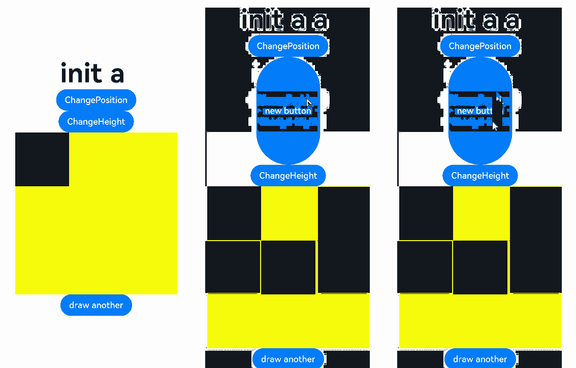
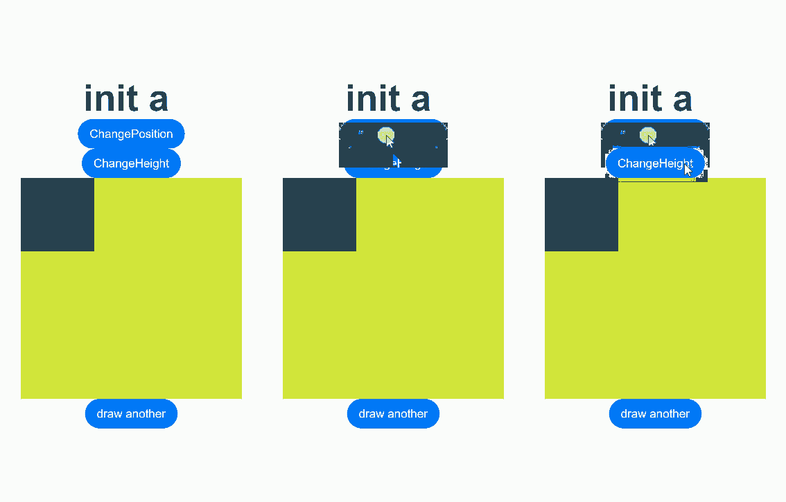
cl.arkui.3 Behavior Change of the onReady Event for <Canvas>
Description The onReady event is triggered when the component is ready or when the component size changes. After it is triggered, the canvas is cleared.
Example
@Entry
@Component
struct OnReadyDiff {
  @State message: string = 'init '
  @State isShow: boolean = false
  @State myHeight: number = 300
  private settings: RenderingContextSettings = new RenderingContextSettings(true);
  private context: CanvasRenderingContext2D = new CanvasRenderingContext2D(this.settings);

  build() {
    Row() {
      Column() {
        Text(this.message)
          .fontSize(50)
          .fontWeight(FontWeight.Bold)
        Button('ChangePosition')
          .onClick(()=>{
            this.isShow = !this.isShow
          })
        if (this.isShow) {
          Button('new button')
            .height(200)
        }
        Button('ChangeHeight')
          .onClick(()=>{
            this.myHeight = this.myHeight==300?500:300
          })

        Canvas(this.context)
          .width(300)
          .height(this.myHeight)
          .backgroundColor('#ffff00')
          .onReady(() =>{
            this.context.fillRect(0, 0, 100, 100)
            this.message += 'a '
          })
        Button('draw another')
          .onClick(()=>{
            this.context.fillRect(100, 100, 100, 100)
          })
      }
      .width('100%')
    }
    .height('100%')
  }
}
API version 9: The onReady event is triggered when the component is ready, when the component location changes, or when the component size changes.

API version 10 and later: The onReady event is triggered when the component is ready or when the component size changes. It is not triggered when the component location changes.

Change Impact
When the component location changes, the onReady event is triggered in API version 9 and earlier versions, but not in API version 10 and later versions.
cl.arkui.4 Change of How Percentage Is Calculated for Margin
Before the change: The margin is calculated twice when set in percentage. The second calculation is conducted after the result of the first calculation has been subtracted from the percentage reference. After the change: The first margin calculation result is used as the final result, and the second calculation is not conducted.
Change Impact
This change affects calculation of margins set in percentage.
Example (incorrect):
// xxx.ets
@Entry
@Component
struct TextInputExample {
  @State text: string = ''
  controller: TextInputController = new TextInputController()

  build() {
    Column(){
      Row().margin({left:"50%"}).width(100).height(100)
    }.width("100%").height("100%")
  }
}
Key API/Component Changes
N/A
Adaptation Guide
After the change, the margin percentage reference is fixed at the parent component’s width minus its padding, and does not subtract the result of the first margin calculation. As a result, the margin percentage is slightly greater than that before the change. Account for this change when setting the margin percentage.
cl.arkui.5 Change of SwipeActionItem in the <ListItem> Component
Changed Delete in the parameters of the SwipeActionItem API of the <ListItem> component to Action, and deleted the useDefaultDeleteAnimation API.
Change Impact
When developing an application based on OpenHarmony 4.0.9.3 or a later SDK version, you need to use the new APIs.
Key API/Component Changes
| API Before Change | API After Change |
|---|---|
| deleteAreaDistance | actionAreaDistance |
| onDelete | onAction |
| onEnterDeleteArea | onEnterActionArea |
| onExitDeleteArea | onExitActionArea |
| useDefaultDeleteAnimation | Deleted |
Adaptation Guide
When developing an application based on OpenHarmony 4.0.9.3 or a later SDK version, use the new APIs of SwipeActionItem. When developing an application based on OpenHarmony 4.0.9.2 or an earlier SDK version, use the original APIs of SwipeActionItem.
The code snippet is as follows:
// xxx.ets
@Entry
@Component
struct ListItemExample2 {
  @State message: string = 'Hello World'
  @State arr: number[] = [0, 1, 2, 3, 4]
  @State enterEndDeleteAreaString: string = "not enterEndDeleteArea"
  @State exitEndDeleteAreaString: string = "not exitEndDeleteArea"

  @Builder itemEnd() {
    Row() {
      Button("Delete").margin("4vp")
      Button("Set").margin("4vp")
    }.padding("4vp").justifyContent(FlexAlign.SpaceEvenly)
  }

  build() {
    Column() {
      List({ space: 10 }) {
        ForEach(this.arr, (item) => {
          ListItem() {
            Text("item" + item)
              .width('100%')
              .height(100)
              .fontSize(16)
              .textAlign(TextAlign.Center)
              .borderRadius(10)
              .backgroundColor(0xFFFFFF)
          }
          .transition({ type: TransitionType.Delete, opacity: 0 })
          .swipeAction({
            end: {
              builder: this.itemEnd.bind(this, item),
              onAction: () => {
                animateTo({ duration: 1000 }, () => {
                  let index = this.arr.indexOf(item)
                  this.arr.splice(index, 1)
                })
              },
              actionAreaDistance: 80,
              onEnterActionArea: () => {
                this.enterEndDeleteAreaString = "enterEndDeleteArea"
                this.exitEndDeleteAreaString = "not exitEndDeleteArea"
              },
              onExitActionArea: () => {
                this.enterEndDeleteAreaString = "not enterEndDeleteArea"
                this.exitEndDeleteAreaString = "exitEndDeleteArea"
              }
            }
          })
        }, item => item)
      }
      Text(this.enterEndDeleteAreaString).fontSize(20)
      Text(this.exitEndDeleteAreaString).fontSize(20)
    }
    .padding(10)
    .backgroundColor(0xDCDCDC)
    .width('100%')
    .height('100%')
  }
}
你可能感兴趣的鸿蒙文章
harmony 鸿蒙Arkui Subsystem State Management Changelog
harmony 鸿蒙Bundle Management Subsystem Changelog
harmony 鸿蒙Distributed Data Subsystem Changelog
- 所属分类: 后端技术
- 本文标签:
热门推荐
-
2、 - 优质文章
-
3、 gate.io
-
8、 openharmony
-
9、 golang
-
10、 harmony 鸿蒙左右翻页