harmony 鸿蒙text开发指导
text开发指导
text是文本组件,用于呈现一段文本信息。具体用法请参考text API。
创建text组件
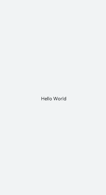
在pages/index目录下的hml文件中创建一个text组件。
<!-- xxx.hml -->
<div class="container" style="text-align: center;justify-content: center; align-items: center;">
  <text>Hello World</text>
</div>
/* xxx.css */
.container {
  width: 100%;
  height: 100%;
  flex-direction: column;
  align-items: center;
  justify-content: center;
  background-color: #F1F3F5;
}
设置text组件样式和属性
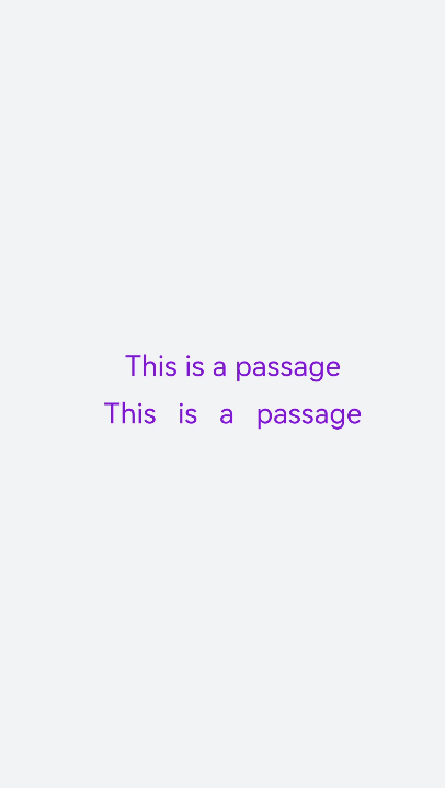
- 添加文本样式
设置color、font-size、allow-scale、word-spacing、text-valign属性分别为文本添加颜色、大小、缩放、文本之间的间距和文本在垂直方向的对齐方式。
  <!-- xxx.hml -->
  <div class="container" style="background-color:#F1F3F5;flex-direction: column;justify-content: center; align-items: center;">
    <text style="color: blueviolet; font-size: 40px; allow-scale:true">
      This is a passage
    </text>
    <text style="color: blueviolet; font-size: 40px; margin-top: 20px; allow-scale:true;word-spacing: 20px;" >
      This is a passage
    </text>
  </div>
  /* xxx.css */
  .container {
    width: 100%;
    height: 100%;
    flex-direction: column;
    align-items: center;
    justify-content: center;
    background-color: #F1F3F5;
  }
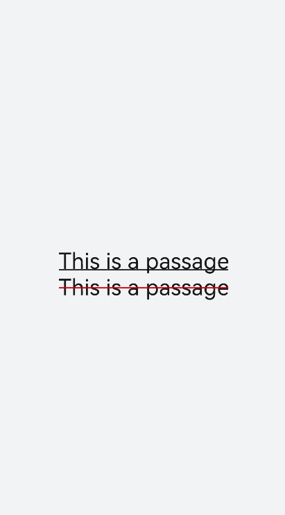
- 添加划线
设置text-decoration和text-decoration-color属性为文本添加划线和划线颜色,text-decoration枚举值请参考 text自有样式。
  <!-- xxx.hml -->
  <div class="container" style="background-color:#F1F3F5;">
    <text style="text-decoration:underline">
      This is a passage
    </text>
    <text style="text-decoration:line-through;text-decoration-color: red">
      This is a passage
     </text>
  </div>
  /* xxx.css */
  .container {
    width: 100%;
    height: 100%;
    flex-direction: column;
    align-items: center;
    justify-content: center;
  }
  text{
    font-size: 50px;
  }
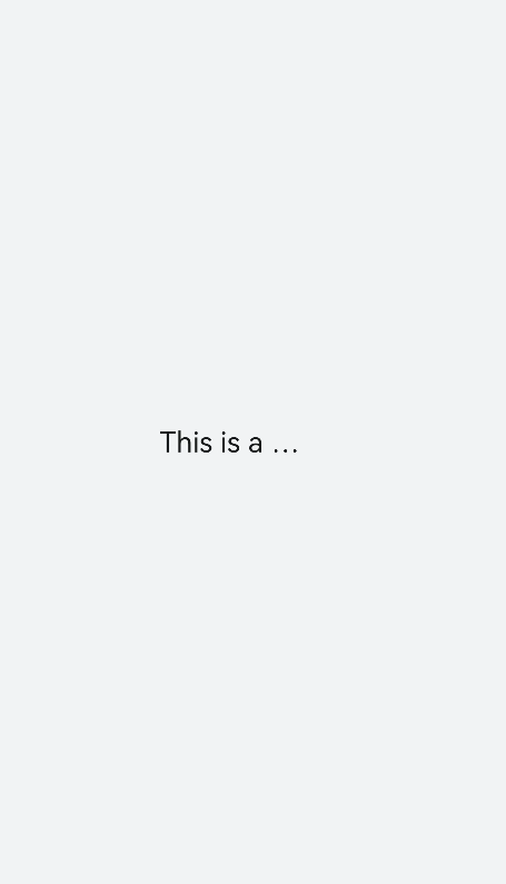
- 隐藏文本内容
当文本内容过多而显示不全时,添加text-overflow属性将隐藏内容以省略号的形式展现。
  <!-- xxx.hml -->
  <div class="container">
    <text class="text">
      This is a passage
    </text>
  </div>
  /* xxx.css */
  .container {
    width: 100%;
    height: 100%;
    flex-direction: column;
    align-items: center;
    background-color: #F1F3F5;
    justify-content: center;
  }
  .text{
    width: 200px;
    max-lines: 1;
    text-overflow:ellipsis;
  }
说明: - text-overflow样式需要与max-lines样式配套使用,设置了最大行数的情况下生效。 - max-lines属性设置文本最多可以展示的行数。
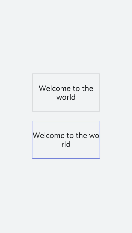
- 设置文本折行
设置word-break属性对文本内容做断行处理,word-break枚举值请参考text自有样式。
  <!-- xxx.hml -->
  <div class="container">
    <div class="content">
      <text class="text1">
        Welcome to the world
      </text>
        <text class="text2">
          Welcome to the world
        </text>
    </div>
  </div>
  /* xxx.css */
  .container {
    width: 100%;
    height: 100%;
    background-color: #F1F3F5;
    flex-direction: column;
    align-items: center;
    justify-content: center;
  }
  .content{
    width: 50%;
    flex-direction: column;
    align-items: center;
    justify-content: center;
  }
  .text1{
    width: 100%;
    height: 200px;
    border:1px solid #1a1919;
    margin-bottom: 50px;
    text-align: center;
    word-break: break-word;
    font-size: 40px;
  }
  .text2{
    width: 100%;
    height: 200px;
    border:1px solid #0931e8;
    text-align: center;
    word-break: break-all;
    font-size: 40px;
  }
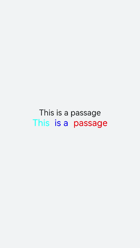
- text组件支持Span子组件
  <!-- xxx.hml -->
  <div class="container" style="justify-content: center; align-items: center;flex-direction: column;background-color: #F1F3F5;  width: 100%;height: 100%;">
    <text style="font-size: 45px;">
      This is a passage
    </text>
    <text style="font-size: 45px;">
      <span style="color: aqua;">This </span><span style="color: #F1F3F5;">      1
      </span>
      <span style="color: blue;"> is a </span>    <span style="color: #F1F3F5;">      1    </span>
      <span style="color: red;">  passage </span>
    </text>
  </div>
 > 说明:
> - 当使用Span子组件组成文本段落时,如果Span属性样式异常(例如:font-weight设置为1000),将导致文本段落显示异常。
>
> - 在使用Span子组件时,注意text组件内不能存在文本内容,如果存在文本内容也只会显示子组件Span里的内容。
> 说明:
> - 当使用Span子组件组成文本段落时,如果Span属性样式异常(例如:font-weight设置为1000),将导致文本段落显示异常。
>
> - 在使用Span子组件时,注意text组件内不能存在文本内容,如果存在文本内容也只会显示子组件Span里的内容。
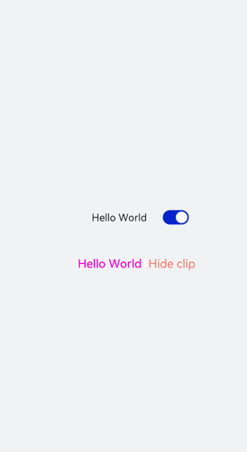
场景示例
text组件通过数据绑定展示文本内容,Span组件通过设置show属性来实现文本内容的隐藏和显示。
<!-- xxx.hml -->
<div class="container">
  <div style="align-items: center;justify-content: center;">
    <text class="title">
      {{ content }}
    </text>
    <switch checked="true" onchange="test"></switch>
  </div>
  <text class="span-container" style="color: #ff00ff;">
    <span show="{{isShow}}">  {{ content  }}  </span>
    <span style="color: white;">
        1
    </span>
    <span style="color: #f76160">Hide clip </span>
  </text>
</div>
/* xxx.css */
.container {
  width: 100%;
  height: 100%;
  align-items: center;
  flex-direction: column;
  justify-content: center;
  background-color: #F1F3F5;
}
.title {
  font-size: 26px;
  text-align:center;
  width: 200px;
  height: 200px;
}
// xxx.js
export default {
  data: {
    isShow:true,
    content: 'Hello World'
  },
  onInit(){    },
  test(e) {
    this.isShow = e.checked
  }
}
相关实例
针对text开发,有以下相关实例可供参考:
你可能感兴趣的鸿蒙文章
0
赞
热门推荐
-
2、 - 优质文章
-
3、 gate.io
-
8、 golang
-
9、 openharmony
-
10、 Vue中input框自动聚焦