@ohos.arkui.uiMaterial (System Material) (System API)
This module provides APIs for system materials. Different system materials correspond to different UI effects, including the background color (backgroundColor), border color (borderColor), border width (borderWidth), and shadow (shadow).
NOTE
The initial APIs of this module are supported since API version 23. Newly added APIs will be marked with a superscript to indicate their earliest API version.
This topic describes only system APIs provided by the module. For details about other public APIs, see System Material.
Modules to Import
import { uiMaterial } from '@kit.ArkUI';
MaterialType
Enumerates system material types.
Model restriction: This API can be used only in the stage model.
System capability: SystemCapability.ArkUI.ArkUI.Full
System API: This is a system API.
| Name | Value | Description |
|---|---|---|
| NONE | 0 | No system material effect. The corresponding effects are: backgroundColor and borderColor are transparent, borderWidth is 0, and there is no shadow. |
| SEMI_TRANSPARENT | 1 | Semi-transparent system material effect. The corresponding effect is as follows: backgroundColor: #f2f1f3f5 in light mode and #f2303131 in dark mode. borderColor: token value of theme.colors.compForegroundPrimary with 10% transparency. borderWidth: 1 vp. shadow: ShadowStyle.OUTER_DEFAULT_SM. |
MaterialOptions
System material options.
Model restriction: This API can be used only in the stage model.
System capability: SystemCapability.ArkUI.ArkUI.Full
System API: This is a system API.
| Name | Type | Read-Only | Optional | Description |
|---|---|---|---|---|
| type | MaterialType | No | Yes | Material type. Default value: MaterialType.NONE. |
Material
System material object on the UI.
constructor
constructor(options?: MaterialOptions)
A constructor used to create a Material object.
Model restriction: This API can be used only in the stage model.
System capability: SystemCapability.ArkUI.ArkUI.Full
System API: This is a system API.
Parameters
| Name | Type | Mandatory | Description |
|---|---|---|---|
| options | MaterialOptions | No | System material options, including the material type. Default value: {type:MaterialType.NONE}. |
Example
Example 1: Setting the System Material
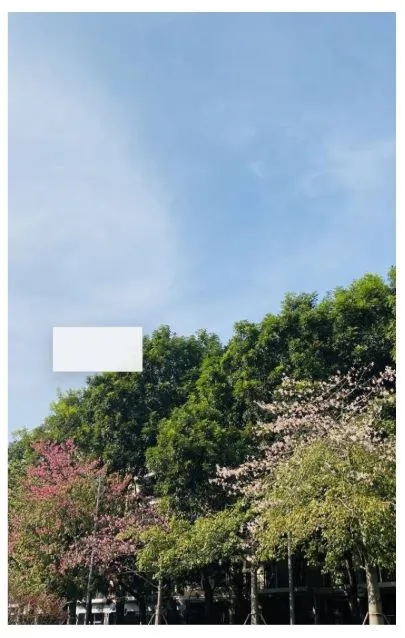
This example shows how to apply the Material object of a semi-transparent material to a component using the systemMaterial attribute.
import { uiMaterial } from '@kit.ArkUI';

@Entry
@Component
struct SystemMaterialPage {
  build() {
    Column() {
      Stack() {
        Image($r('app.media.bg1')) // Replace $r('app.media.bg1') with the image resource file you use.
          .width('100%')
          .height('100%')

        Column()
          .width(100)
          .height(50)
          .position({ x: 50, y: 350 })
          .systemMaterial(new uiMaterial.Material({ type: uiMaterial.MaterialType.SEMI_TRANSPARENT })) // Use the semi-transparent system material effect.
      }
      .height('90%')
      .width('90%')
    }
    .height('100%')
    .width('100%')
    .alignItems(HorizontalAlign.Center)
    .justifyContent(FlexAlign.Center)
  }
}
你可能感兴趣的鸿蒙文章
openharmony 鸿蒙 arkts-apis-uicontext-contextmenucontroller
openharmony 鸿蒙 errorcode-canvas
openharmony 鸿蒙 capi-oh-nativexcomponent-native-xcomponent-oh-nativexcomponent
openharmony 鸿蒙 errorcode-bindSheet
openharmony 鸿蒙 js-apis-arkui-uiExtension-sys
openharmony 鸿蒙 capi-arkui-accessibility-arkui-accessibilityeventinfo
openharmony 鸿蒙 capi-arkui-rendernodeutils
openharmony 鸿蒙 js-apis-arkui-node
openharmony 鸿蒙 capi-native-node-h
openharmony 鸿蒙 capi-arkui-nativemodule-arkui-listitemswipeactionitem